react-native-carousel-picker v2.0.3
React Native Carousel Picker
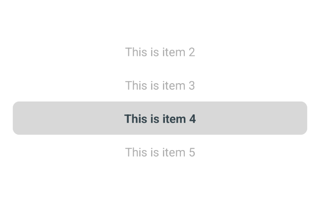
A cross-platform carousel picker component for React Native in pure Javascript. (iOS wheel Picker for Android & iOS)
Features
- 100% Javascript
- Highly customizable
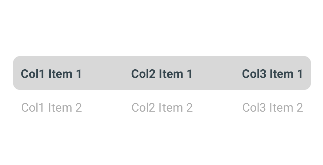
Demo


Installation
Open a Terminal in the project root and run:
npm install react-native-carousel-pickerWe're done! Now you can build and run the app on your device/simulator.
Quick Start
import React, { useState } from "react";
import { View } from "react-native";
import CarouselPicker from "react-native-carousel-picker";

const App = () => {
    // Set the initial indices for each column.
    const [selectedIndices, setSelectedIndices] = useState({ col1: 0, col2: 0, col3: 0 });

    // Sample items for each column.
    const items = {
        col1: [...Array(10).keys()].map((index) => `Col1 Item ${index + 1}`),
        col2: [...Array(10).keys()].map((index) => `Col2 Item ${index + 1}`),
        col3: [...Array(10).keys()].map((index) => `Col3 Item ${index + 1}`),
    };

    // Update the selected indices state when an item is selected.
    const handleSelected = (column, index) => {
        setSelectedIndices(prevState => ({
            ...prevState,
            [column]: index
        }));
    };

    return (
        <View style={{ flex: 1, backgroundColor: 'white', justifyContent: 'center' }}>
            <CarouselPicker
                onSelected={handleSelected}
                items={items}
                selectedIndices={selectedIndices}
            />
        </View>
    );
};

export default App;
Props
onSelected (required)
Callback which is called on carousel picker change, receives the column & index of the new selected item as argument. The current selected index state needs to be updated when it's called, otherwise the change is dropped.
selectedIndices (required)
This is the current selected indices that needs to be updated when the picker change. You can use this property to update the selected item. Default value is {}.
itemHeight (optional)
Height of each item of the picker needs to be upper to zero. The global height of the container depends on the height of each item. Default value is 40.
countVisibleItems (optional)
The minimum number of visible items to be displayed. The global height of the container depends on the number of visible items. Default value is 2
items (optional)
An array of string items that needs to be displayed. This array can be updated any time, the picker will refresh its content according to the new array. Default value is [].
backgroundColor (optional)
Define background of the carousel picker. Default value is undefined.
selectedMarkBackgroundColor (optional)
Define color of the selected mark. Default value is #4DB6AC.
selectedMarkBorderRadius (optional)
Define border radius of the selected mark. Default value is 8.
selectedMarkMarginHorizontal (optional)
Define the horizontal margin of the selected mark. Default value is 20.
selectedMarkHeight (optional)
Define the size of the selected mark. Default value is 1.
itemTextStyle (optional)
Define the text style of each displayed item. Default value is undefined.
containerStyle (optional)
Define the container style of the displayed picker. Default value is {}.
selectedItemTextStyle (optional)
Define the text style of each selected item. Default value is { fontWeight: 'bold', color: '#37474F' }.
unselectedItemTextStyle (optional)
Define the text style of each selected item. Default value is { fontWeight: 'normal', color: '#ADADAD' }.
Accessibility labels
The component provides some accessilibility labels, the general format is picker:<accessibility label>
Items of the picker
Accessibility label for Item 0 would be picker:Item 0
2 years ago
2 years ago
2 years ago
2 years ago
2 years ago
2 years ago
2 years ago
2 years ago
2 years ago
2 years ago
2 years ago
2 years ago
2 years ago
2 years ago
2 years ago
2 years ago
2 years ago
2 years ago
2 years ago
2 years ago
2 years ago
2 years ago