react-native-circular-multiple-slider v2.0.0
react-native-circular-multiple-slider
React Native component for circular multiple slider and pie chart.
Example app:
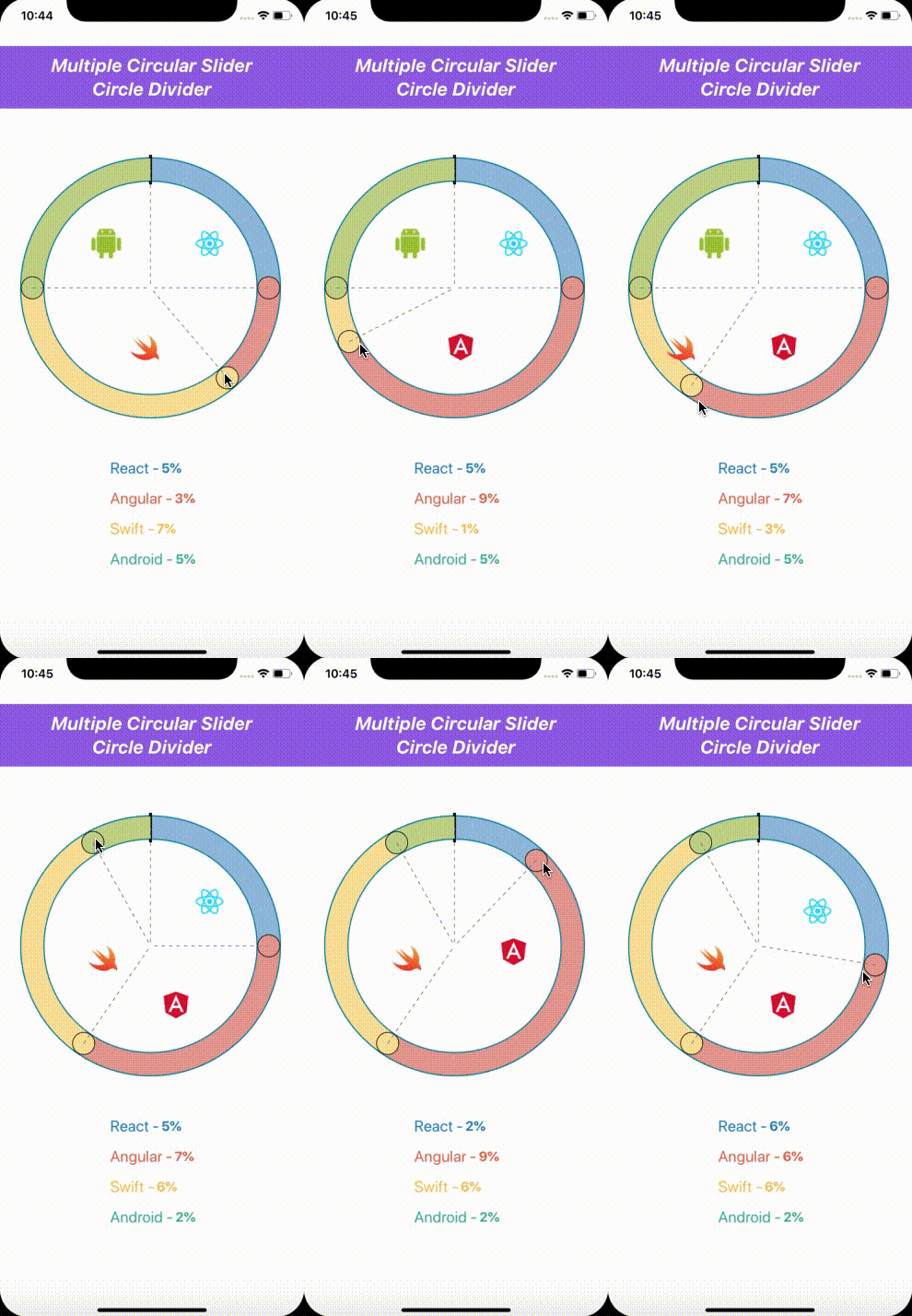
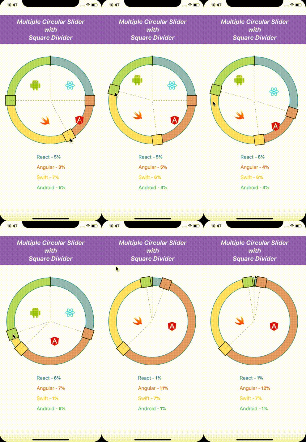
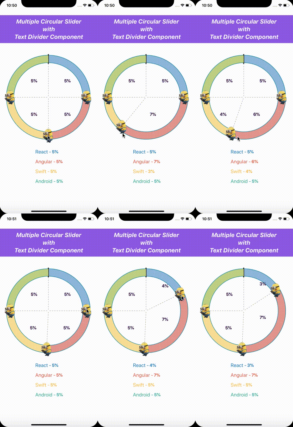
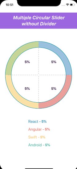
It's an example with this package
![]()
![]()
Features:
- Slider with Circle Divider
- Slider with Square Divider
- Slider with Bar Divider
- Slider with Icon Divider
- Slider with Text Divider Component
- Slider without Divider
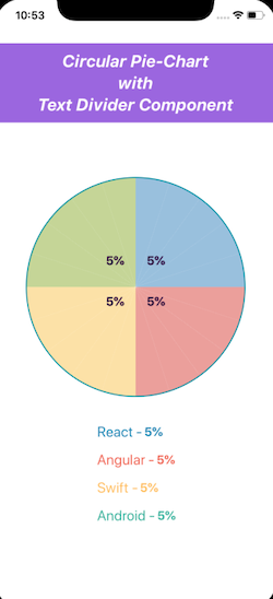
- PieChart with Text Divider Component
- PieChart with Icon Divider Component
Installation
Install library and react-native-svg
npm i --save react-native-circular-multiple-slider react-native-svg@9.7.1Link native code for SVG
react-native link react-native-svgand install cocoapods in the ios project
pod install
Usage
Import Circular Multiple Slider
import CircularSlider from 'react-native-circular-multiple-slider';Use as follows:
<CircularMultipleSlider
  componentType={'slider'} //Default type is slider
  values={this.state.value}
  colors={['#9BBFE0', '#E8A09A', '#FBE29F', '#C6D68F']}
  onUpdate={this.onUpdate}
  dividerComponent={[
    this.getDividerComponentImage(REACT_IMAGE),
    this.getDividerComponentImage(ANGULAR_IMAGE),
    this.getDividerComponentImage(SWIFT_IMAGE),
    this.getDividerComponentImage(ANDROID_IMAGE),
  ]}
  dividerComponentSize={DIVIDER_COMPONENT_SIZE}
  slideDividerType={'circle'}
  borderColor={'#0088a0'}
  borderWidth={3}
  strokeWidth={30}
  radius={160}
  separatorColor="#171717"
  minimumStopValue={0.5}
/>
Configuration
You can configure the passing by following props:
Props
stylevaluescolorsonUpdatecomponentTypedividerComponentdividerComponentSizeminimumStopValueslideDividerTypeslideDividerIconhideSlideDividerTypeonPanResponderGrantonPanResponderReleaseborderWidthstrokeWidthradiusseparatorColor
Methods
style
Used to style and layout the Multiple Circular Slider. See StyleSheet.js and ViewStylePropTypes.js for more info.
| Type | Required |
|---|---|
| View.style | No |
values
values is a mandatory prop. This an array of values which used to render the pie chart or multiple circular slider.
| Type | Required | Platform |
|---|---|---|
| array | Yes | iOS, Android |
colors
colors is a mandatory prop. This an array of colors which used to apply the color for the pie chart or multiple circular slider.
| Type | Required | Platform |
|---|---|---|
| array | Yes | iOS, Android |
onUpdate
onUpdate is an prop method, used to handle the updated callback for this multiple circular slider component.
| Type | Required | Platform |
|---|---|---|
| func | Yes | iOS, Android |
componentType
componentType is a type, which will decide wheather it is pie-chart or multiple circular slider component.
| Type | Required | Values | Default Value | Platform |
|---|---|---|---|---|
| string | No | Slider, Pie_Chart | Slider | iOS, Android |
dividerComponent
dividerComponent is array of component, which used to render between the divider portions.
| Type | Required | Platform |
|---|---|---|
| array | No | iOS, Android |
dividerComponentSize
dividerComponent is size of component, which is the size of the component rendered between the divider portions.
| Type | Required | Default Value | Platform |
|---|---|---|---|
| number | No | 50 | iOS, Android |
minimumStopValue
minimumStopValue is value of the divider progress can move until this minimum value.
| Type | Required | Default Value | Platform |
|---|---|---|---|
| number | No | 1 | iOS, Android |
slideDividerType
slideDividerType is a type, which will decide the type of the slide divider.
| Type | Required | Values | Default Value | Platform |
|---|---|---|---|---|
| string | No | Circle, Square, Bar, Icon | Circle | iOS, Android |
slideDividerIcon
slideDividerIcon is the icon used for the slideDivider, if the slideDividerType is icon. | Type | Required | Platform | | ---- | -------- | -------- | | any | No | iOS, Android |
hideSlideDividerType
hideSlideDividerType will decide the visibility of the SlideDivider
| Type | Required | Values | Default Value | Platform |
|---|---|---|---|---|
| bool | No | false, true | false | iOS, Android |
onPanResponderGrant
onPanResponderGrant is an prop method, used to handle the slider grant callback, this method will get called whenever the slider starts sliding.
| Type | Required | Platform |
|---|---|---|
| func | Yes | iOS, Android |
onPanResponderRelease
onPanResponderRelease is an prop method, used to handle the slider release callback, this method will get called whenever the slider release from the sliding.
| Type | Required | Platform |
|---|---|---|
| func | Yes | iOS, Android |
borderColor
borderColor is the color for the border. | Type | Required | Platform | | ---- | -------- | -------- | | string | No | iOS, Android |
borderWidth
borderWidth is the width of the border.
| Type | Required | Default Value | Platform |
|---|---|---|---|
| number | No | 3 | iOS, Android |
strokeWidth
strokeWidth is the width of the stroke for the pie-chart or circular multiple slider.
| Type | Required | Default Value | Platform |
|---|---|---|---|
| number | No | 30 | iOS, Android |
radius
radius is the radius for the pie-chart or circular multiple slider.
| Type | Required | Default Value | Platform |
|---|---|---|---|
| number | No | 120 | iOS, Android |
separatorColor
separatorColor is the separator color for the slider arc of the pie-chart or circular multiple slider.
| Type | Required | Default Value | Platform |
|---|---|---|---|
| string | No | #171717 | iOS, Android |
Methods
updateValues
updateValues is the method in this package which can be used to update the values at run time by accessing via reference of the pie-chart or circular multiple slider.
Parameter
- values - This an array of values which used to render the pie chart or multiple circular slider.
| Type | Parameters | Platform |
|---|---|---|
| func | values | iOS, Android |
Working with example app
With XCode
You'll find working example in the example directory of this repository. You can run it by:
git clone https://github.com/ibrahimsulai/react-native-circular-multiple-slider.git
cd  react-native-circular-multiple-slider/app/example/react_native_circular_multiple_slider_example
npm install
open ios/react_native_circular_multiple_slider_example.xcworkspace
XCode will open. Click Run button and that's it.
Author
Ibrahim Sulaiman (ibrahim.kce@icloud.com)
License
The library is released under the MIT licence. For more information see LICENSE.


