

Installation
npm i react-native-companim
Components Animated
- MultiplyButton
- FadeButton
- RotateButton
- BounceButton
- ScaleButton
- Card
- CircleIndicator
- MultiplyIndicator
- RotateIndicator
- ScaleIndicator
- SequentIndicator
SuddenIndicator
Usage
MultiplyButton
import React from 'react'
import {MultiplyButton} from 'react-native-companim'
import {View} from "react-native"

export default class App extends React.Component{

  render() {
    return (
      <View style={{justifyContent:"center",alignItems:"center",flex:1}}>


        <MultiplyButton middleButtonPixel={50}
                        lastButtonPixel={100}
                        direction="y"
                        tension={40}
                        friction={40}
                        delay={500}
                        />
    )}
  }
Code explanation:
You can specify style of the all of three button whatever you want.You can also specify child components of the buttons
You can also specify:
| prop | #default |
|---|
| direction | x-axis |
| tension | 40 |
| friction | 40 |
| delay | 0 |
| middleButtonPixe | 50 |
| lastButtonPixel | 100 |
| firstButtonChilds | none |
| secondButtonChilds | none |
| lastButtonChilds | none |
| firstButtonStyle | object |
| middleButtonStyle | object |
| lastButtonStyle | object |
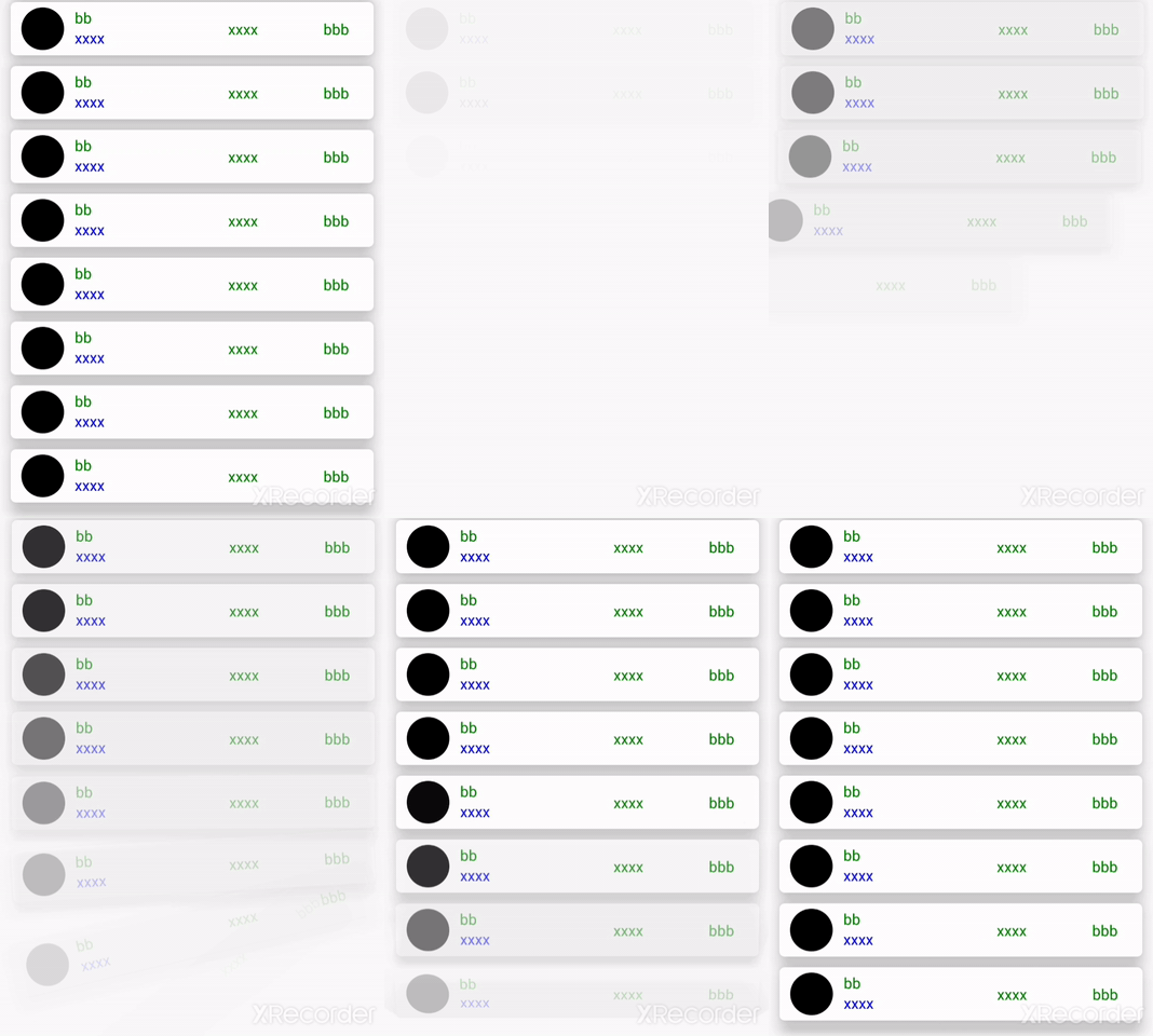
Card
import React from 'react'
import {Card} from 'react-native-companim'
import {View} from "react-native"

const data = [1,2,3,4,5,6]//it is added just for map function.Not important!

const datas={   "name":"xxxx",
                "title":"xxxx",
                "subtitle":"xxxx",
                "middleTitle":"xxxx"
          }

export default class App extends React.Component{

  render() {
    return (
        {data.map((_,index)=>{ return <Card sequentially={index}
                                            animationType="opacity"
                                            title={datas.title}
                                            titleStyle={{color:"green"}}
                                            />
                                            })}
      )
    }
}
Code explanation:
You can specify style of the title,subtitle,middletitle and endtitle whatever you want.You can also specify:
- animationType value which is can take
leftToRight , opacity , bothLeftToRightOpacity, bytheZaxis, bytheXaxis and bytheYaxis values(for the animation, index value of the map function is necessary) - sequentially value which takes index of the map function (necessary for the animation)
| prop | #default |
|---|
| animationType | leftToRight |
| sequentially | index of map function(it necessary for animation) |
| title | xxxx |
| titleStyle | {color:"green"} |
| subtitle | {color:"blue"} |
| middleTitle | xxxx |
| middleTitleStyle | {color:"green"} |
| endTitle | xxxx |
| endTitleStyle | {color:"green"} |
| image | none |
Bounce Button
import React from 'react'
import {BounceButton} from 'react-native-companim'
import {View} from "react-native"

export default class App extends React.Component{

 render() {
   return (
       <BounceButton   style={{backgroundColor:"green",width:200,height:200}}
                       duration={500}
                       direction={false}
                       friction={false}
                       delay={0}/>
     )
   }
}
Code explanation:
You can specify style of the button whatever you want.You can also specify:
- duration value which is the complement time of the animation
- direction value which is used for direction of the animation such as to forward(with
false value) or to upward(with true value) - friction value is the effect of the animation
- delay value is the waiting time before the animation
| prop | #default |
|---|
| duration | 500 |
| direction | (true)forwards |
| friction | 40 |
| delay | 0 |
| style | object |
Fade Button
import React from 'react'
import {FadeButton} from 'react-native-companim'
import {View} from "react-native"

export default class App extends React.Component{

 render() {
   return (
         <FadeButton   style={{backgroundColor:"green",width:200,height:200}}
                       duration={500}
                       repeat={true}
                       gone={true}/>
     )
   }
}
Code explanation:
You can specify style of the button whatever you want.You can also specify :
- duration value which is the complement time of the animation
- repeat value which is repetition of the animation.If it is
true, animation playing continuously - gone value is that when is true , button is not shown again
| prop | #default |
|---|
| duration | 1000 |
| gone | (false) |
| repeat | false |
| style | object |
Rotate Button
import React from 'react'
import {RotateButton} from 'react-native-companim'
import {View} from "react-native"

export default class App extends React.Component{

 render() {
   return (
         <RotateButton
                       style={{backgroundColor:"green",width:200,height:200}}
                       from_deg="0"
                       to_deg="-45"
                       delay={100}
                       duration={500}
                       type="infinite" />
     )
   }
}
Code explanation:
You can specify style of the button whatever you want.You can also specify :
- from_deg value which is beginning degree of the animation
- to_deg value which is last degree of the animation
- delay value is waiting time before the animation
- duration value which is the complement time of the animation
- type value can be take three value which is
infinite,comeback,shake
| prop | #default |
|---|
| type | shake |
| from_deg | none |
| to_deg | none |
| delay | 0 |
| duration | 500 |
| style | object |
Scale Button
import React from 'react'
import {ScaleButton} from 'react-native-companim'
import {View} from "react-native"

export default class App extends React.Component{

 render() {
   return (
         <ScaleButton
                       style={{backgroundColor:"green",width:200,height:200}}
                       animationType="bothXYaxis"
                       duration={1000}
                       />
     )
   }
}
Code explanation:
You can specify style of the button whatever you want.You can also specify :
- delay value is waiting time before the animation
- duration value which is the complement time of the animation
- animationType value can be take three value which is
bothXYaxis,byTheYaxis,byTheXaxis
| prop | #default |
|---|
| animationType | byTheXaxis |
| duration | 1000 |
| delay | 0 |
| style | object |
CircleIndicator
import React from 'react'
import {CircleIndicator} from 'react-native-companim'

export default class App extends React.Component{

 render() {
   return (
         <CircleIndicator
                       color={["gray","blue","yellow","green"]}
                       delay={0}
                       />
     )
   }
}
MultiplyIndicator
import React from 'react'
import {MultiplyIndicator} from 'react-native-companim'

export default class App extends React.Component{

  render() {
    return (
          <MultiplyIndicator
                        duration={1000}
                        tension={40}
                        />
      )
    }
}
RotateIndicator
import React from 'react'
import {RotateIndicator} from 'react-native-companim'

export default class App extends React.Component{

  render() {
    return (
          <RotateIndicator
                        duration={1000}
                        delay={0}
                        />
      )
    }
}
| prop | #default |
|---|
| duration | 1000 |
| delay | 0 |
ScaleIndicator
import React from 'react'
import {ScaleIndicator} from 'react-native-companim'

export default class App extends React.Component{

  render() {
    return (
          <ScaleIndicator
                        tension={80}
                        />
      )
    }
}
| prop | #default |
|---|
| tension | 200 |
| style | object |
Sequent Indicator
import React from 'react'
import {SequentIndicator} from 'react-native-companim'

export default class App extends React.Component{

  render() {
    return (
          <SequentIndicator
                        tension={200}
                        middleStyle={{......}}
                        />
      )
    }
}
| prop | #default |
|---|
| tension | 40 |
| rightSecondaryStyle | object |
| rightFirstStyle | object |
| leftFirstStyle | object |
| leftSecondaryStyle | object |
| middleStyle | object |
Sudden Indicator
import React from 'react'
import {SuddenIndicator} from 'react-native-companim'

export default class App extends React.Component{

  render() {
    return (
          <SuddenIndicator
                       />
      )
    }
}
| prop | #default |
|---|
| tension | 90 |
| style | object |


