
react-native-country-picker-modal
A searchable, themeable country picker for React Native — iOS, Android and Web.



| iOS | Android | Web |
|---|---|---|
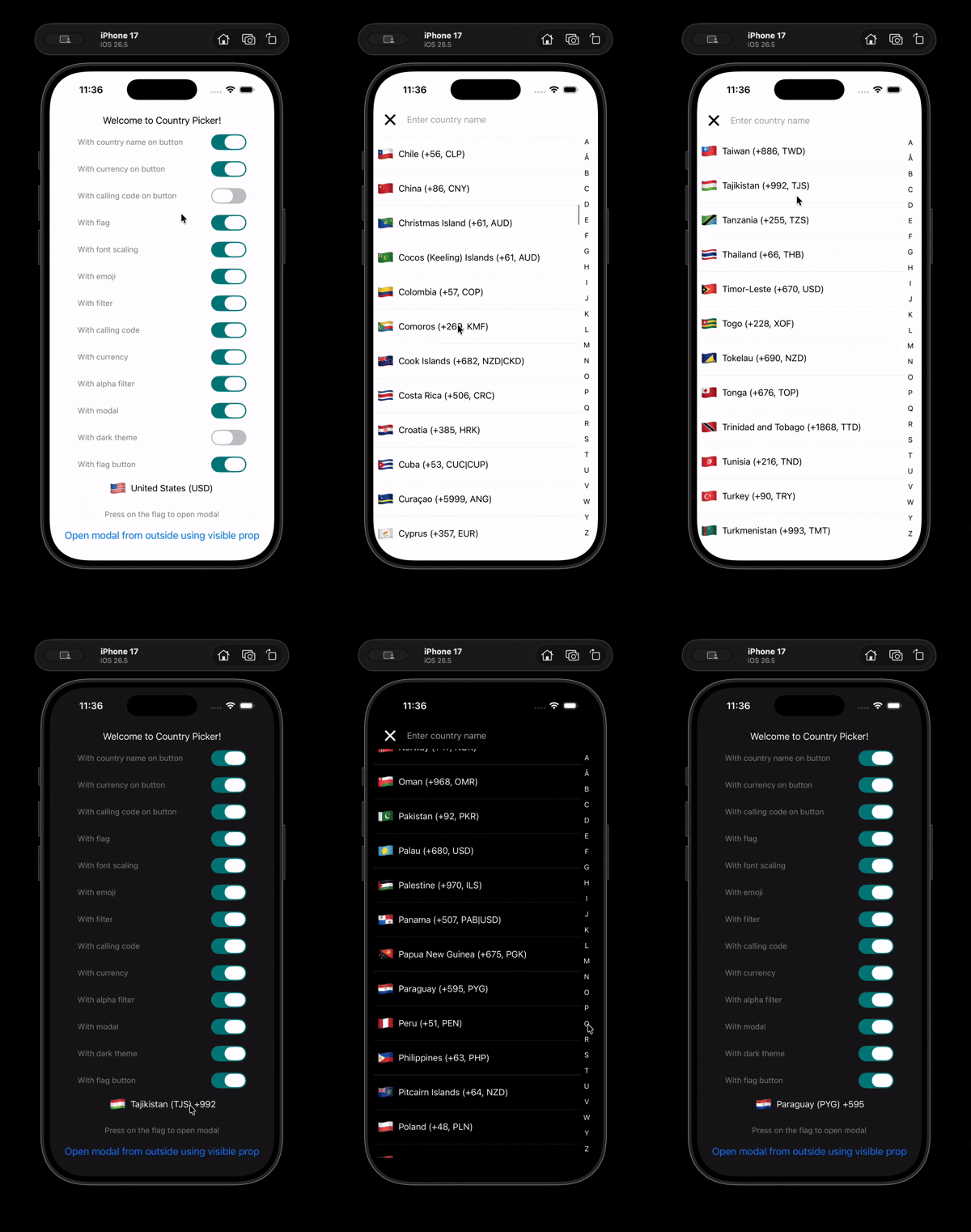 |
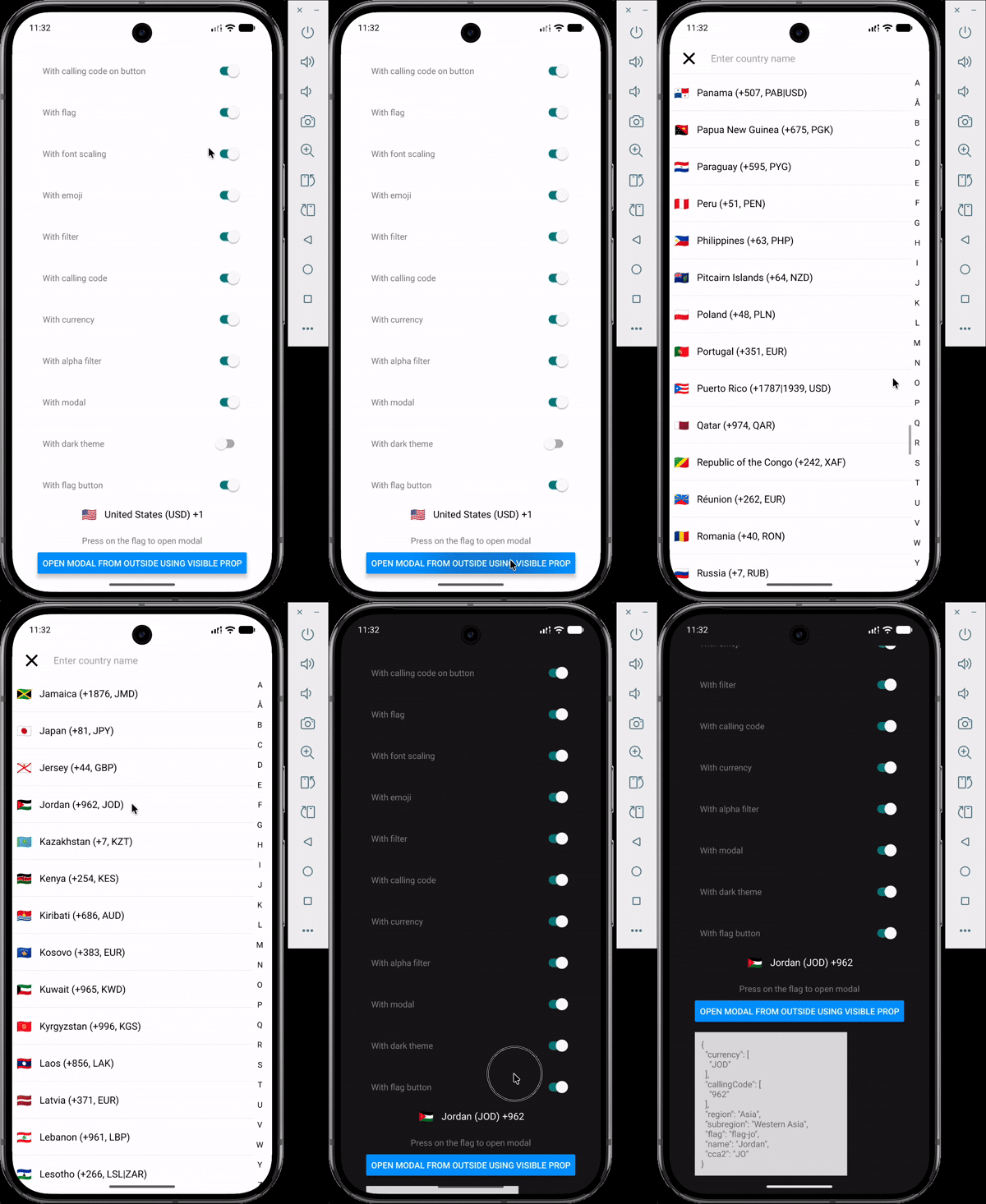 |
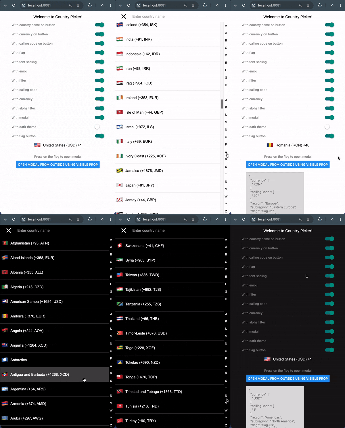 |
Features
- 250 countries with names, flags, calling codes, currencies, regions and subregions.
- Emoji flags with no runtime dependency — derived from the country code, nothing to download.
- Fuzzy search across name, country code and calling code, plus an A–Z jump index.
- 18 name translations bundled, with automatic fallback to English.
- Fully themeable, with a built-in dark theme.
- Written in TypeScript; country codes, regions and translations are literal union types.
- Works on iOS, Android and Web.
Requirements
| Package | Version |
|---|---|
react |
>= 19.0 |
react-native |
>= 0.78 |
Using React 18 or React Native 0.72? Stay on
v2. See Migrating from v2.
Installation
npm  install react-native-country-picker-modal
yarn add     react-native-country-picker-modal
pnpm add     react-native-country-picker-modal
bun  add     react-native-country-picker-modal
There is no native code and no linking step, so it works in Expo Go as well as bare React Native.
Quick start
import { useState } from 'react'
import { SafeAreaView, Text } from 'react-native'
import CountryPicker, {
  type Country,
  type CountryCode,
} from 'react-native-country-picker-modal'

export default function App() {
  const [countryCode, setCountryCode] = useState<CountryCode>('US')
  const [country, setCountry] = useState<Country>()

  return (
    <SafeAreaView>
      <CountryPicker
        countryCode={countryCode}
        withFilter
        withFlag
        withCallingCode
        onSelect={(selected) => {
          setCountryCode(selected.cca2)
          setCountry(selected)
        }}
      />
      {country ? <Text>You picked {country.name as string}</Text> : null}
    </SafeAreaView>
  )
}
Tapping the flag opens the modal. To drive it yourself, pass visible and handle onOpen / onClose.
A runnable version exercising every option lives in example/App.tsx.
Props
Selection
| Prop | Type | Default | Description |
|---|---|---|---|
countryCode |
CountryCode |
— | The currently selected country, e.g. 'US'. |
onSelect |
(country: Country) => void |
no-op | Called with the full country object when one is chosen. |
countryCodes |
CountryCode[] |
— | Restrict the list to these countries. |
excludeCountries |
CountryCode[] |
— | Remove these countries from the list. |
preferredCountries |
CountryCode[] |
— | Show these first. Ignored when withAlphaFilter is true. |
region |
Region |
— | Restrict to a region, e.g. 'Europe'. |
subregion |
Subregion |
— | Restrict to a subregion, e.g. 'Western Europe'. |
translation |
TranslationLanguageCode |
'common' |
Language for names. Falls back to English per country. |
What the list shows
| Prop | Type | Default | Description |
|---|---|---|---|
withFlag |
boolean |
true |
Show a flag on each row. |
withEmoji |
boolean |
true |
Use emoji flags. When false, images are fetched — see Image flags. |
withCallingCode |
boolean |
false |
Append the calling code to each row. |
withCurrency |
boolean |
false |
Append the currency to each row. |
withFilter |
boolean |
false |
Show the search field. |
withAlphaFilter |
boolean |
false |
Show the A–Z jump index. |
What the button shows
| Prop | Type | Default | Description |
|---|---|---|---|
withFlagButton |
boolean |
true |
Show the flag on the button. |
withCountryNameButton |
boolean |
false |
Show the country name on the button. |
withCallingCodeButton |
boolean |
false |
Show the calling code on the button. |
withCurrencyButton |
boolean |
false |
Show the currency on the button. |
placeholder |
string |
'Select Country' |
Shown when no countryCode is set. |
containerButtonStyle |
StyleProp<ViewStyle> |
— | Style for the button container. |
allowFontScaling |
boolean |
true |
Respect the OS font-size setting. |
Modal
| Prop | Type | Default | Description |
|---|---|---|---|
withModal |
boolean |
true |
When false, the list renders inline and no button is shown. |
visible |
boolean |
false |
Open the modal from outside. |
onOpen / onClose |
() => void |
— | Called when the modal opens or closes. |
withCloseButton |
boolean |
true |
Show the close button in the header. |
modalInsets |
{ top?: number; bottom?: number } |
— | Override the Android status/navigation bar insets. See Android and edge-to-edge. |
Escape hatches
| Prop | Type | Description |
|---|---|---|
theme |
Theme |
Merged over the default theme. See Theming. |
modalProps |
ModalProps |
Forwarded to the underlying Modal. |
filterProps |
TextInputProps |
Forwarded to the search field. |
flatListProps |
FlatListProps<Country> |
Forwarded to the list. |
renderFlagButton |
(props: FlagButtonProps) => ReactNode |
Replace the button entirely. |
renderCountryFilter |
(props: CountryFilterProps) => ReactNode |
Replace the search field entirely. |
closeButtonImage, closeButtonStyle, closeButtonImageStyle |
— | Customise the close button. |
Theming
theme is merged over the defaults, so you specify only what you want to change.
import CountryPicker, { DARK_THEME } from 'react-native-country-picker-modal'

// Built-in dark theme
<CountryPicker theme={DARK_THEME} countryCode='US' onSelect={onSelect} />

// Or override individual values
<CountryPicker
  theme={{ primaryColor: '#6C5CE7', fontSize: 18, itemHeight: 56 }}
  countryCode='US'
  onSelect={onSelect}
/>| Key | Default (light) |
|---|---|
primaryColor |
'#ccc' |
primaryColorVariant |
'#eee' |
backgroundColor |
'#ffffff' |
onBackgroundTextColor |
'#000000' |
fontSize |
16 |
fontFamily |
'System' / 'Roboto' / 'Arial' |
filterPlaceholderTextColor |
'#aaa' |
keyboardAppearance |
'light' ('dark' in DARK_THEME, iOS only) |
activeOpacity |
0.5 |
itemHeight |
7% of screen height |
desktopBreakpoint |
768 (web only) |
dialogMaxWidth |
480 (web only) |
dialogMaxHeight |
640 (web only) |
dialogBorderRadius |
12 (web only) |
backdropColor |
'rgba(0, 0, 0, 0.45)' (web only) |
flagSize |
20 on Android, 30 elsewhere |
flagSizeButton |
20 on Android, 30 elsewhere |
useTheme() returns the fully resolved theme if you are building your own row or button.
Android and edge-to-edge
Android 15 and newer always lay the app window out edge-to-edge. Two things in react-native do not follow, and the picker compensates for both:
SafeAreaViewisPlatform.select({ ios: ..., default: View }), so it applies no insets at all on Android. The modal pads itself byStatusBar.currentHeightinstead.- The native modal sets
fitsSystemWindowson its content and disables edge-to-edge on the dialog window wheneverstatusBarTranslucentis false. That offset the content by the status bar height while it stayed full-screen tall, pushing the search bar down and the bottom of the list off screen. The picker passesstatusBarTranslucentso the dialog matches the app window.
navigationBarTranslucent is deliberately left off, which lets the system inset
the dialog above the navigation bar — the one inset core react-native cannot
measure. If your app already uses react-native-safe-area-context and you want
exact values, pass them in:
import { useSafeAreaInsets } from 'react-native-safe-area-context'

const insets = useSafeAreaInsets()

<CountryPicker modalInsets={insets} countryCode='US' onSelect={onSelect} />
modalInsets accepts { top?: number; bottom?: number } and overrides the
measured values. It is ignored on iOS, where SafeAreaView reports real insets.
Web
On web the picker is responsive. Below desktopBreakpoint it stays the full-screen
sheet you get on a phone; at or above it the sheet becomes a centred dialog capped to
dialogMaxWidth / dialogMaxHeight over a dimmed backdrop, because a country list
stretched across a monitor is hard to read. Clicking the backdrop or pressing
Esc closes the dialog, and rows highlight on hover using
primaryColorVariant. Native is unaffected.
Helper functions
Everything the picker uses internally is exported, so you can query the country data without rendering anything.
import {
  getEmojiFlag,
  getCountryName,
  getCallingCode,
  getCurrency,
  getCountryInfo,
  getAllCountries,
  FlagType,
} from 'react-native-country-picker-modal'

getEmojiFlag('JP') // '🇯🇵' — synchronous, no I/O

await getCountryName('JP', 'fra') // 'Japon'
await getCallingCode('JP') // '81'
await getCurrency('JP') // 'JPY'
await getCountryInfo({ countryCode: 'JP' })
// { countryName: 'Japan', currency: 'JPY', callingCode: '81' }

await getAllCountries(FlagType.EMOJI, 'common')
Recipes
Opening the modal from your own button
const [visible, setVisible] = useState(false)

<Button title='Choose a country' onPress={() => setVisible(true)} />
<CountryPicker
  countryCode={countryCode}
  visible={visible}
  withFlagButton={false}
  onSelect={onSelect}
  onClose={() => setVisible(false)}
/>
Rendering the list inline, without a modal
<CountryPicker
  withModal={false}
  withFilter
  countryCode='US'
  onSelect={onSelect}
/>
Image flags
Emoji flags are the default and need no network access. Setting withEmoji={false} switches to bitmap flags, which are not bundled — they are roughly 500 KB and are fetched on first use from a GitHub Pages URL.
To avoid depending on a third-party origin at runtime, host data/countries.json yourself:
import { setImageFlagsUrl } from 'react-native-country-picker-modal'

setImageFlagsUrl('https://cdn.example.com/countries/')
Migrating from v2
v3 requires React 19 and React Native 0.78+. Most apps need no code changes; the list below is exhaustive.
| v2 | v3 | Why |
|---|---|---|
getEmojiFlagAsync(code) |
getEmojiFlag(code) |
The emoji is derived from the country code, so it is no longer asynchronous. |
translation='svk' / 'isr' |
translation='slk' / removed |
Neither existed in the data and both silently fell back to English. svk was a typo for slk (Slovak). |
useTheme(): Partial<Theme> |
useTheme(): ResolvedTheme |
Values are always present, so theme.fontSize! becomes theme.fontSize. |
import { Omit } from '...' |
TypeScript's built-in Omit |
The custom alias shadowed the built-in. |
disableNativeModal |
removed | The picker always uses react-native's Modal. react-native-web renders Modal natively now, so the portal it switched to was only ever needed to stack modals on iOS. |
CountryModalProvider |
removed | It existed solely to host the portal that disableNativeModal rendered into, so it had nothing left to do. |
The default export is unchanged. Every other prop is unchanged; the two removals above are the only breaking changes, and they affect you only if you were working around iOS's refusal to stack two native modals.
Newly available in v3: the ces, est, kor, pol, slk and urd translations, which were present in the bundled data but rejected by the v2 types.
Also fixed in v3: the web modal, which never rendered because the shim imported the wrong module; flags disappearing from list rows; and search returning stale results after changing the translation or country list.
Contributing
git clone https://github.com/xcarpentier/react-native-country-picker-modal.git
cd react-native-country-picker-modal
yarn install

yarn lint        # ESLint 9, flat config
yarn typecheck   # tsc --noEmit
yarn test        # Jest + @testing-library/react-native
yarn build       # react-native-builder-bob -> lib/
yarn verify      # all of the above

# Run the Expo demo
yarn example install
yarn example start
The repository is the library at the root plus a standalone Expo app in example/ that consumes it through a link: dependency.
FAQ
Does it work on both iOS and Android? Yes, and on Web.
Is the country data available offline? Yes. Names, calling codes, currencies and emoji flags are bundled. Only bitmap flags (withEmoji={false}) are fetched at runtime.
Does it need native linking? No. It is pure JavaScript and works in Expo Go.
Credits
Country data from world-countries.
Questions
Open an issue or get in touch.
Hire an expert
Looking for a React Native freelance expert with more than 12 years of experience? Get in touch from my website.