1.0.10 • Published 6 years ago
react-native-custom-keyboard-mroads v1.0.10
react-native-custom-keyboard-mroads

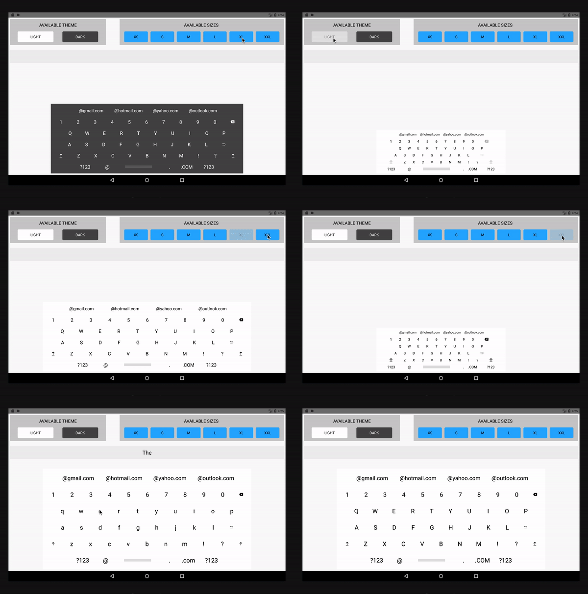
This is a Custom keyboard which can be used in a React Native project for text input. This keyboard comes with few inbuilt features which is commonly not available with the device keyboard.
The keyboard has the following features:
- There are 6 sizes supported which can be used as per the requirement in different screens and different components namely "xsmall", "small", "medium", "large", "xlarge" and "xxl". The default size is set to large. Refer the below snippet to get comfortable with the syntax of using size. This is an optional prop.
<Keyboard size="large" />- The keyboard presently comes with two different themes namely "light" and "dark" which can be adjusted at any point of time simply by passing the theme as a prop. This is again an optional prop.
<Keyboard theme="dark" />- Two input formats are currently available with the keyboard. The inputType prop could be set either to "email" or "text". When set to "email", we get some domain suggestions which can be used handy. An optional prop again.
<Keyboard inputType="email" />NOTE: Make sure you are passing the exact names mentioned above as prop when choosing different size, theme and inputType. The keyboard needs to have the two required props along with the other optional props. Refer the below table for more details.
Installation
Use the package manager to install.
`$ npm install react-native-custom-keyboard-mroads --save`or
`$ yarn add react-native-custom-keyboard-mroads`Usage
Props
Props you need to pass while implementing.
| Prop | Required | Default | Type | Description |
|---|---|---|---|---|
| theme | False | dark | String | Determines the theme of the keyboard, either 'Dark' or 'Light'. |
| size | False | xlarge | String | Determines the size of the keyboard. |
| input type | False | text | String | Determines the type of the input you require. Is either 'email' or 'text'. |
| onInput | True | () => {} | Function | Called when there is a text change on keyboard button press. |
| value | True | - | String | The value entered using the keyboard. |
| disableEnterButton | False | false | Boolean | The enter or return button on keyboard can be disaled when required. |
| disableCapsLock | False | false | Boolean | Removes the Caps lock button on the keyboard when passed as true. |
| keysToDisable | False | [] | Array | The characters passed to this props as array will remove them from the keyboard. Thus, giving flexibility of choosing buttons visibility on keyboard. The characters passed should all be in lowercase. |
Sizes Available
| xsmall | small | medium | large | xlarge | xxl |
|---|
Theme Available
| dark | light |
|---|
Basic
import React from 'react';
import Keyboard from 'react-native-custom-keyboard-mroads';

state = {
  textContent: '',
};

changeTextHandler = value => {
    this.setState({ textContent: value });
  }

class MyKeyboard extends React.Component() {
  render(){
   return (
     <Keyboard
        onInput={this.changeTextHandler}
        value={this.state.textContent}
     />
    );
   }
 }

export default MyKeyboard;
Advanced
import React from 'react';
import Keyboard from 'react-native-custom-keyboard-mroads';
import { StyleSheet, SafeAreaView, Text, View, } from 'react-native';

class MyKeyboard extends React.Component{

  state = {
  textContent: '',
};

changeTextHandler = value => {
    this.setState({ textContent: value });
}

  render(){

  return (
      <>
        <SafeAreaView>
          <View style={styles.mainView}>
            <View style={styles.keyboardWrapper}>
              <View style={styles.enteredTextContainer}>
                <Text style={styles.enteredText}>{this.state.textContent}</Text>
              </View>
            </View>
            <View style={{ justifyContent: 'flex-end', width: 'auto', height: '65%' }}>
                <Keyboard
                  onInput={this.changeTextHandler}
                  inputType="email"
                  size="xlarge"
                  theme="dark"
                  value={this.state.textContent}
                  disableEnterButton /* Disables the enter button on keyboard */
                  disableCapsLock /* Disables the Caps Lock button.*/
                  keysToDisable={['!', '?', '@']} /* Removes !, ? and @ from the keyboard. */
                />
            </View>
          </View>
        </SafeAreaView>
      </>
   );
 }
}

const styles = StyleSheet.create({
  mainView: {height: '100%', justifyContent: 'space-between', alignItems: 'center', padding: 7 },
  keyboardWrapper: { width: '100%', height: '15%' },
  enteredTextContainer: { width: '100%', height: 60, backgroundColor: '#EEEEEE', justifyContent: 'center', alignItems: 'center'},
  enteredText: { width: '100%', textAlign: 'center', fontSize: 25},
});

export default MyKeyboard;