react-native-date-picker


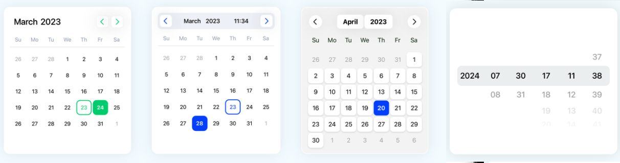
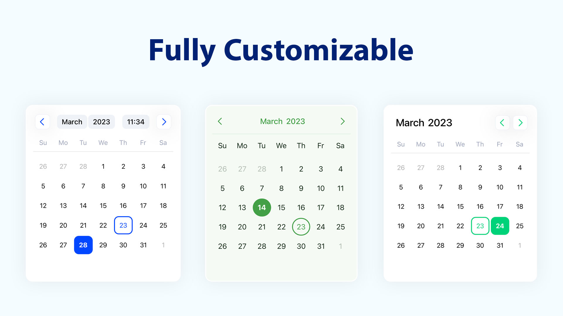
React Native 的 DateTimePicker 组件,允许你创建一个可自定义的日期和时间选择器。该组件使用 Day.js 库,并包含一组样式属性,使你可以根据自己的 UI 设计更改日历的每一项。
安装
# 如果你没有在项目中使用dayjs则需要安装
# npm install dayjs react-native-dates-picker
npm install react-native-dates-picker
如果你使用Yarn
# 如果你没有在项目中使用dayjs则需要安装
# yarn add dayjs react-native-dates-picker
yarn add react-native-dates-picker
或者你使用pnpm
# 如果你没有在项目中使用dayjs则需要安装
# pnpm install dayjs react-native-dates-picker
pnpm install react-native-dates-picker
用法说明
import DateTimePicker from 'react-native-dates-picker';
import dayjs from 'dayjs';

export default function App() {
  const [date, setDate] = useState(dayjs());

  return (
    <View style={styles.container}>
      <DateTimePicker
        mode="single"
        date={date}
        onChange={(params) => setDate(params.date)}
      />
    </View>
  );
}

const styles = StyleSheet.create({
  container: {
    flex: 1,
    backgroundColor: '#F5FCFF',
  },
});
欲了解更多信息,请查看 /example 目录。
Calendar props
| Name | Type | Default | Description |
|---|---|---|---|
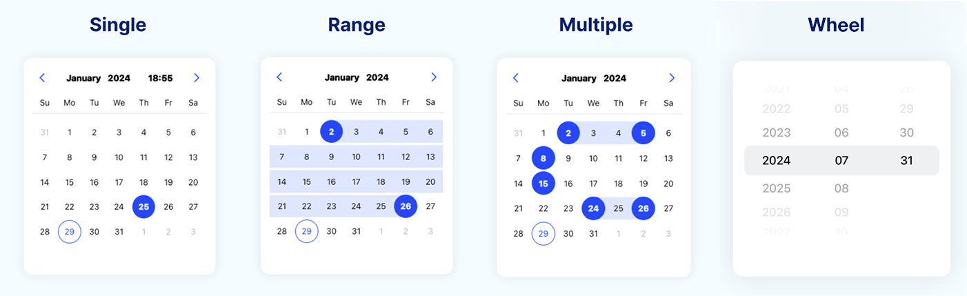
| mode | string |
'single' |
定义 DatePicker 的模式 ['single', 'range', 'multiple', 'wheel'] |
| locale | string |
'zh-cn' |
定义 DatePicker 的语言环境,使用其他语言需要从dayjs引入语言包 |
| minDate | DateType |
null |
定义 DatePicker 的最小可选日期 |
| maxDate | DateType |
null |
定义 DatePicker 的最大可选日期 |
| firstDayOfWeek | number |
0 |
定义一周的起始日,范围为 0-6,其中 0 表示星期天,6 表示星期六 |
| displayFullDays | boolean |
false |
定义是否在当前日历视图中显示上个月和下个月的日期 |
| initialView | string |
'day' |
定义 DatePicker 的初始视图 ['day', 'month', 'year', 'time'] |
| height | number |
'undefined' |
定义日历视图的高度 |
| format | string |
'YYYY/MM/DD HH:mm:ss' |
设置日期格式 |
Single Mode props
| Name | Type | Default | Description |
|---|---|---|---|
| date | DateType |
undefined |
选中的日期 |
| onChange | Function |
({date}) => {} |
当从 DatePicker 选择新日期时调用 |
| timePicker | boolean |
false |
定义是否显示时间选择器 |
Range Mode props
| Name | Type | Default | Description |
|---|---|---|---|
| startDate | DateType |
undefined |
用于显示选定的开始日期 |
| endDate | DateType |
undefined |
用于显示选定的结束日期 |
| onChange | Function |
({startDate, endDate}) => {} |
当从 DatePicker 选择新开始日期或结束日期时调用 |
Multiple Mode props
| Name | Type | Default | Description |
|---|---|---|---|
| dates | DateType[] |
[] |
用于显示已选日期的日期数组 |
| onChange | Function |
({dates}) => {} |
当从 DatePicker 选择新日期时调用 |
Wheel Mode props
| Name | Type | Default | Description |
|---|---|---|---|
| date | DateType |
undefined |
选中的日期 |
| columns | string[] |
['year', 'month', 'day'] |
定义滚轮视图展示的列 ['year', 'month', 'day', 'hour', 'minute', 'second'] |
| onChange | Function |
({date}) => {} |
当从 DatePicker 选择新日期时调用 |
Styling props
| Name | Type | Default | Description |
|---|---|---|---|
| calendarTextStyle | TextStyle |
null |
定义日历内部所有文本的样式(包括日、月、年、时、分和秒) |
| selectedTextStyle | TextStyle |
null |
定义选中(日、月、年)文本的样式 |
| selectedItemColor | string |
'#0047FF' |
定义选中(日、月、年)项的背景和边框颜色 |
| selectedRangeBackgroundColor | string |
undefined |
定义选中范围的背景颜色 |
| headerContainerStyle | ViewStyle |
null |
定义日历头部容器的样式 |
| headerTextContainerStyle | ViewStyle |
null |
定义日历头部文本(月、年、时间)容器的样式 |
| headerTextStyle | TextStyle |
null |
定义日历头部文本的样式(月、年、时间) |
| headerButtonStyle | ViewStyle |
null |
定义日历头部“上一个和下一个按钮”容器的样式 |
| headerButtonColor | string |
null |
定义日历头部“上一个和下一个按钮”图标的颜色 |
| headerButtonSize | number |
18 |
定义日历头部“上一个和下一个按钮”图标的大小 |
| headerButtonsPosition | string |
'around' |
定义日历头部“上一个和下一个按钮”的位置 ['around', 'right', 'left'] |
| buttonPrevIcon | ReactNode |
undefined |
定义日历头部“上一个按钮”的自定义图标 |
| buttonNextIcon | ReactNode |
undefined |
定义日历头部“下一个按钮”的自定义图标 |
| daysPanelStyle | ViewStyle |
null |
定义日期选择面板的样式 |
| dayContainerStyle | ViewStyle |
null |
定义每个日期的容器样式 |
| todayContainerStyle | ViewStyle |
null |
定义“今天”容器的样式 |
| todayTextStyle | TextStyle |
null |
定义“今天”文本的样式 |
| monthContainerStyle | ViewStyle |
null |
定义月份容器的样式 |
| yearContainerStyle | ViewStyle |
null |
定义年份容器的样式 |
| weekDaysContainerStyle | ViewStyle |
null |
定义星期容器的样式 |
| weekDaysTextStyle | TextStyle |
null |
定义星期文本的样式 |
| wheelPickerContainerStyle | ViewStyle |
null |
定义滚轮选择容器的样式 |
| wheelPickerTextStyle | TextStyle |
null |
定义滚轮选择器文本(年、月、日、时、分、秒)的样式 |
| wheelPickerItemStyle | TextStyle |
null |
定义滚轮选择器选项容器的样式 |
| wheelPickerSelectedIndicatorStyle | ViewStyle |
null |
定义选中滚轮指示器的样式 |
Contributing
See the contributing guide to learn how to contribute to the repository and the development workflow.
Consider supporting with a ️ Star on GitHub
如果你在项目中使用了该库,请考虑为其点赞支持。
License
MIT