react-native-drag-drop-and-swap
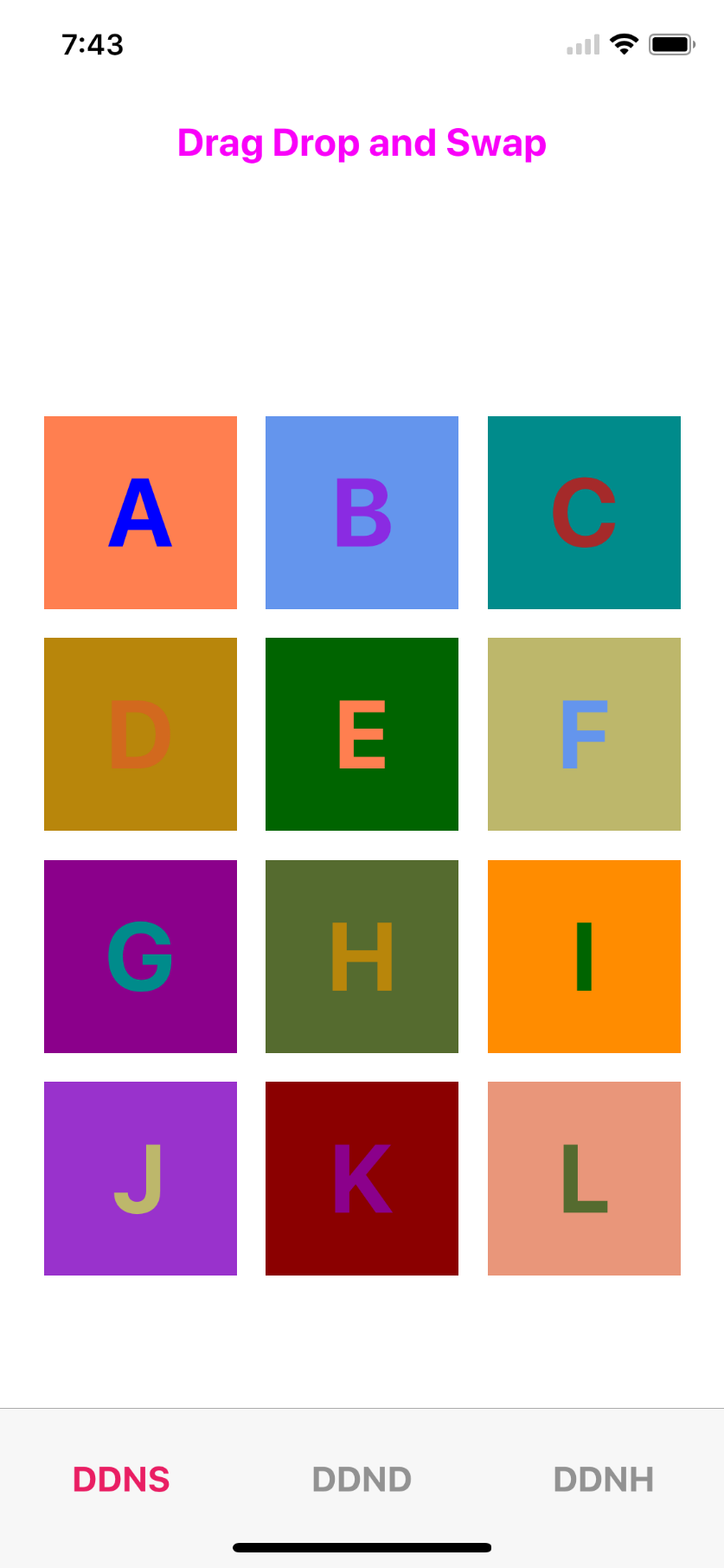
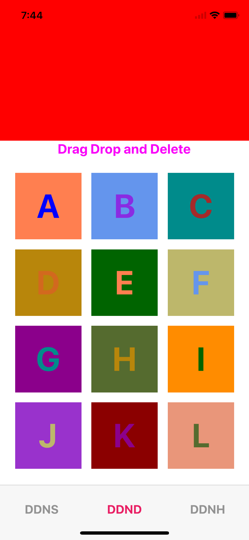
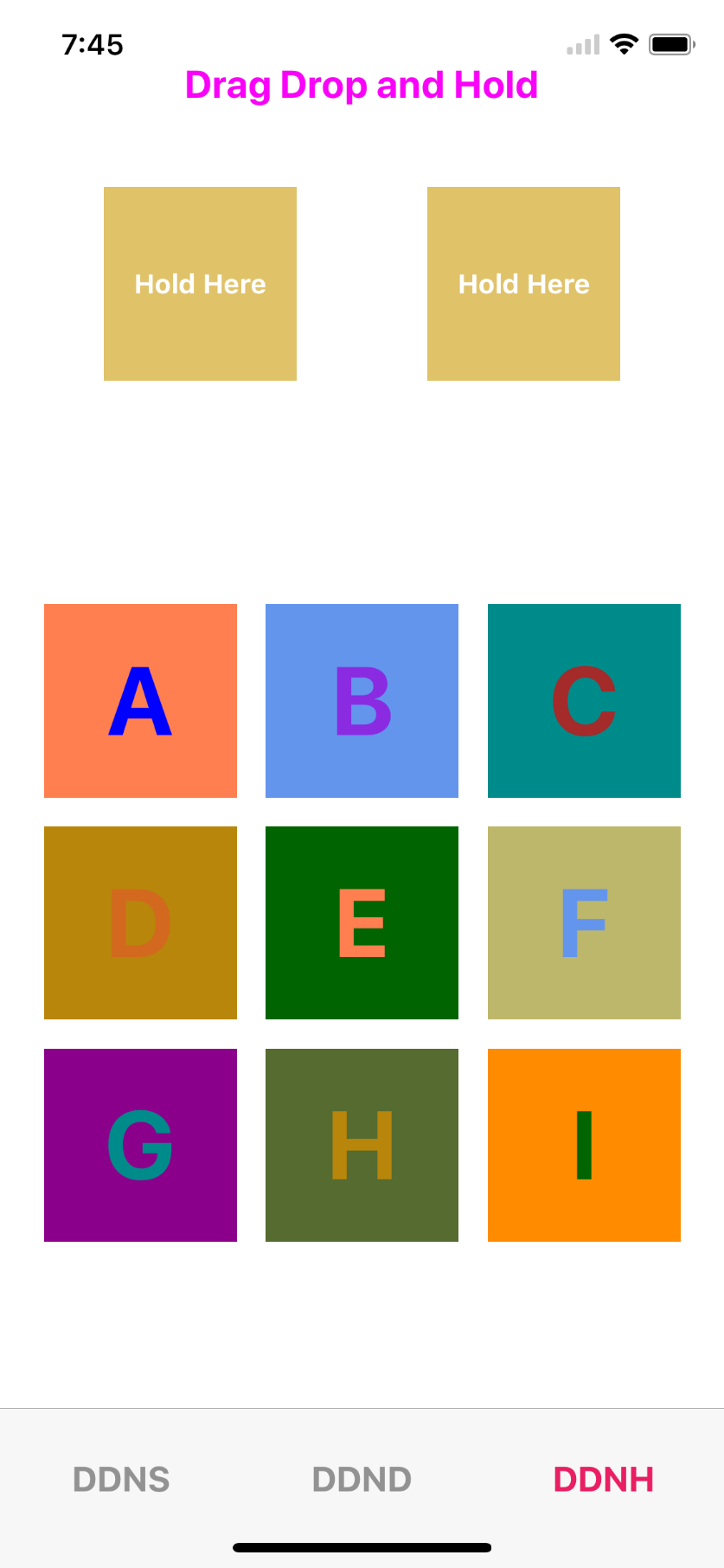
Screenshots
Getting started
$ npm install --save react-native-drag-drop-and-swap
Usage
import {
  DragContainer,
  Draggable,
  DropZone
} from "react-native-drag-drop-and-swap";


// Main component to render
class DraggyInner extends React.Component {
  constructor(props) {
    super(props);
    this.state = {
      color: ["blue","blueviolet","brown","chocolate","coral","cornflowerblue","darkcyan","darkgoldenrod","darkgreen","darkkhaki","darkmagenta","darkolivegreen","darkorange","darkorchid","darkred","darksalmon","darkseagreen","darkslateblue","darkslategrey"]
    };
  }
  render() {
    if (this.props.dragOver && !this.props.ghost && !this.props.dragging) {
      LayoutAnimation.easeInEaseOut();
      return (<View
          style={{
            width: this.props.dragOver ? 110 : 100,
            alignItems: "center",
            justifyContent: "center",
            height: this.props.dragOver ? 110 : 100,
            backgroundColor: "rgba(255,0,0,.7)"
          }}
        >
          <Text
            style={{
              color: this.state.color[this.props.index],
              fontSize: 50,
              fontWeight: "bold"
            }}
          >
            {" "}
            {this.props.alphabet.data}{" "}
          </Text>
        </View>
      );
    }
    let shadows = {
      shadowColor: "black",
      shadowOffset: { width: 0, height: 20 },
      shadowOpacity: 0.5,
      shadowRadius: 20,
      opacity: 0.5
    };
    return (
      <View
        style={[
          {
            height: 100,
            width: 100,
            backgroundColor: this.props.ghost
              ? this.state.color[this.props.index]
              : this.state.color[this.props.index + 4],
            alignItems: "center",
            justifyContent: "center"
          },
          this.props.dragging ? shadows : null
        ]}
      >
        <Text
          style={{
            color: this.state.color[this.props.index],
            fontSize: 50,
            fontWeight: "bold"
          }}
        >
          {this.props.alphabet.data}
        </Text>
      </View>
    );
  }
}

//Drag helper
class Draggy extends React.Component {
  render() {
    return (
      <Draggable data={this.props.alphabet} style={{ margin: 7.5 }}>
        <DropZone
          onDrop={e => this.props.onDrop(e, this.props.index)}
          onEnter={e =>
            this.props.onHover(this.props.alphabet, this.props.index)
          }
        >
          <DraggyInner
            alphabet={this.props.alphabet}
            index={this.props.index}
          />
        </DropZone>
      </Draggable>
    );
  }
}
// Genertaing data to display
let alphaData = [];
let first = "A",
  last = "L";
for (var i = first.charCodeAt(0); i <= last.charCodeAt(0); i++) {
  alphaData.push({ data: eval("String.fromCharCode(" + i + ")"), id: i });
}

//Main screen
class DDNS extends Component {
  constructor(props) {
    super(props);
    this.displayName = "DragDropTest";
    this.onDrop = this.onDrop.bind(this);
    this.onHover = this.onHover.bind(this);
    this.onDelete = this.onDelete.bind(this);
    this.state = {
      alphabets: alphaData,
      hoverData: {},
      dropData: {},
      hoverDataIndex: null
    };
  }
  onDrop(data, index) {
    let alphabets = this.state.alphabets.map((item, i) => {
      if (item.id == data.id) {
        return this.state.hoverData;
      }
      if (item.id == this.state.hoverData.id) {
        return data;
      }
      return item;
    });
    this.setState({ alphabets });
  }
  onDelete(e) {
    let data = this.state.alphabets || [];
    let alphabets = data.map((item, i) => {
      if (e.id === item.id) {
        return { id: e.id, data: "" };
      } else {
        return item;
      }
    });
    this.setState({ alphabets });
  }

  onHover(hoverData, hoverDataIndex) {
    this.setState({ hoverData, hoverDataIndex });
  }
  render() {
    return (
      <DragContainer>
        <View style={{ flex: 1,justifyContent: "space-around" }}>
        <Text style={{ fontSize:20,fontWeight:"bold", alignSelf:"center",color:"#f900f9" }}>Drag Drop and Swap</Text>
            <View
              style={{
                justifyContent: "center",
                alignItems: "flex-end",
                flexDirection: "row",
                flexWrap: "wrap"
              }}
            >
              {this.state.alphabets.map((item, i) => (
                <Draggy
                  key={i}
                  alphabet={item}
                  onHover={this.onHover}
                  onDrop={this.onDrop}
                  index={i}
                />
              ))}
            </View>
        </View>
      </DragContainer>
    );
  }
}
Example implementation of Drag and Drop in React Native
The implementation provides three components, DragContainer, Draggable, and DropZone. Example
DragContainer
This component must be higher up the react tree than the other two components. It's size is not important, it just provides the context by which everything communicates.
API
Props
| Prop | Type | Optional | Default | Description |
|---|---|---|---|---|
onDragStart |
Function | Yes | Is called when dragging begins. It is passed a summary of the dragged element. | |
onDragEnd |
Function | Yes | Is called when dragging ends. It is passed two arguments, the same summary as onDragStart, and array of zones that were dropped on. |
DropZone
This is a wrapper component for an area where a Draggable element can be dropped.
Props
| Prop | Type | Optional | Default | Description |
|---|---|---|---|---|
onEnter |
Function | Yes | Is called when an item is dragged over the zone. | |
onLeave |
Function | Yes | Is called when an item is dragged off of the zone. | |
onDrop |
Function | Yes | Is called when an item is dropped. The data property of the draggable is passed through as an argument. | |
disabled |
Boolean | Yes | Prevents being a dropzone when when set to true. |
The children of the DropZone are passed the following props also;
| Prop | Type | Optional | Default | Description |
|---|---|---|---|---|
dragOver |
Boolean | Yes | Is true when there is an item being dragged over the zone. |
Draggable
This is a wrapper component that makes it's children draggable.
| Prop | Type | Optional | Default | Description |
|---|---|---|---|---|
data |
Any | Yes | Whatever is passed in the data prop will be given to the DropZone on drop. | |
dragOn |
String | Yes | Expects either onLongPress (default) or onPressIn. Determines when dragging begins. | |
disabled |
Boolean | Yes | Prevents dragging when when set to true. |
The children of the Draggable componnent are passed the following props also;
| Prop | Type | Optional | Default | Description |
|---|---|---|---|---|
dragging |
Boolean | Yes | The component is being dragged. | |
ghost |
string | Yes | The component is the ghost left in place of the item being dragged. |