react-native-draganddrop-board v1.0.4
Introduction
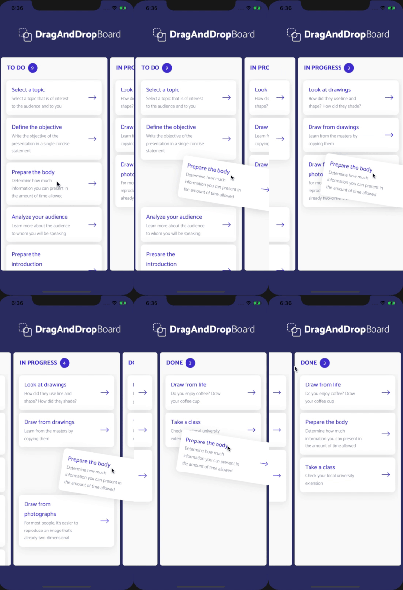
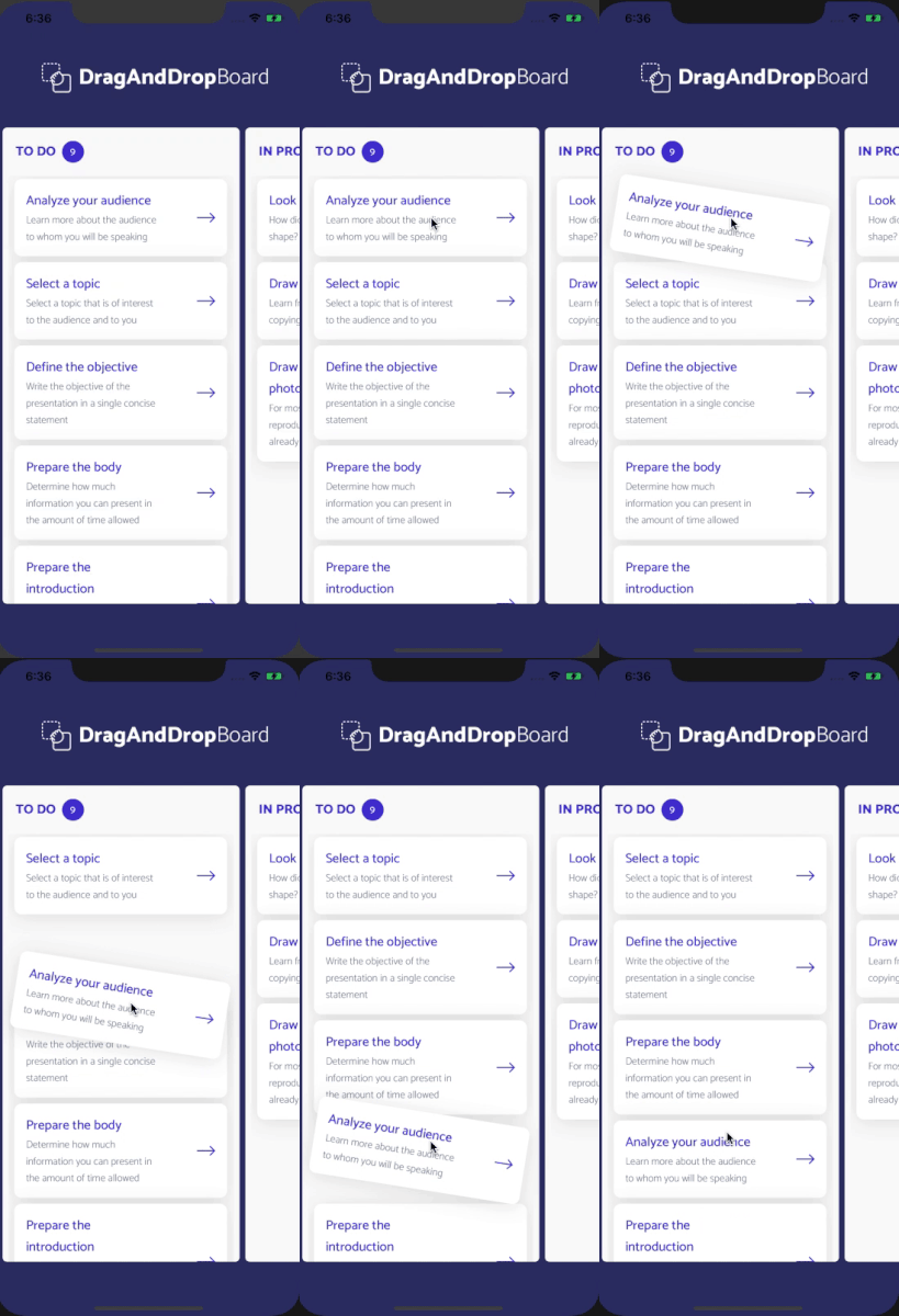
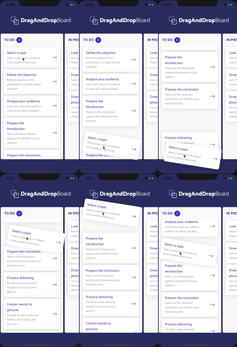
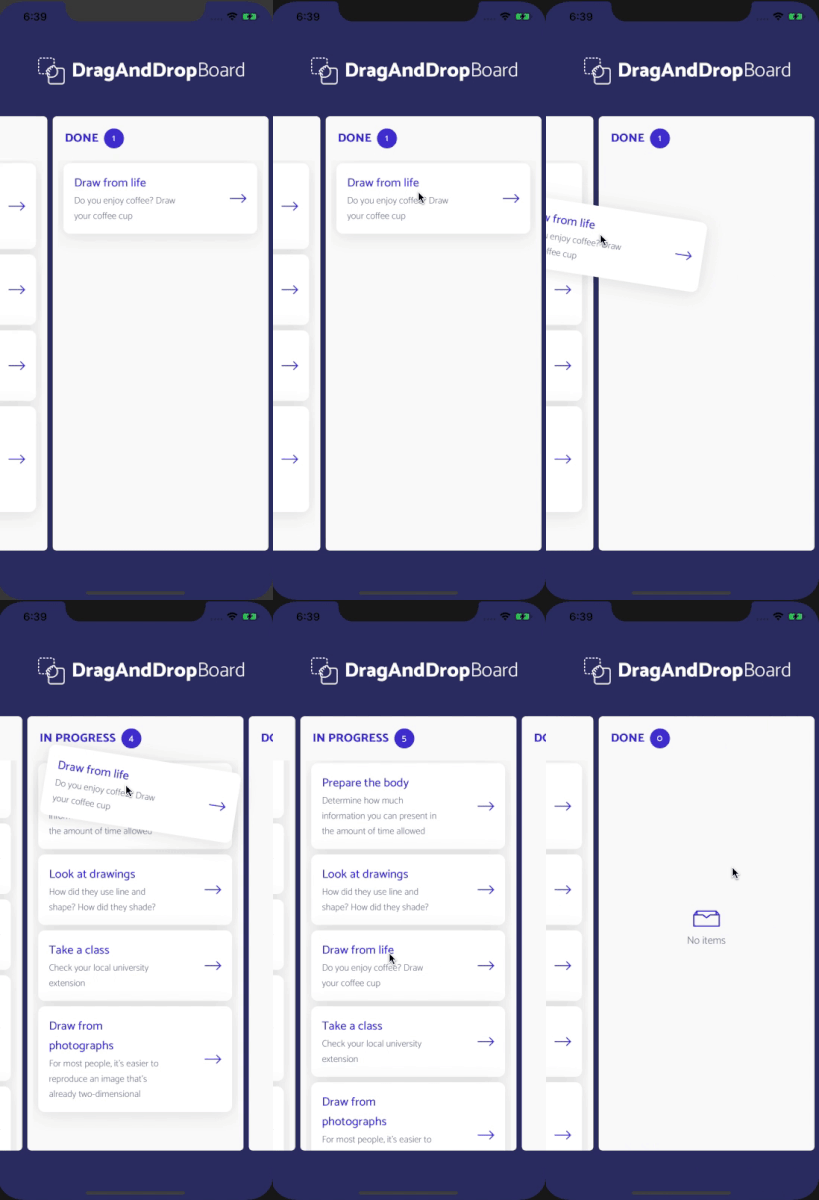
react-native-draganddrop-board is a simple React Native library, enabling to create a scrollable board component with carousel, sortable columns and draggable cards for your iOS and Android apps.


Installation
Install library via npm or yarn
npm install react-native-draganddrop-board or yarn add react-native-draganddrop-board
In Use
First you need to build and fill with data BoardRepository:
import { BoardRepository } from 'react-native-draganddrop-board'

const data = [
  {
    id: 1,
    name: 'TO DO',
    rows: [
      {
        id: '1',
        name: 'Analyze your audience',
        description: 'Learn more about the audience to whom you will be speaking'
      },
      {
        id: '2',
        name: 'Select a topic',
        description: 'Select a topic that is of interest to the audience and to you'
      },
      {
        id: '3',
        name: 'Define the objective',
        description: 'Write the objective of the presentation in a single concise statement'
      }
    ]
  },
  {
    id: 2,
    name: 'IN PROGRESS',
    rows: [
      {
        id: '4',
        name: 'Look at drawings',
        description: 'How did they use line and shape? How did they shade?'
      },
      {
        id: '5',
        name: 'Draw from drawings',
        description: 'Learn from the masters by copying them'
      },
      {
        id: '6',
        name: 'Draw from photographs',
        description: 'For most people, it’s easier to reproduce an image that’s already two-dimensional'
      }
    ]
  },
  {
    id: 3,
    name: 'DONE',
    rows: [
      {
        id: '7',
        name: 'Draw from life',
        description: 'Do you enjoy coffee? Draw your coffee cup'
      },
      {
        id: '8',
        name: 'Take a class',
        description: 'Check your local university extension'
      }
    ]
  }
]

const boardRepository = new BoardRepository(data);
Then you can render the Board:
import { Board } from 'react-native-draganddrop-board'

  <Board
    boardRepository={boardRepository}
    open={() => {}}
    onDragEnd={() => {}}
  />
Board component
| Property | Type | Required | Description |
|---|---|---|---|
| boardRepository | BoardRepository | yes | object that holds data |
| boardBackground | string | no | board background color |
| open | function | yes | function invoked when item is pressed, returns item |
| onDragEnd | function | yes | function invoked when drag is finished, returns srcColumnId, destColumnId, draggedItem |
All props from Board, Card, Column and Empty components should be added to <Board />
Data update
Data can be changed within our predefined class 'boardRepository'. 'boardRepository.updateData(data)' That way we won't have to rerender the Board and class objects.
Card component
If you want to use default Card you should build your boardRepository with rows that have elements id, nameand description:
  {
     id: '1',
     name: 'Analyze your audience',
     description: 'Learn more about the audience to whom you will be speaking'
}| Property | Type | Required | Description |
|---|---|---|---|
| cardNameTextColor | string | no | color of the first line (name) |
| cardNameFontSize | number | no | font size of of the first line (name) |
| cardNameFontFamily | string | no | font family of the first line (name) |
| cardDescriptionTextColor | string | no | color of the second line (description) |
| cardDescriptionFontSize | number | no | font size of the second line (description) |
| cardDescriptionFontFamily | string | no | font family of the second line (description) |
| cardIconColor | string | no | color of the icon (arrow) |
If you need to have another elements in rows, then you can use cardContent prop - it's a function that returns item element and can take another Components to fill Card.
import { Text, View } from 'react-native'
import { Board } from 'react-native-draganddrop-board'

  <Board
    boardRepository={boardRepository}
    open={() => {}}
    onDragEnd={() => {}}
    cardContent={(item) => (<View><Text>{item.name}</Text></View>)}
/>| Property | Type | Required | Description |
|---|---|---|---|
| cardBackground | string | no | card background color |
| cardBorderRadius | number | no | card border radius value |
| isCardWithShadow | bool | no | add shadow to card component |
Column component
| Property | Type | Required | Description |
|---|---|---|---|
| badgeBackgroundColor | string | no | color of the count badge |
| badgeBorderRadius | number | no | count badge border radius |
| badgeHeight | number | no | height of the count badge |
| badgeWidth | string | no | width of the count badge |
| badgeTextColor | string | no | color of the count badge |
| badgeTextFontSize | number | no | font size of the count badge |
| badgeTextFontFamily | string | no | font family of the count badge |
| columnBackgroundColor | string | no | column background color |
| columnBorderRadius | number | no | column border radius |
| columnHeight | number | no | height of the column |
| columnNameTextColor | string | no | color of the column |
| columnNameFontSize | number | no | font size of the column |
| columnNameFontFamily | string | no | font family of the column |
| isWithCountBadge | bool | no | if false then the count badge is not visible |
Empty column component

You can use default empty column component:
| Property | Type | Required | Description |
|---|---|---|---|
| emptyIconColor | string | no | color of the icon |
| emptyTextColor | string | no | color of the text |
| emptyFontSize | number | no | font size of the text |
| emptyFontFamily | string | no | font family of the text |
You can also create your own empty column component:
| Property | Type | Required | Description |
|---|---|---|---|
| emptyComponent | function | no | function that should return custom empty column component |
Tech stack
React Native 0.61.4
License
Copyright (c) 2019, Natalia Muryn
Permission to use, copy, modify, and/or distribute this software for any purpose with or without fee is hereby granted, provided that the above copyright notice and this permission notice appear in all copies.
THE SOFTWARE IS PROVIDED "AS IS" AND THE AUTHOR DISCLAIMS ALL WARRANTIES WITH REGARD TO THIS SOFTWARE INCLUDING ALL IMPLIED WARRANTIES OF MERCHANTABILITY AND FITNESS. IN NO EVENT SHALL THE AUTHOR BE LIABLE FOR ANY SPECIAL, DIRECT, INDIRECT, OR CONSEQUENTIAL DAMAGES OR ANY DAMAGES WHATSOEVER RESULTING FROM LOSS OF USE, DATA OR PROFITS, WHETHER IN AN ACTION OF CONTRACT, NEGLIGENCE OR OTHER TORTIOUS ACTION, ARISING OUT OF OR IN CONNECTION WITH THE USE OR PERFORMANCE OF THIS SOFTWARE.