react-native-flatlist-slider v1.0.6
React-Native-FlatList-Slider
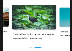
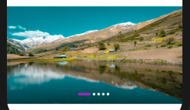
Custom Image Slider Component in React Native

Install
npm i react-native-flatlist-sliderImport
import {FlatListSlider} from 'react-native-flatlist-slider';Usage

Images from URI
  const images = [
   {
    image:'https://images.unsplash.com/photo-1567226475328-9d6baaf565cf?ixlib=rb-1.2.1&ixid=eyJhcHBfaWQiOjEyMDd9&auto=format&fit=crop&w=400&q=60',
    desc: 'Silent Waters in the mountains in midst of Himilayas',
   },
  {
    image:'https://images.unsplash.com/photo-1455620611406-966ca6889d80?ixlib=rb-1.2.1&ixid=eyJhcHBfaWQiOjEyMDd9&auto=format&fit=crop&w=1130&q=80',
    desc:
      'Red fort in India New Delhi is a magnificient masterpeiece of humans',
  },
  ]

  <FlatListSlider
    data={images}
  />
Images from Local
  const images = [
   {
    banner:'require('./images/banner1.png'),
    desc: 'Silent Waters in the mountains in midst of Himilayas',
   },
  {
    banner:'require('./images/banner2.png'),
    desc:
      'Red fort in India New Delhi is a magnificient masterpeiece of humans',
  },
  ]
<FlatListSlider data={images} imageKey={'banner'} local />
<FlatListSlider data={images} width={275} timer={5000} component={} onPress={item => alert(JSON.stringify(item))} indicatorActiveWidth={40} contentContainerStyle={{paddingHorizontal: 16}} />
<FlatListSlider data={images} height={240} timer={5000} onPress={item => alert(JSON.stringify(item))} contentContainerStyle={{paddingHorizontal: 16}} indicatorContainerStyle={{position:'absolute', bottom: 20}} indicatorActiveColor={'#8e44ad'} indicatorInActiveColor={'#ffffff'} indicatorActiveWidth={30} animation />
### Props for Customization

| Prop                    | Type         | Default      | Description                                        |
| :---------------------: | :----------: | :----------: | :------------------------------------------------: |
| data                    | Array        | []           | Array of objects with images                       |
| imageKey                | String       | ‘image'      | Key for image in object                            |
| local                   | Boolean      | false        | Image to be loaded from URI or local               |
| width                   | Number       | screenWidth  | Width of Item in list                              |
| height                  | Number       | 230          | Height of Item in list                              |
| loop                    | Boolean      | true         | Enable infinite scroll for list                    |
| separatorWidth          | Number       | 0            | Width of separator between list items              |
| autoscroll              | Boolean      | true         | Enable autoScroll for list                         |
| timer                   | Number       | 3000         | Timer for scroll in milliseconds                   |
| onPress                 | Function     |              | Function to call on Item press                     |
| contentContainerStyle   | Object       |              | Styling slider container                           |
| component               | Component    |              | Stateful/Stateless custom component for list item  |
| currentIndexCallback    | Function     |              | Callback for image change with index               |
| indicator               | Boolean      | true         | Flag to render indicator                           |
| indicatorStyle          | Object       |              | Indicator Style                                    |
| indicatorContainerStyle | Object       |              | Indicator Container Style                          |
| indicatorActiveColor    | String       | '#3498db'    | Active indicator color                             |
| indicatorInActiveColor  | String       | '#bdc3c7'    | Inactive indicator color                           |
| indicatorActiveWidth    | Number       | 6            | Active Indicator Width                             |
| removeClippedSubviews   | Boolean      | true         | Flatlist prop for performance                      |
| animation               | Boolean      | true         | Animate indicator change                           |\

### Props passed to Custom Component

| Prop       | Type         | Description                          |
| :--------: | :----------: |  :---------------------------------: |
| style      | Object       | Container Style for Component        |
| item       | Object       | Object from Array                    |
| imageKey   | String       | Key for image in object              |
| onPress    | Function     | Function to call on Item press       |
| index      | Number       | Index of item                        |
| active     | Boolean      | Flag if item is currently visible    |
| local      | Boolean      | Image to be loaded from URI or local |

### Sample Custom Component
import React from 'react'; import { View, Text, TouchableOpacity, Image, StyleSheet, Platform, } from 'react-native';
export default (Preview = ({ style, item, imageKey, onPress, index, active, local, }) => { return ( <TouchableOpacity style={styles.videoContainer} onPress={() => onPress(item)}> <View style={styles.imageContainer, styles.shadow}> <Image style={styles.videoPreview, active ? {} : {height: 120}} source={{uri: itemimageKey}} /> {item.desc} ); });
const styles = StyleSheet.create({ videoContainer: { width: 275, paddingVertical: 28, justifyContent: 'center', alignItems: 'center', marginRight: 20, }, videoPreview: { width: 275, height: 155, borderRadius: 8, resizeMode: 'cover', }, desc: { fontSize: 14, letterSpacing: 0, lineHeight: 24, marginTop: 18, }, imageContainer: { justifyContent: 'center', alignItems: 'center', }, shadow: { ...Platform.select({ ios: { shadowColor: 'black', shadowOffset: {width: 0, height: 1}, shadowOpacity: 0.1, shadowRadius: 5, }, android: { elevation: 5, }, }), }, });