react-native-infinite-wheel-picker v1.0.0

react-native-infinite-wheel-picker
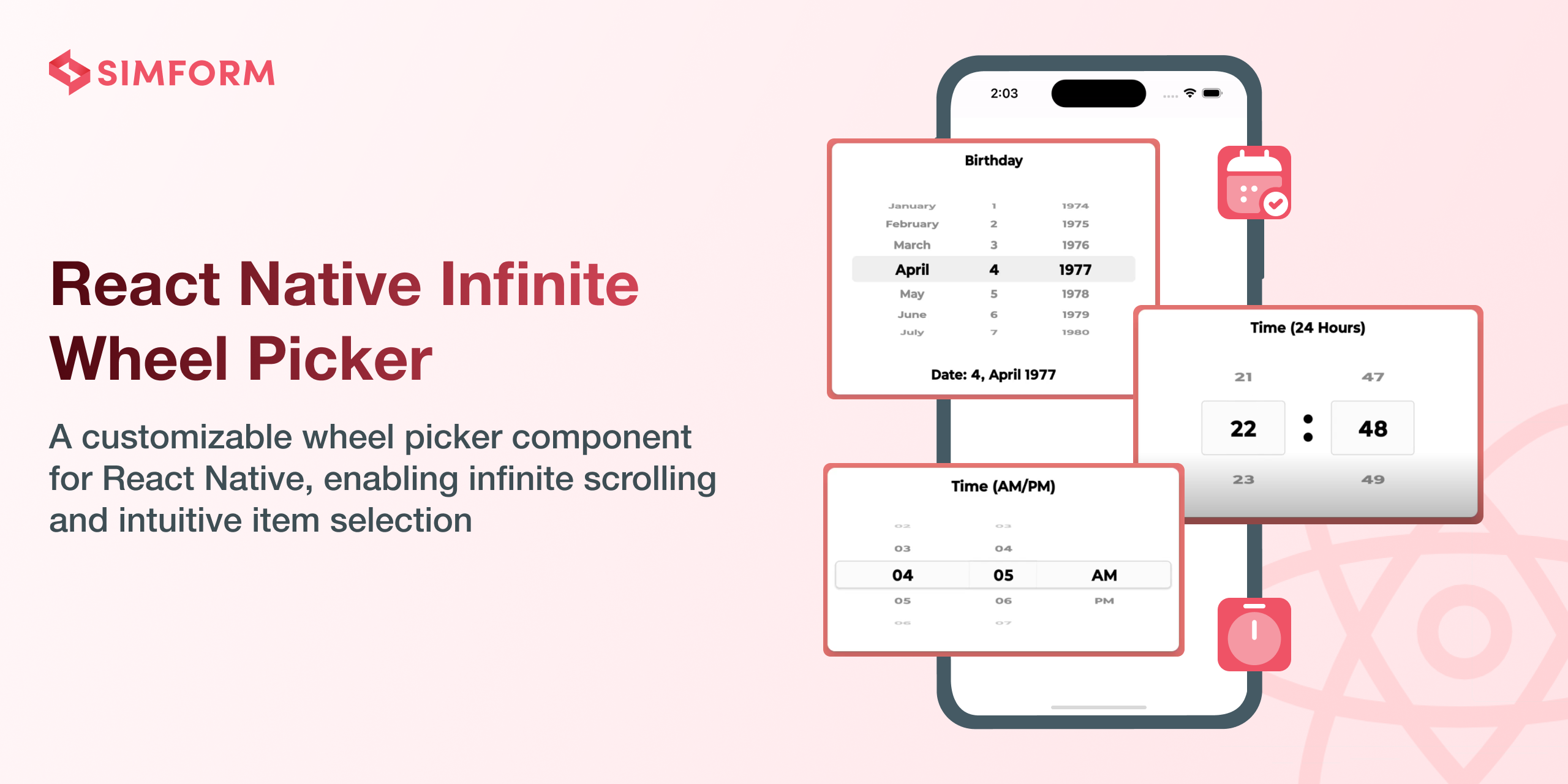
The React Native Infinite Wheel Picker package offers a highly customizable, versatile, and seamless wheel picker component, enhancing the user experience with smooth scrolling and intuitive selection. It's dynamic design allows for endless scrolling, providing a natural and interactive interface for selecting values.
The library is compatible with both Android and iOS platforms, offering a versatile solution to elevate your app's user interface with ease.
🎬 Preview
Quick Access
Installation | Usage and Examples | Properties | Example Code | License
Getting Started
Here's how to get started with react-native-infinite-wheel-picker in your React Native project:
Installation
Install the package
npm install react-native-infinite-wheel-pickerUsing Yarn:
yarn add react-native-infinite-wheel-pickerUsage
import React from 'react';
import { StyleSheet, View } from 'react-native';
import { WheelPicker } from 'react-native-infinite-wheel-picker';

const App: React.FC = () => {
  const initialData = [1, 2, 3, 4, 5, 6, 7, 8];
  const [selectedIndex, setSelectedIndex] = React.useState(3);

  return (
    <View style={styles.container}>
      <WheelPicker
        initialSelectedIndex={3}
        data={initialData}
        restElements={2}
        elementHeight={30}
        onChangeValue={(index, value) => {
          console.log(value);
          setSelectedIndex(index);
        }}
        selectedIndex={selectedIndex}
        containerStyle={styles.containerStyle}
        selectedLayoutStyle={styles.selectedLayoutStyle}
        elementTextStyle={styles.elementTextStyle}
      />
    </View>
  );
};

export default App;

const styles = StyleSheet.create({
  container: {
    flex: 1,
    justifyContent: 'center',
    backgroundColor: '#fff',
    alignItems: 'center',
  },
  selectedLayoutStyle: {
    backgroundColor: '#00000026',
    borderRadius: 2,
  },
  containerStyle: {
    backgroundColor: '#0000001a',
    width: 150
  },
  elementTextStyle: {
    fontSize: 18
  },
});
🎬 Preview
For, a simple scroll use infiniteScroll={false} that disable infinite scrolling of the items.
<WheelPicker
  initialSelectedIndex={3}
  data={initialData}
  restElements={2}
  elementHeight={30}
  onChangeValue={value => {
    console.log(value);
  }}
  infiniteScroll={false}
  selectedIndex={selectedIndex}
  containerStyle={styles.containerStyle}
  selectedLayoutStyle={styles.selectedLayoutStyle}
  elementTextStyle={styles.elementTextStyle}
/>;
🎬 Preview
Properties
| Props | Default | Type | Description |
|---|---|---|---|
| data | - | Array<string> or Array<number> | An array of strings or numbers representing the items to be displayed. eg 1, 2, 3, 4, 5, 6, 7, 8 |
| onChangeValue | - | function | A callback function invoked when the selected item changes, receiving the new value |
| selectedIndex | - | number | The item that should be selected in the picker |
| initialSelectedIndex | 0 | number or string | The item that should be pre-selected in the picker |
| infiniteScroll | true | boolean | A boolean that enables or disables infinite scrolling of the items |
| restElements | 2 | number | The number of items to show above and below the selected item in the picker |
| loopCount | 100 | number | The number of times data array is repeated in picker |
| decelerationRate | 'fast' | 'normal', 'fast', 'number | Determines how quickly the scroll decelerates after the user lifts their finger in the picker |
| elementHeight | 40 | number | The height of each item in the picker, in pixels |
| elementTextStyle | - | StyleProp<TextStyle> | Style applied to the text of each item in the picker |
| elementContainerStyle | - | StyleProp<ViewStyle> | Style applied to the container of each item in the picker |
| selectedLayoutStyle | - | StyleProp<ViewStyle> | Style applied to the container of the selected item |
| containerStyle | - | StyleProp<ViewStyle> | Style applied to the container of the wheel picker |
| containerProps | - | ViewProps | Props applied to the container of the wheel picker |
| flatListProps | - | FlatListProps | Props applied to the flatlist of the wheel picker |
Know more about ViewProps, ViewStyle, FlatListProps, TextStyle, decelerationRate
Note: In case of a manual prop change, make sure to reload the application to see the changes in the component.
WheelPickerRef Methods
scrollToIndex()
scrollToIndex(index: number): voidscrollToIndex function that scroll to particular index.
Example
A full working example project is here Example
yarn
yarn example ios   // For ios
yarn example android   // For Android
Find this library useful? ❤️
Support it by joining stargazers for this repository.⭐
Bugs / Feature requests / Feedbacks
For bugs, feature requests, and discussion please use GitHub Issues, GitHub New Feature, GitHub Feedback
🤝 How to Contribute
We'd love to have you improve this library or fix a problem 💪 Check out our Contributing Guide for ideas on contributing.
Awesome Mobile Libraries
- Check out our other available awesome mobile libraries
License
2 years ago


