1.2.1 • Published 2 years ago
react-native-inline-datepicker v1.2.1
react-native-inline-datepicker
This is a datepicker component for react-native apps which will be rendered inline with other components. Note that this component is applicable for android apps only.
Getting Started
Installation
$ npm install react-native-inline-datepicker --save
Usage
Import
import InlineDatePicker from 'react-native-inline-datepicker';
Example
import InlineDatePicker from 'react-native-inline-datepicker';
import React, { Component } from 'react';
import { View, Text } from 'react-native';

export default class DatePickerDemo extends Component {
  state = {
    year: 2019,
    month: 4,
    date: 24
  };
  setDate = (y, m, d) => {
    this.setState({year: y, month: m, date: d});
  }
  render() {
    return (
            <View>
              <InlineDatePicker onChangeDate = {this.setDate}/>
              <Text>The selected date is:</Text>
              <Text>{this.state.year}-{this.state.month}-{this.state.date}</Text>
            </View>
    );
  }
}
The screenshot for the above code can be found here.
Props
| Prop | Default | Type | Description |
|---|---|---|---|
| onChangeDate | null | func | Callback function taking three arguments (year, month, date) to take the user selected year, month and date respectively. |
| startDate | null | Array | An array containing three numbers to set the current date of the datepicker. The first element is the year, the second element is the month number ( 0 = January ... 11 = December). If this prop is not defined, the current date on the datepicker will be set to the current date on the user's device. |
| skinColor | null | enum("red", "green", "blue") | Predefined skin colors for the date picker which provides style alternatives without defining the color properties described below. See below for effects. |
| fontSize | 18 | number | The font size of all the texts in the datepicker except the title. |
| titleFontSize | 20 | number | The font size of the title. |
| textColor | #ddd | string | Text color all texts in the current month. |
| activeTextColor | #ddd | string | Text color of selected date or month. |
| adjacentTextColor | #ccc | string | Text color of ajacent months. |
| iconSize | 22 | number | The size of the increment icons. |
| headerBackgroundColor | #222 | string | Background color of the header. |
| currentMonthBackgroundColor | #555 | string | Background color of the dates within the current month or the months which appear when the header is clicked. |
| adjacentMonthsBackgroundColor | #888 | string | Background color of the dates in the adjacent months. |
| selectedDateBackgroundColor | #000 | string | Background color of the selected date. |
skinColor prop
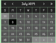
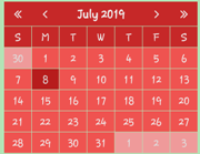
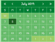
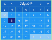
The optional skinColor property can have values of "red", "green" or "blue" with the following effects.
Default

skinColor = 'red'

skinColor = 'green'

skinColor = 'blue'

Issues or suggestions?
If you have any issues or want to suggest something , your can write it here.
