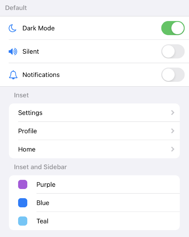
react-native-ios-list v2.0.0
react-native-ios-list
iOS-styled List component

Installation
yarn add react-native-ios-listUsage
Import the components you need
import { List, Row } from 'react-native-ios-list';Render each list item as a Row inside of the List container
function StaticList() {
  return (
    <List sidebar inset>
      <Row
        leading={<GearIcon />}
        trailing={<RightArrow />}
        onPress={navigateToSettings}
      >
        <Text>Settings</Text>
      </Row>
      <Row leading={<MoonIcon />} trailing={<Toggle />}>
        <Text>Dark Mode</Text>
      </Row>
    </List>
  );
}
You can also dynamically render rows by mapping over an array (be sure to use a unique key)
const options = ['Dark', 'Auto', 'Light'];

function DynamicList() {
  const [selected, setSelected] = useState(1);
  return (
    <List header='Appearance'>
      {options.map((option, i) => (
        <Row
          key={i}
          trailing={i === selected && <Check />}
          onPress={() => setSelected(i)}
        >
          <Text>{option}</Text>
        </Row>
      ))}
    </List>
  );
}
Documentation
<List />
The List component is the container for all of your list items. You can define your styles, header, footer, and other properties here.
Props:
inset
Gives the list rounded corners and adjusts list width to be inset from the edges of the parent view.
This prop is based off of inset grouped and grouped list styles found in the Apple Human Interface Guidelines.
required: no
type:
booleandefault:
false
sideBar
If true, the leading component for each Row will display in the left margin of the row item, extending past the divider.
required: no
type:
booleandefault:
false
header
Text or content above the list.
required: no
type:
ReactElement<any> | stringdefault:
null
footer
Text or content below the list.
required: no
type:
ReactElement<any> | stringdefault:
null
backgroundColor
The list background color.
required: no
type:
stringdefault:
'white'
containerBackgroundColor
The list container background color. The container includes the header and footer.
required: no
type:
stringdefault:
'transparent'
headerColor
List header text color. This only applies if the header prop recieves a string.
required: no
type:
stringdefault:
'#8e8e93'
footerColor
List footer text color. This only applies if the footer prop recieves a string.
required: no
type:
stringdefault:
'#8e8e93'
dividerColor
The color to apply to the dividers.
required: no
type:
stringdefault:
'#c7c7cc'
hideDividers
Hides dividers for all rows if true.
required: no
type:
booleandefault:
false
children
The list rows.
required: no
type:
ReactNodedefault:
null
style
List style object.
required: no
type:
StyleProp<ViewStyle>default:
null
<Row />
The Row component is the content you want to show in each row of the list. It has some basic styles, but you have full control over how the content is styled.
An row consists of 3 sections:
leading: left-most componenttrailing: right-most componentchildren: center content
Each corresponds to a different part of the row and all are optional.
<Row leading={<MoonIcon />} trailing={<Toggle />}>
  <View style={styles.rowSpaceBetween}>
    <Text>Dark Mode</Text>
    <Text>On</Text>
  </View>
</Row>
Props:
leading
Left component. This is usually an icon.
required: no
type:
ReactElement<any> | ReactElement<any>[] | nulldefault:
null
trailing
Right component. This is usually an icon or a control.
required: no
type:
ReactElement<any> | ReactElement<any>[] | nulldefault:
null
onPress
An action to execute when the row is pressed. The row will highlight when it is pressed (uses TouchableHighlight behind the scenes, you can modify the highlightColor prop to customize it further)
required: no
type:
() => voiddefault:
null
backgroundColor
Row background color.
required: no
type:
stringdefault:
'transparent'
highlightColor
Highlight color when pressed. Only applies if the onPress prop is specified.
required: no
type:
stringdefault:
'#e5e5ea'
hideDividers
Hides this row's divider if true.
required: no
type:
booleandefault:
true
children
The content of the row.
required: no
type:
ReactNodedefault:
null
style
Row style object.
required: no
type:
StyleProp<ViewStyle>default:
null