react-native-knob v2.3.2
react-native-knob
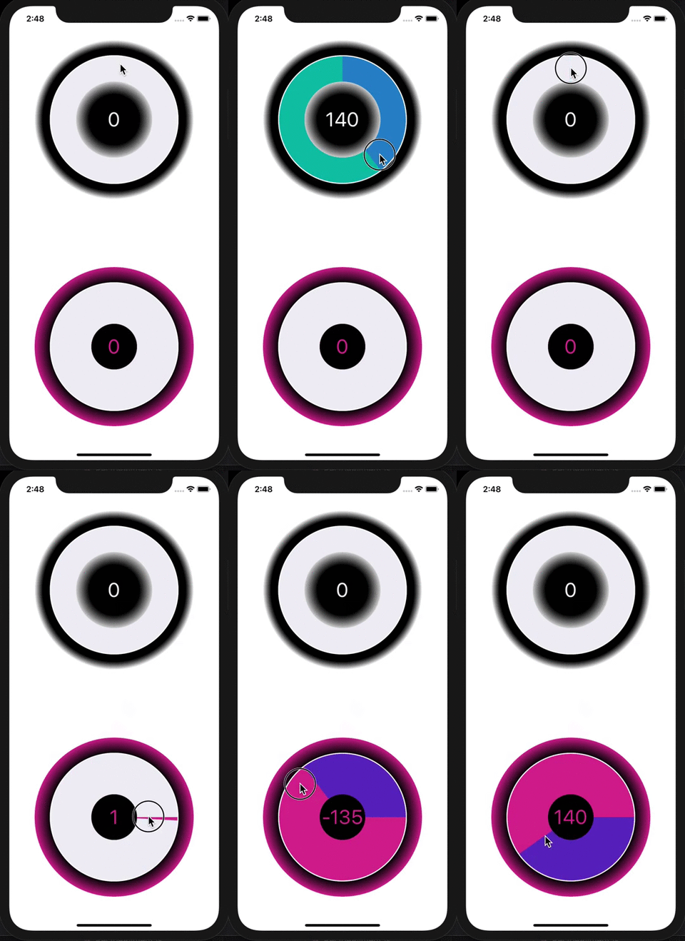
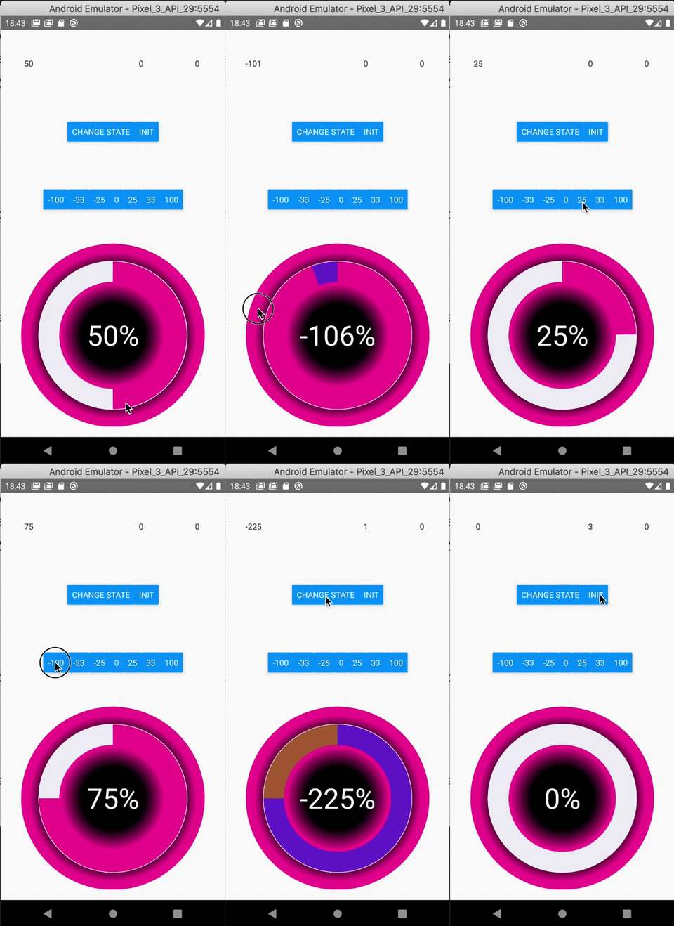
A simple and fully customizable React Native component that implements circular progress bar.
It uses react-native-reanimated to get 60fps animation. and react-native-gesture-handler for the gestures.
Works on both iPhone and Android
| Iphone | Android |
|---|---|
 |  |
Installation
If using yarn :
yarn add react-native-knobIf using npm :
npm i react-native-knobAdditional installation steps
Don´t forget to install pods if they are not installed yet
For ios from your root app folder run :
cd ios && pod installFor android :
You will need to add those lines in your java files if not already done on your project. It concerns the react-native-gesture-handler package see documentation here
Usage
See Example app for testing.
import React, { useState } from 'react';
import { StyleSheet, View, TextInput, Button, Text, Dimensions } from 'react-native';

import { Knob } from 'react-native-knob';

export default App = () => {
  const [val1, setVal1] = useState(0);
  const [knobValue, setKnobValue] = useState(0);
  const { width, height } = Dimensions.get("window");
  const [isLandscape, setIsLandscape] = useState(height < width);
  let buttons = [-100, -33, -25, 0, 25, 33, 100];

  callback = (values) => {
    setKnobValue(values[0]);
  }

  updateKnobValue = (value) => {
    _knobRef.setValue(value === 0 ? value : knobValue + value);
  }

  onLayout = () => {
    console.log("layautChangeApp");
    const { width, height } = Dimensions.get("window");
    setIsLandscape(height < width);
  }

  const styles = StyleSheet.create({
    container: {
      flex: 1,
      flexDirection: isLandscape ? 'row' : 'column',
      alignItems: 'center',
    },
    labels: {
      flex: 1,
      flexDirection: isLandscape ? 'column' : 'row',
      justifyContent: 'center',
    },
    label: {
      flex: 1,
      textAlign: 'center',
    },
    buttons: {
      flex: 1,
      flexDirection: isLandscape ? 'column' : 'row',
      justifyContent: 'center',
      alignItems: 'center',
    },
    button: {
      padding: 10,
      marginHorizontal: 50,
      backgroundColor: '#E03997',
      color: 'white',
    },
  });

  return (
    <View style={styles.container} onLayout={this.onLayout}>
      <View style={styles.labels}>
        <TextInput
          value={knobValue.toString()}
          style={styles.label}
          ref={component => _textInput1 = component}
        />
        <TextInput
          style={styles.label}
          ref={component => _textInput2 = component}
        />
        <TextInput
          value={val1.toString()}
          style={styles.label}
        />
      </View>
      <View style={styles.buttons}>
        <Button
          style={styles.button}
          title="Change State"
          onPress={() => setVal1(val1 + 1)}
        />
      </View>
      <View style={styles.buttons}>
        {buttons.map((val, i) => <Button
          key={i}
          style={styles.button}
          title={val.toString()}
          onPress={() => updateKnobValue(val)}
        />)}
      </View>
      <Knob
        ref={component => _knobRef = component}
        margin={0}
        padding={32}
        strokeWidth={80}
        value={knobValue}
        maxValue={100}
        rotation={0}
        negative={true}
        colors={['#F0EFF5', '#E03997', '#6435C9', '#A5673F', '#AAA', '#888', '#666', '#444', '#222', '#000']}
        gradientInt={[{ offset: '50%', stopColor: '#000' }, { offset: '80%', stopColor: '#E03997' }]}
        gradientExt={[{ offset: '100%', stopColor: '#E03997' }, { offset: '80%', stopColor: '#000' }]}
        textStyle={{ color: '#E03997' }}
        {...{ callback }}
        style={{ flex: 2 }}
      />
    </View>
  );
};
Controlled component
You can set the Knob´s value imperatively using a ref on the Knob component and calling the _knobRef.setValue(value : number) on it. (See example above)
If you change the state of the parent´s knob component, it will not rerender the knob. So you can´t control the value of the knob with a parent variable state.
Other imperative calls
initKnob(val: number)
You HAVE TO call setValue(value) before using initKnob, if you want to set a value.
resetInit
When callbackInit is called, use this function to reset the 'init' state of the knob. You can´t set the 'init' state and reset it in the same call.
Responsive
The component will resize automatically to take all the space available by his container in landscape mode or not.
Documentation
Knob Component
| Name | Description | Type | Default |
|---|---|---|---|
| margin | Space between edge of canvas and knob (included the knob´s decoration internal gradient). You can provide a percent like this xx.xx% | number | string | 0 |
| padding | Space between gradientInt and knob. You can provide a percent like this xx.xx% | number | string | 0 |
| strokeWidth | Width of the animated circle. You can provide a percent like this xx.xx% | number | string | 20% |
| strokeWidthDecoration | The circle under the progress one | number | 30 |
| value | Explicit | number | 25 |
| maxValue | You can set any number value that you want. The full knob will reach on maxValue | number | 100 |
| rotation | Begin position where the knob start. Value unit is in Radians. 0 is position to the right like in trigonometric circle. Under the hood, it´s a style transform using here. | number | -Math.PI / 2 |
| negative | If your want the knob can be negative and goes inverted | boolean | true |
| colors | The colors of each loop. The first color is for decoration knob. | Array | '#F0EFF5', '#00b5ad', '#2185D0', '#B5CC18', '#FBBD08', '#F2711C', '#DB2828', '#E03997', '#6435C9', '#A5673F', '#AAA', '#888', '#666', '#444', '#222', '#000' |
| gradientInt | If you want to decorate your knob with an internal radial gradient | Array | { offset: '50%', stopColor: '#000' }, { offset: '80%', stopColor: '#fff' } |
| gradientExt | If you want to decorate your knob with an external radial gradient | Array | { offset: '100%', stopColor: '#fff' }, { offset: '90%', stopColor: '#000' } |
| textStyle | You can customize the text inside. FontSize is a percent of the canvasSize | object | { color: 'white', textAlign: 'center', fontSize: '12.5%' } |
| textDisplay | If you don´t want the text in the middle | boolean | true |
| style | Change style of the knob main container | object | true |
| callback | This function will be called each time the knob´s value change. First param is an array and first value is the value of the knob | (values: readonly number[]) => void | callback: () => { } |
| callbackInit | This function will be called if you call imperatively the initKnob function. Allow you to know when the knob is ready to be dispayed if you have performance or refresh issues. In this callback, you can setState a display variable to show your parent component when the knob is ready. | (values: readonly number[]) => void | callback: () => { } |
| canvasSize | Fix the size of the canvas. Optional, if not provided, the size adapt to the space available to his container | number | undefined |
Contributing
Pull requests are always welcome! Feel free to open a new GitHub issue for any changes that can be made.
Compilation
npm run build
Test on Example App
npm pack && cd example/ && npm i ../react-native-knob-2.3.2.tgz
Author
Réan Guillaume
If you want to eat better and healthy, i recommand to check out my mobile app dietethic this component was created to allow daily better food recording.
License
Special Thanks
Thanks to William Candillon and his youtube chanel | can it be done in React Native ?