react-native-modalizer v0.2.1
react-native-modalizer
A fully customizable, animated modal component for React-Native. Make modals out of anything, such fun!

Installation
In your project root run:
npm install react-native-modalizerOr if you use yarn:
yarn add react-native-modalizerImport the module:
import Modalizer from 'react-native-modalizer'Props
| Name | Type | Required | Description |
|---|---|---|---|
| modalOpen | bool | yes | Set true to open modal, set false to close |
| wrapperStyle | {} | optional | Overwrite any default wrapper styles |
| modalStyle | {} | optional | Overwrite any default modal styles |
Usage
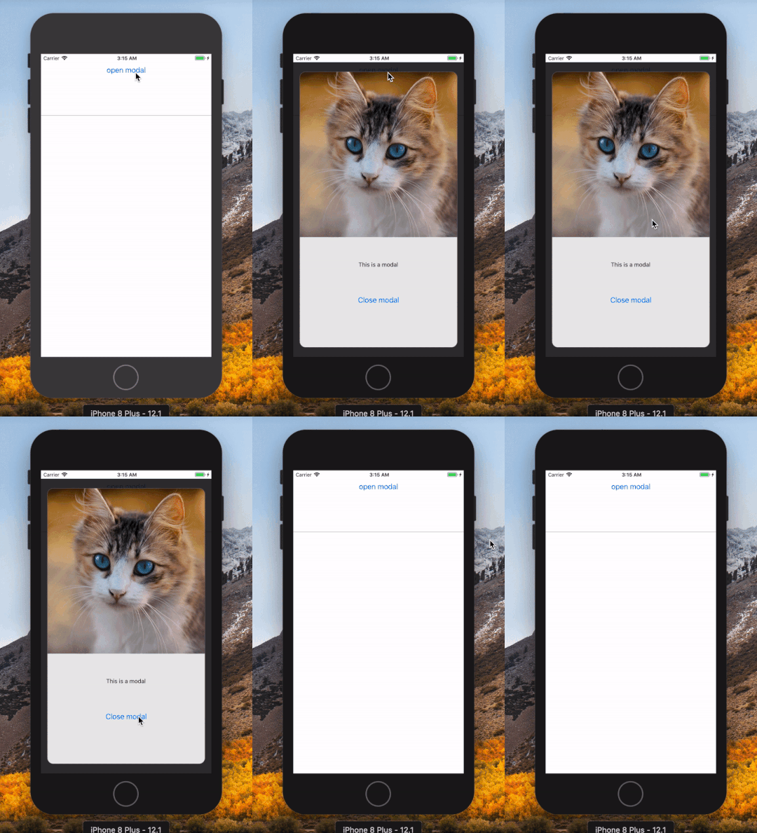
Usage is simple, place the Modalizer inside any container (the component will take up 100% of the width and height of it), render children between the tags and use modalOpen prop to control opening and closing the modal. When you change the modalOpen prop animation is triggered and all of the content inside the modal is either rendered or unmounted.
<Modalizer modalOpen={modalOpen}>
  {Render children here}
</Modalizer>
Example usage
export default (props) => {
  const [ modalOpen, setModalOpen] = useState(false)

  const modalContent = (
    <View style={{ flex: 1 }}>
      <View style={{ flex: 3 }}>
        <Image
          style={{ height: '100%', width: '100%'}}
          source={{uri: 'https://images.pexels.com/photos/3418058/pexels-photo-3418058.jpeg?auto=compress&cs=tinysrgb&dpr=2&h=750&w=1260 '}}
        />
      </View>
      <View style={{ flex: 1, justifyContent: 'center', alignItems: 'center' }}>
        <Text>This is a modal</Text>
      </View>
      <View style={{ flex: 1 }}>
        <Button title="Close modal" onPress={() => setModalOpen(false)}/>
      </View>
    </View>
  )

  return (
    <ScreenContainer style={{ flex: 1 }} >
      <Button title="open modal" onPress={() => setModalOpen(true)}/>
      <Modalizer modalOpen={modalOpen}>
        {modalContent}
      </Modalizer>
    </ScreenContainer>
  )
}
Altering default styles
The component consists of two parts, the outter wrapper and the modal itself. The wrapper takes up 100% of width and height of any container where you put it to prevent scrolling the content and to center the modal. To alter the size or look of the modal, use the modalStyle prop to override any default styles.