1.0.0 • Published 4 years ago
react-native-picker-calendar-view v1.0.0
react-native-picker-calendar-view 📅 ✨
This is a highly customizable package 🔥 that can be used as a simple date picker as well as a calendar view 📅 for React Native. It is compatible with both Android and iOS platforms ✨
Features available :
- Supports custom day view in calendar.
- Supports custom week view in calendar.
- Supports complete custom header view in calendar.
- Flexible component can be used within any view like bottom sheet etc.
- Can be used as a simple date picker view for any usecases.
- Supports restricting user to select betwwen minimum date & maximum date only for validation.
- *Allows to change arrow images for left and right navigation.
Spread Your ❤️:
If you like the work then don't forget to hit that ⭐ button to show some appreciation & love
for this project as your token of love does wonders.
Installation
If using yarn:
yarn add react-native-picker-calendar-viewIf using npm:
npm i react-native-picker-calendar-viewScreenshots : IOS
| Custom day view | Custom week view | Custom header view |
|---|---|---|
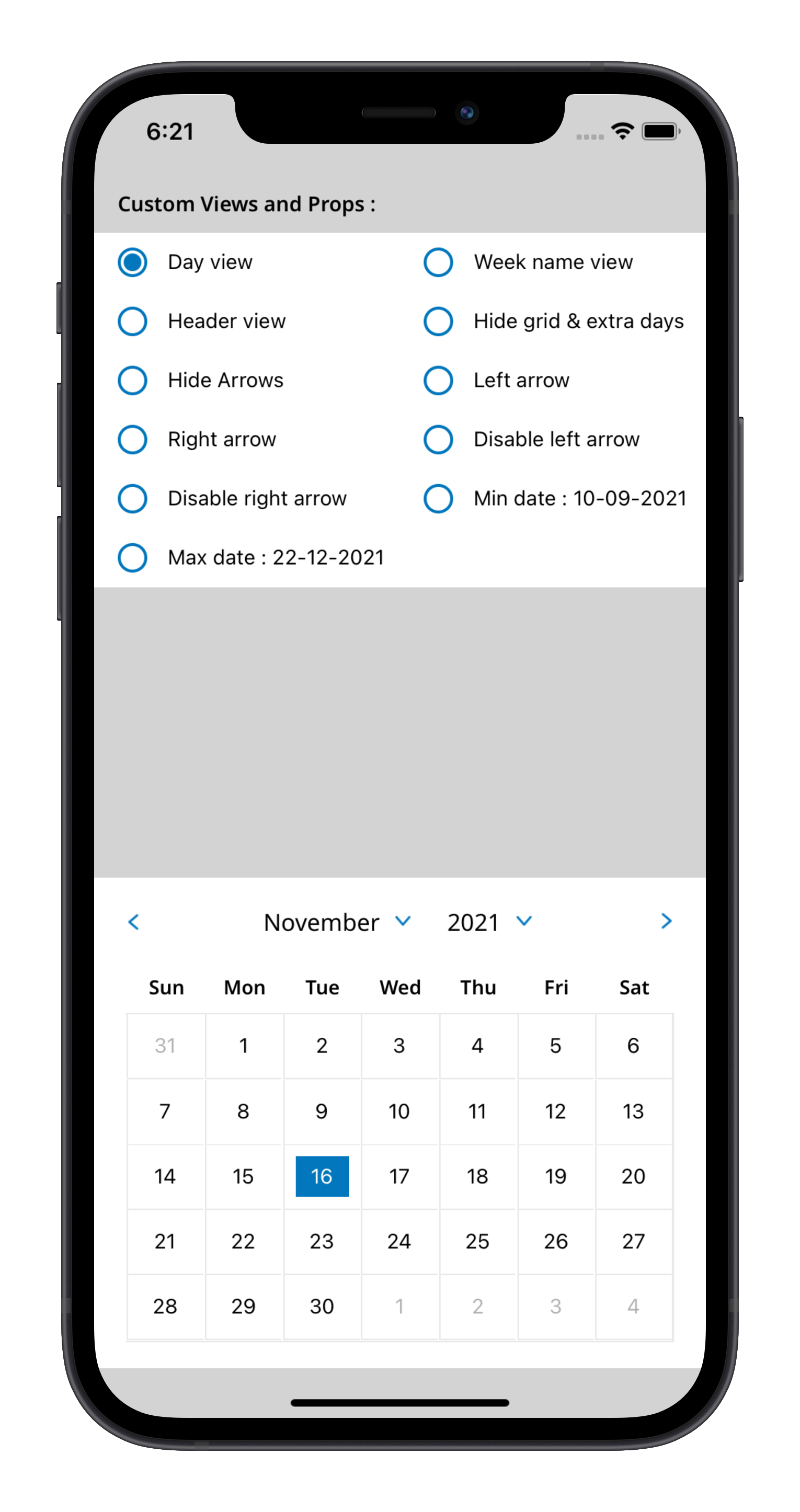 | 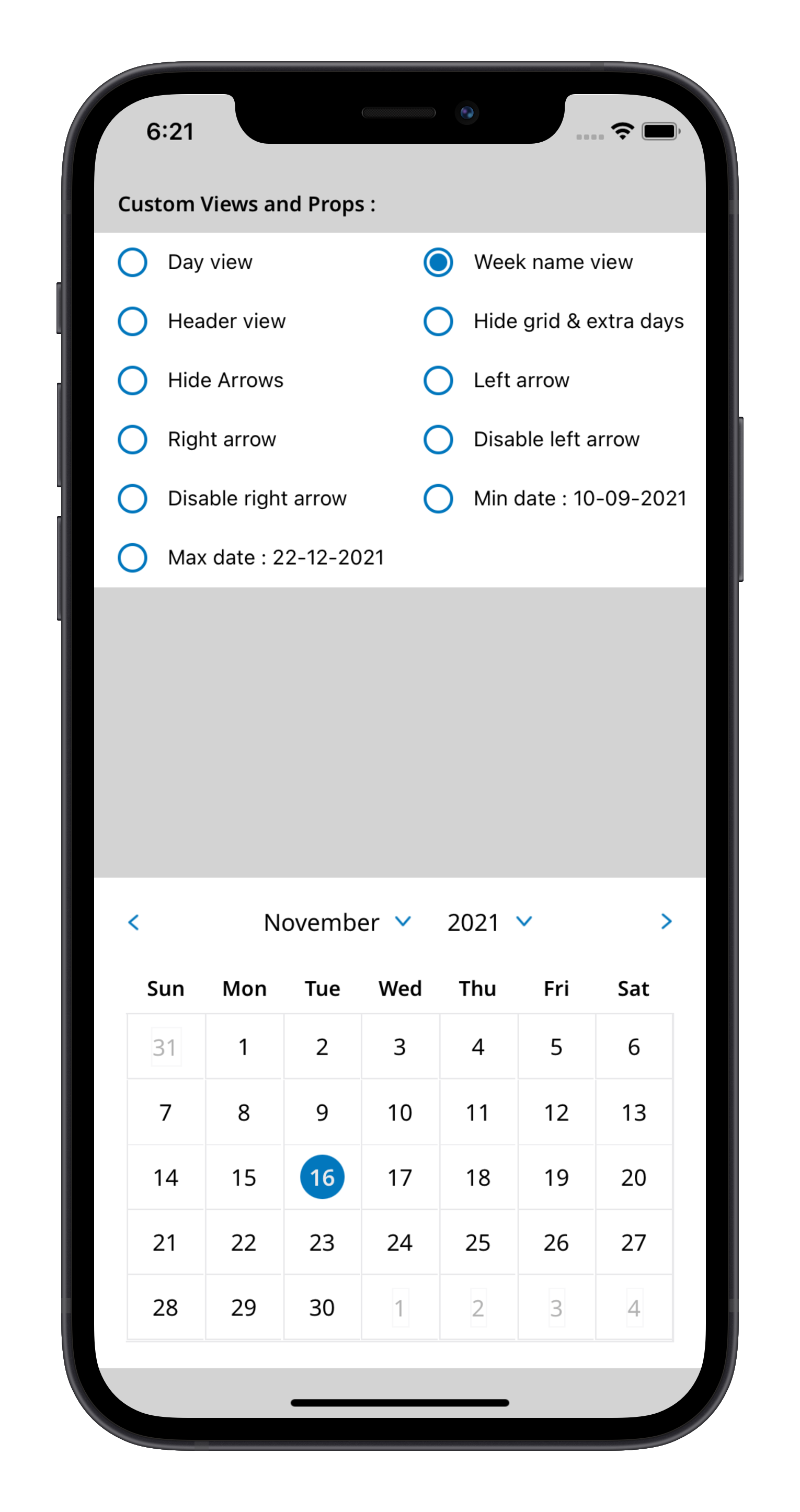 | 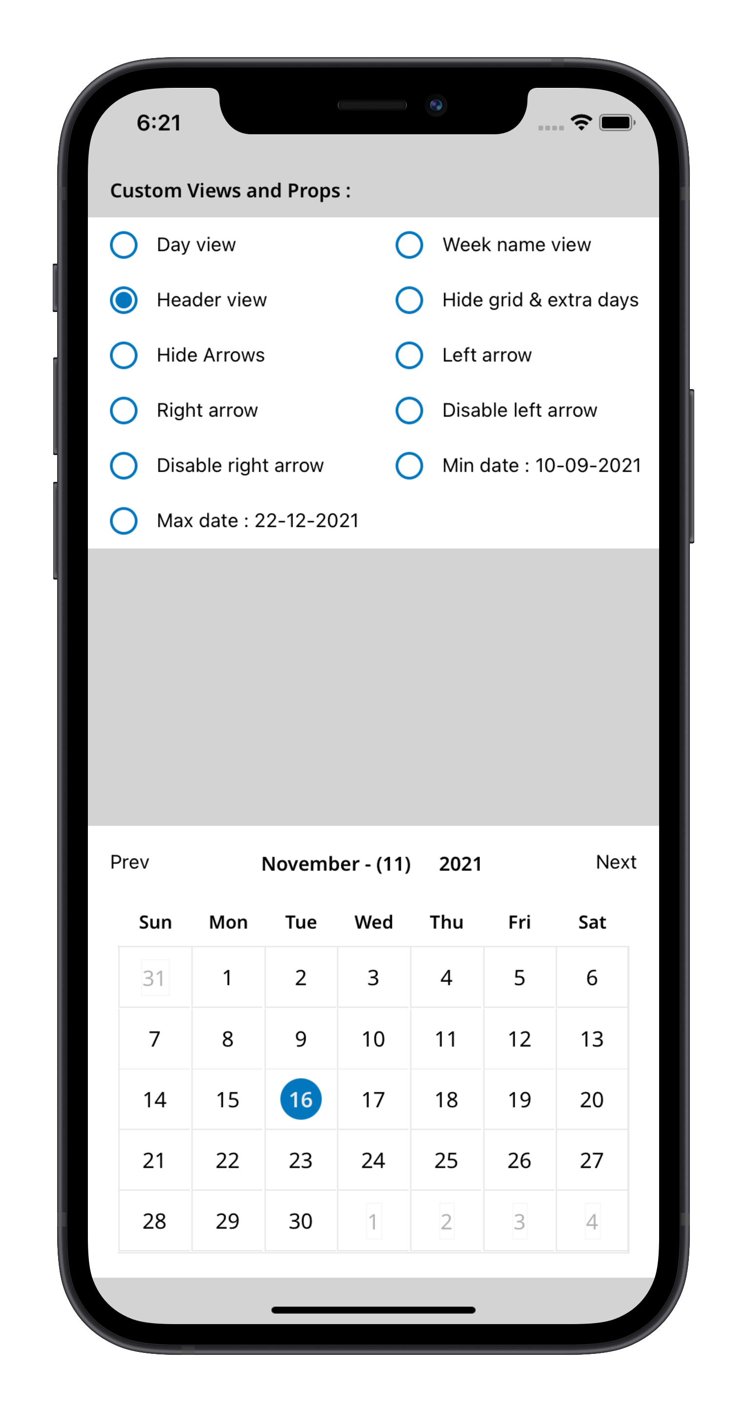 |
Screenshots : ANDROID
| Custom day view | Custom week view | Custom header view |
|---|---|---|
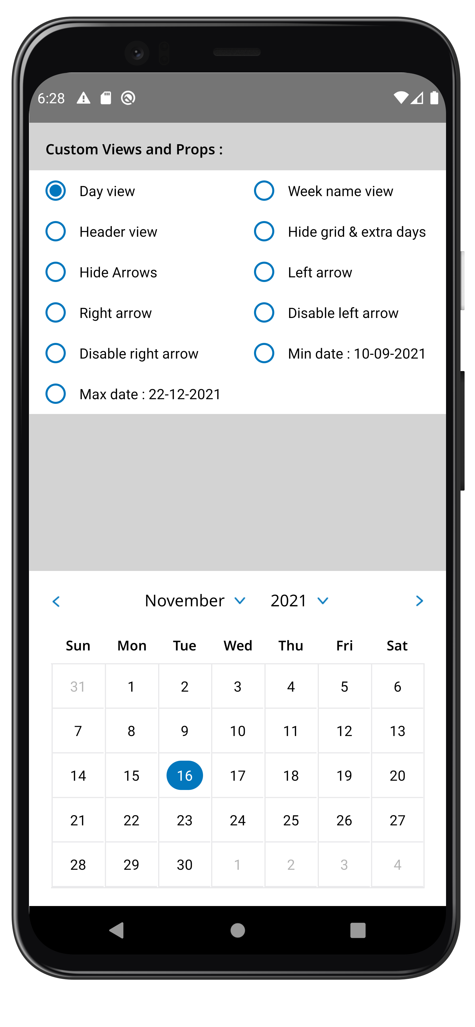 | 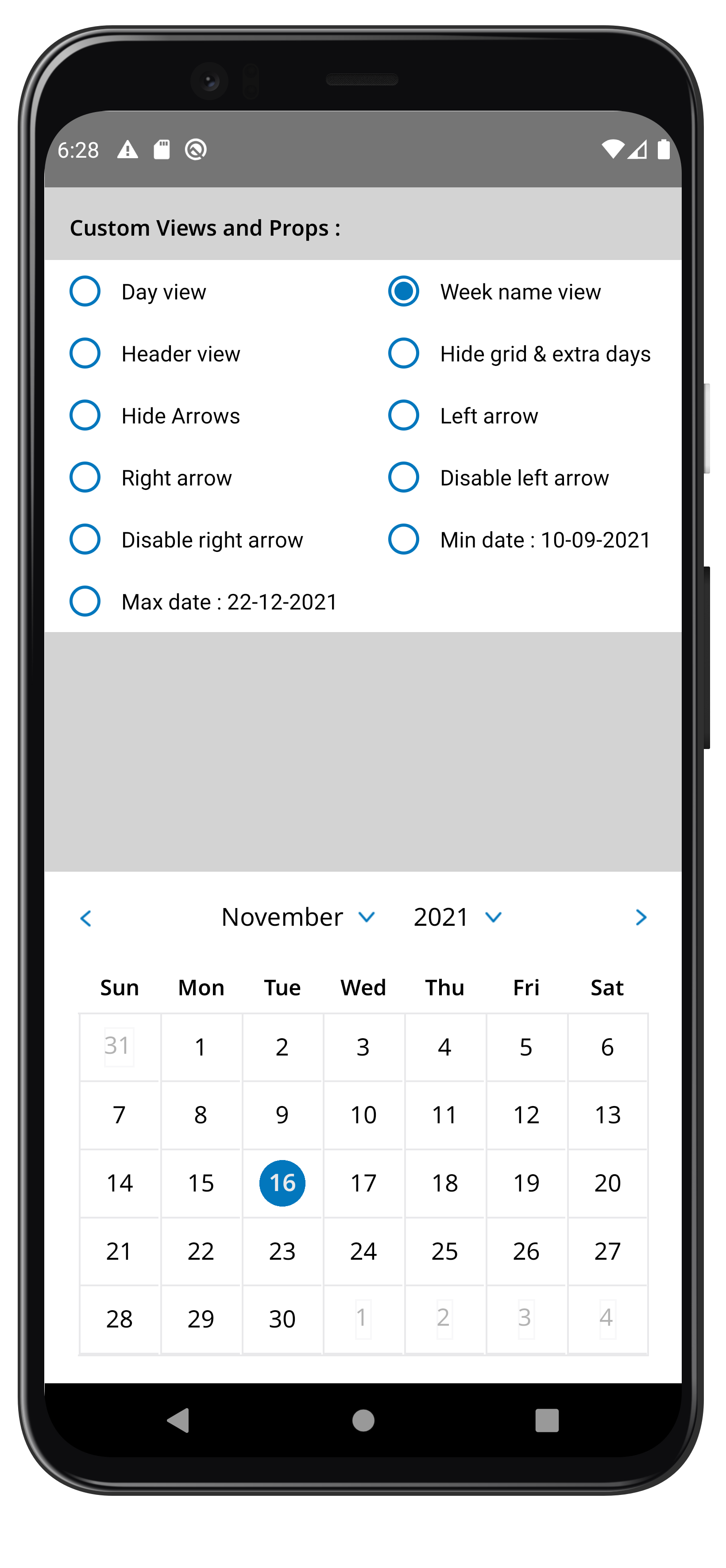 | 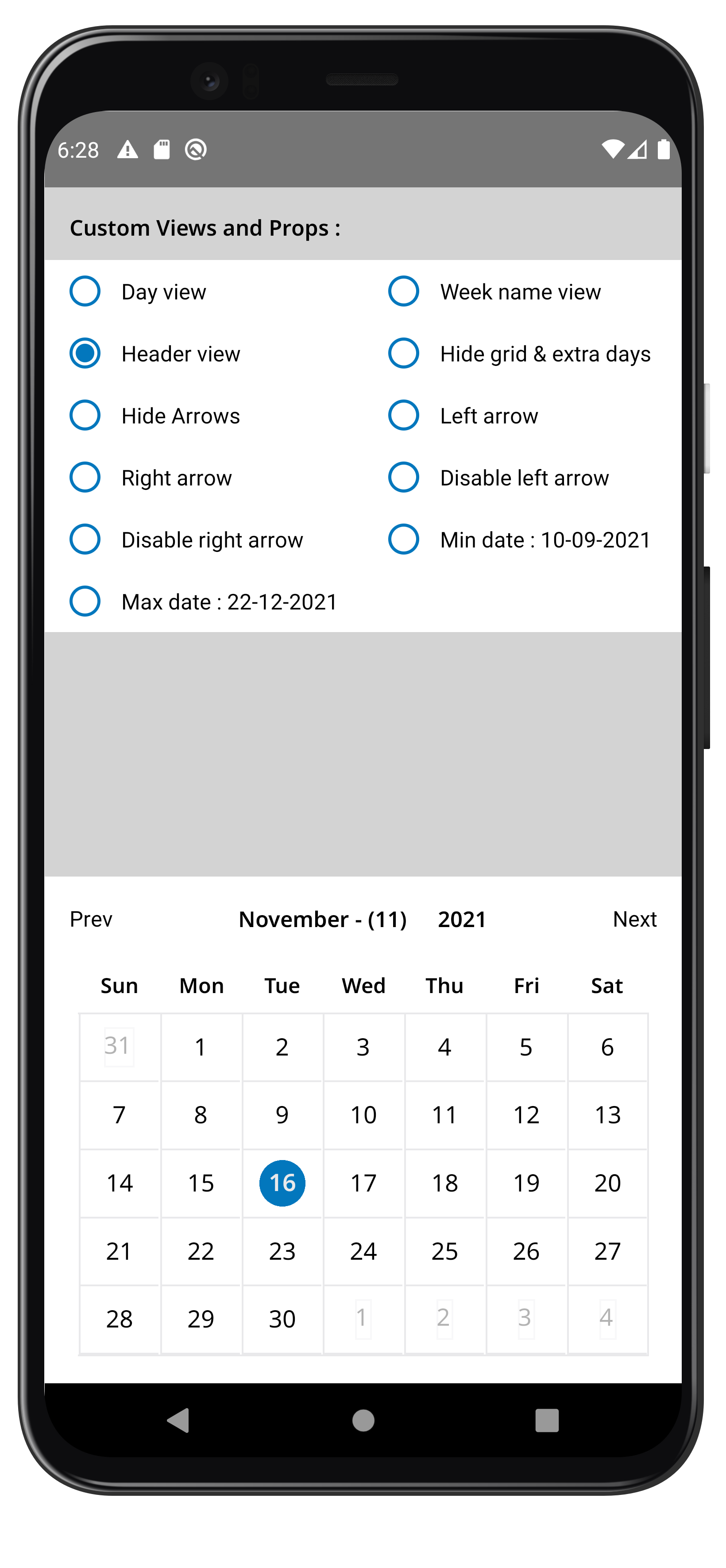 |
Usage
For example code, Click here
Basic Props
{

	/** Unique testid for the component */
	testId?: string;

	/** Parent style for the entire component. */
	style?: StyleProp<ImageStyle>;

	/** Display grid like view around each day, DEFAULT = true */
	isShowGrid?: boolean;

	/** Hide previous month & next month's extra days, DEFAULT = false */
	hideExtraDays?: boolean;

	/** Hide month & year navigation arrows, DEFAULT = false */
	hideArrows?: boolean;

	/** Callback which get invloked when a date is clicked, The function receives day, month & year as parameter  */
	onDayPress?: (props: { day: number; month: number; year: number }) => void;

	/** Replace default month and year title with custom one. The function receive a month ,year & other header props as parameter */
	renderHeader?: (props: {
		month: number;
		monthName: string;
		year: number;
		toggleMList: () => void;
		toggleYList: () => void;
		prevMonth: () => void;
		nextMonth: () => void;
	}) => JSX.Element;

	/** Render custom day component. the function receive all day props */
	renderDay?: (props: {
		testId?: string;
		index: number;
		day: DayProps;
		month: number;
		year: number;
		onDayPress?: (props: {
			day: number;
			month: number;
			year: number;
		}) => void
	}) => JSX.Element;

	/** Render custom week component. the function receive a all week props */
	renderWeekName?: (props: {
		testId?: string;
		value: {
			d: string; // eg. { d: "1", dd: "01", ddh: "Su", ddd: "Sun", dddd: "Sunday" },
			dd: string;
			ddd: string;
			dddd: string;
			ddh: string;
		};
	}) => JSX.Element;

	/** Replace left arrows with custom ones */
	renderLeftArrow?: () => JSX.Element;

	/** Replace right arrows with custom ones */
	renderRightArrow?: () => JSX.Element;

	/** Handler which gets executed when press arrow icon left. It receive a callback can go back month */
	onPressArrowLeft?: (props: {
		prevMonth?: () => void;
		month?: number;
		nextMonth?: () => void;
	}) => void;

	/** Handler which gets executed when press arrow icon right. It receive a callback can go next month */
	onPressArrowRight?: (props: {
		prevMonth?: () => void;
		month?: number;
		nextMonth?: () => void;
	}) => void;

	/** Disable left arrow */
	disableArrowLeft?: boolean;

	/** Disable right arrow */
	disableArrowRight?: boolean;

	/** Minimum date that can be selected, dates before minDate will be grayed out. Format = "DD-MM-YYYY" */
	minDate?: string;

	/** Maximum date that can be selected, dates after maxDate will be grayed out. Format = "DD-MM-YYYY" */
	maxDate?: string;
}
Documentation :
CalendarDateView
| PropName | PropType | Parameters | Purpose | Default |
|---|---|---|---|---|
| testId | string | Unique testid for the component | ||
| style. | ImageStyle | Parent style for the entire component. | ||
| isShowGrid | boolean | Display grid like view around each day | true | |
| hideExtraDays | boolean | Hide previous month & next month's extra days | false | |
| hideArrows | boolean | Hide month & year navigation arrows. | false | |
| disableArrowLeft | boolean | Disable left arrow. | false | |
| disableArrowRight | boolean | Disable right arrow. | false | |
| minDate | string | Minimum date that can be selected, dates before minDate will be grayed out. | DD-MM-YYYY | |
| maxDate | string | Maximum date that can be selected, dates after maxDate will be grayed out. | DD-MM-YYYY | |
| onDayPress | function | { day: number, month: number, year: number } | Callback which gets invloked when a date is clicked, The function receives day, month & year as parameter | |
| renderHeader | JSX.Element | { month: number, monthName: string, year: number, toggleMList: () => void toggleYList: () => void, prevMonth: () => void, nextMonth: () => void } | Replace default month and year title with custom one. The function receive a month ,year & other header props as parameter | |
| renderDay | JSX.Element | { testId: string, index: number, day: DayProps, month: number, year: number, onDayPress: { day: number, month: number, year: number } | Render custom day component. the function receive all day props | |
| renderWeekName | JSX.Element | { testId: string, value: { d: string, dd: string, ddd: string, dddd: string, ddh: string }} | Render custom week component. the function receive a all week props | |
| renderLeftArrow | JSX.Element | Replace left arrows with custom ones | ||
| renderRightArrow | JSX.Element | Replace right arrows with custom ones | ||
| onPressArrowLeft | function | { prevMonth: () => void, month: number, nextMonth: () => void } | Handler which gets executed when press arrow icon left. It receive a callback can go back month | |
| onPressArrowRight | function | { prevMonth: () => void month: number nextMonth: () => void } | Handler which gets executed when press arrow icon right. It receive a callback can go next month |
Contributing
See the contributing guide to learn how to contribute to the repository and the development workflow.
License
MIT
About Me
Yuvraj Pandey
I am a passionate Engineer which likes to push himself on various fronts of technologies.
For more exciting updates follow me,
1.0.0
4 years ago


