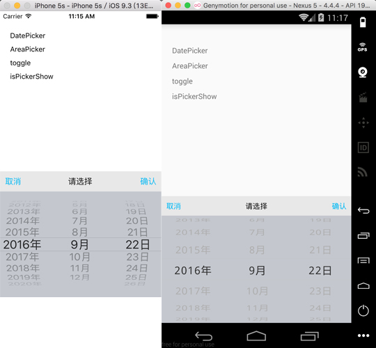
react-native-picker-enhanced v5.0.3
react-native-picker-enhanced
Forked from react-native-picker@4.0.5
For pure javascript version -> v3.0.5

###Documentation
####Params
| Key | Description | Type | Default |
|---|---|---|---|
| pickerConfirmBtnText | string | 确认 | |
| pickerCancelBtnText | string | 取消 | |
| pickerTitleText | string | 请选择 | |
| pickerConfirmBtnColor | array | 1, 186, 245, 1 | |
| pickerCancelBtnColor | array | 1, 186, 245, 1 | |
| pickerTitleColor | array | 20, 20, 20, 1) | |
| pickerToolBarBg | array | 232, 232, 232, 1 | |
| pickerBg | array | 196, 199, 206, 1 | |
| pickerData | array | ||
| wheelWidth | array | ||
| wheelFlex | array | ||
| selectedValue | array | ||
| onPickerConfirm | function | ||
| onPickerCancel | function | ||
| onPickerSelect | function |
####Methods
| Name | Description | Type | Default |
|---|---|---|---|
| init | init and pass parameters to picker | ||
| toggle | show or hide picker | ||
| show | show picker | ||
| hide | hide picker | ||
| isPickerShow | get status of picker, return a boolean |
###Usage
####Step 1 - install
npm install react-native-picker-enhanced --save####Step 2 - link
react-native link####Step 3 - import and use in project
	import Picker from 'react-native-picker-enhanced';

	let data = [];
    for(var i=0;i<100;i++){
        data.push(i);
    }

    Picker.init({
        pickerData: data,
        selectedValue: [59],
        onPickerConfirm: data => {
            console.log(data);
        },
        onPickerCancel: data => {
            console.log(data);
        },
        onPickerSelect: data => {
            console.log(data);
        }
    });
    Picker.show();
###Notice
####support two modes:
1. parallel: such as time picker, wheels have no connection with each other
2. cascade: such as date picker, address picker .etc, when front wheel changed, the behind wheels will all be reset
3. customize width: wheels width can be customized both on the Android and iOS platform.
####parallel:
- single wheel:
	pickerData = [1,2,3,4];
selectedValue = [3];- two or more wheel:
	pickerData = [
		[1,2,3,4],
		[5,6,7,8],
		...
	];
	selectedValue = [1, 5];
####cascade:
- two wheel
    pickerData = [
        {
            a: [1, 2, 3, 4]
        },
        {
            b: [5, 6, 7, 8]
        },
        ...
    ];
selectedValue = ['a', 2];- three wheel
    pickerData = [
        {
            a: [
                {
                    a1: [1, 2, 3, 4]
                },
                {
                    a2: [5, 6, 7, 8]
                },
                {
                    a3: [9, 10, 11, 12]
                }
            ]
        },
        {
            b: [
                {
                    b1: [11, 22, 33, 44]
                },
                {
                    b2: [55, 66, 77, 88]
                },
                {
                    b3: [99, 1010, 1111, 1212]
                }
            ]
        },
        {
            c: [
                {
                    c1: ['a', 'b', 'c']
                },
                {
                    c2: ['aa', 'bb', 'cc']
                },
                {
                    c3: ['aaa', 'bbb', 'ccc']
                }
            ]
        },
        ...
    ]
####customize width:
iOS
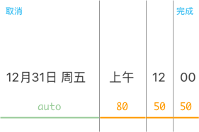
Wheels will be rendered by a specific number or regarded as auto case(equal division) in other types. If the length of wheelWidth array is less than the pickerData's, the unspecific width will be regarded as auto case (i.e. as much wide as possible).
	pickerData = [['12月31日 周五'], ['上午'], ['5'], ['00']],
	wheelWidth = ['auto', 10, 10, 10]
#####rendering

Android
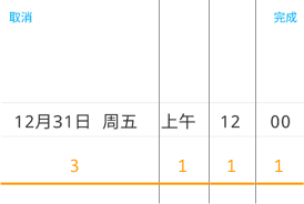
On Android platform, variable devices have so many different screen resolution that we can not give a specific point number to all of them. So wheels will be rendered with width weight which is something like flex in react-native. All you need to do is giving a proportion to each wheel of pickerData. If the length of wheelFlex array is less than the pickerData's, the unspecific wheel will be regarded as 0 weight (i.e. will not display).
	pickerData = [['12月31日 周五'], ['上午'], ['5'], ['00']],
	wheelFlex = [3, 1, 1, 1]
#####rendering
