1.0.8 • Published 4 years ago
react-native-plain-calendar v1.0.8
React-Native-Plain-Calendar
This module includes customizable and flexibility react-native calendar component with possibility implement own picker or use existing in it.
Installation
npm i --save react-native-plain-calendarThe solution is implemented in TypeScript so no native module linking is required.
Examples


Usage
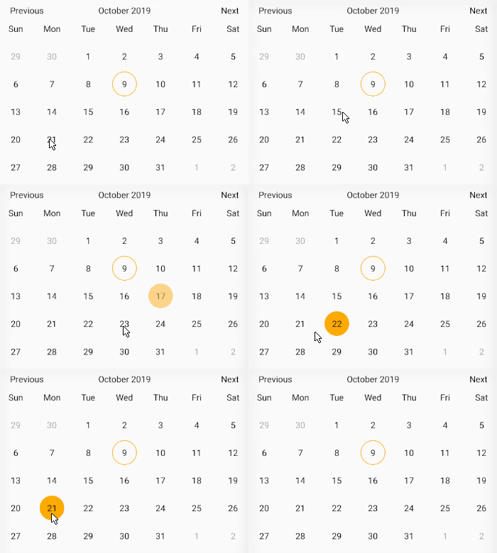
The simplest usage of this calendar component. This library hasn't got any required props, so to use it just import Calendar component
import React from 'react';
import { View } from 'react-native';
import { Calendar } from 'react-native-plain-calendar';

export default const App = () => (
  <View>
    <Calendar />
  </View>
);
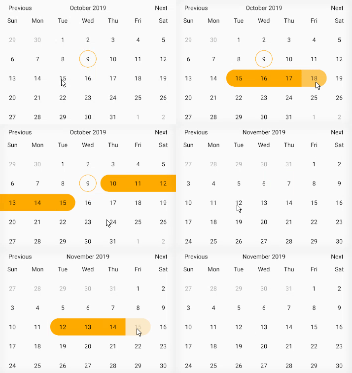
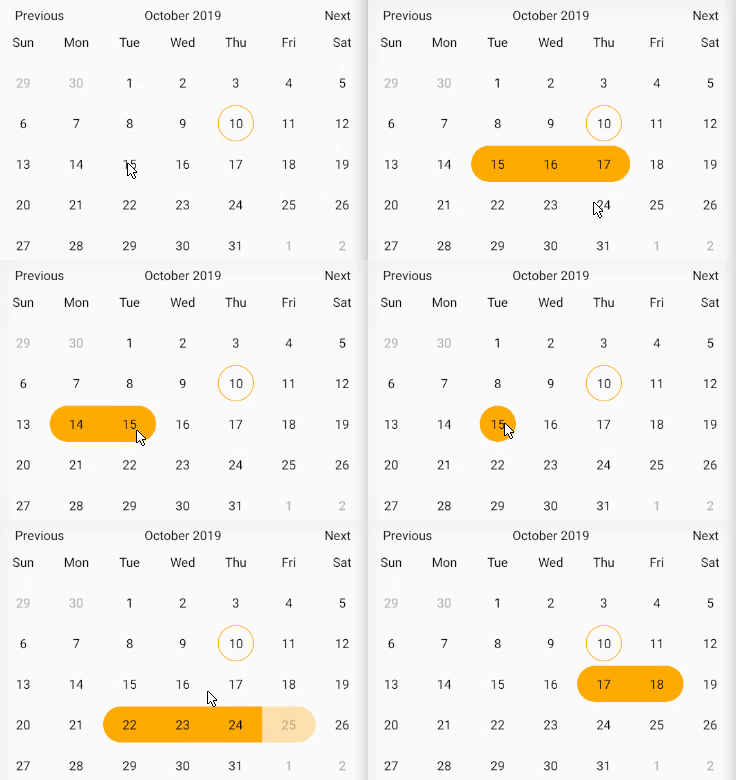
Simple usage of picker
import React from 'react';
import { View } from 'react-native';
import { Calendar } from 'react-native-plain-calendar';

export default const App = () => {
  function onSelected ({ selected, selectedStart, selectedEnd }) {
    // Your code
  }

  return(
    <View>
      <Calendar.Picker
        onSelected={onSelected}
        selectedType='single-range'
      />
    </View>
  );
};
Usage with custom header and day components
import React from 'react';
import { View } from 'react-native';
import { Calendar } from 'react-native-plain-calendar';
import { CustomHeaderComponent, CustomDayComponent } from './components'

export default const App = () => (
  <View>
    <Calendar.Picker
      disabledDates={[new Date('10/01/2020'), new Date('11/01/2020'), new Date('12/01/2020')]}
      HeaderComponent={({
        currentMonth,
        onPrevMonth,
        onNextMonth,
      }) => (
        <CustomHeaderComponent
          onPressLeft={onPrevMonth}
          title={currentMonth}
          onPressRight={onNextMonth}
        />
      )}
      DayComponent={({
        isToday,
        isSelectedDate,
        isSingleSelectedDate,
        isStartSelectedDate,
        isEndSelectedDate,
        isIntermediateSelectedDate,
        isDisabledDate,
        isDisabledParticularDate,
        date,
        onPress,
      }) => (
        <CustomDayComponent
          isToday={isToday}
          isSelectedDate={isSelectedDate}
          isSingleSelectedDate={isSingleSelectedDate}
          isStartSelectedDate={isStartSelectedDate}
          isEndSelectedDate={isEndSelectedDate}
          isIntermediateSelectedDate={isIntermediateSelectedDate}
          isDisabledDate={isDisabledDate}
          isDisabledParticularDate={isDisabledParticularDate}
          date={date}
          onPress={onPress}
        />
      )}
    />
  </View>
);
Calendar props
| Prop | Type | Description | Default |
|---|---|---|---|
| onDayPress | function | Callback which called when day pressed function (date: Date) | - |
| initialDate | Date | The date that the calendar opens to when it will be mounted | - |
| selectedDate | Date | The date which will be marked as selected single date | - |
| startSelectedDate | Date | The date which will be marked as begin date of the range | - |
| endSelectedDate | Date | The date which will be marked as end date of the range | - |
| minDate | Date | Minimum date that can be selected | - |
| maxDate | Date | Maximum date that can be selected | - |
| disabledDates | Date[] | Array of disabled days | [] |
| headerDateFormat | string | The format of the date in the header. react-native-simple-calendar is using the library 'date-fns'. More information about supported dates formats you can find here: https://date-fns.org/v2.2.1/docs/format | 'MMMM yyyy' |
| headerContainerStyle | style | The style of the header container(View) | - |
| headerTitleStyle | style | The style of the header title(Text) | - |
| headerButtonStyle | style | The style of the header button container(View) | - |
| HeaderButtonComponent | component | Takes a component and renders it instead of default header button component | - |
| HeaderComponent | component | Takes a component and renders it instead of default header component | - |
| WeekdaysComponent | component | Takes a component and renders it instead of default weekdays component | - |
| weekStartsOn | number | The index of the first day of the week (0 - Sunday, 1 - Monday, 2 - Tuesday, etc ) | 0 |
| weekdays | string[] | List of days of the week. In the list Must be 7 days and begin from Sunday | [] |
| weekContainerStyle | style | The style of the week container(View) | - |
| weekdayContainerStyle | style | The style of the day container of the week(View) | - |
| weekdayStyle | style | The style of the day of the week(Text) | - |
| cellsStyle | style | The style of the cells component(View) | - |
| daysRowStyle | style | The style of the rows that contains days of the week in cells (View) | - |
| dayContainerStyle | style | The style of the day wrapper(container) component(View) | - |
| DayComponent | component | Takes a component and renders it instead of default day component. | - |
| todayStyle | style | The style of the today(View) | - |
| dayStyle | style | The style of the day(View) | - |
| daySelectedStyle | style | The style of the selected day(View) | - |
| daySingleSelectedStyle | style | The style of the single selected day(View) | - |
| dayStartSelectedStyle | style | The style of the start selected day (day at the begin of the range)(View) | - |
| dayEndSelectedStyle | style | The style of the end selected day (day at the end of the range)(View) | - |
| dayIntermediateSelectedStyle | style | The style of the intermediate selected day (day within start and end selected days)(View) | - |
| dayDisabledStyle | style | The style of the disabled day(View) | - |
| dayDisabledParticularStyle | style | The style of the disabled particular day (days that passed in disabledDates props)(View) | - |
| todayTextStyle | style | The style of the today text(Text) | - |
| dayTextStyle | style | The style of the day text(Text) | - |
| daySelectedTextStyle | style | The style of the selected day text(Text) | - |
| dayDisabledTextStyle | style | The style of the disabled day text(Text) | - |
| dayDisabledParticularTextStyle | style | The style of the disabled particular day text(Text) | - |
| disabledDayPick | boolean | Disable onDayPress | true |
Calendar.Picker props
Takes the same props as Calendar and also takes extra props
| Prop | Type | Description | Default |
|---|---|---|---|
| selectedType | one of 'single','range','single-range' | The type of picker | - |
| onSelected | function | Callback which called when all dates will be selected depends on selectedType. | - |
License
MIT © Yura Pelehatiy 2019