react-native-progress-wheel v2.1.0
react-native-progress-wheel
React Native component for creating natively animated, circular progress wheel.
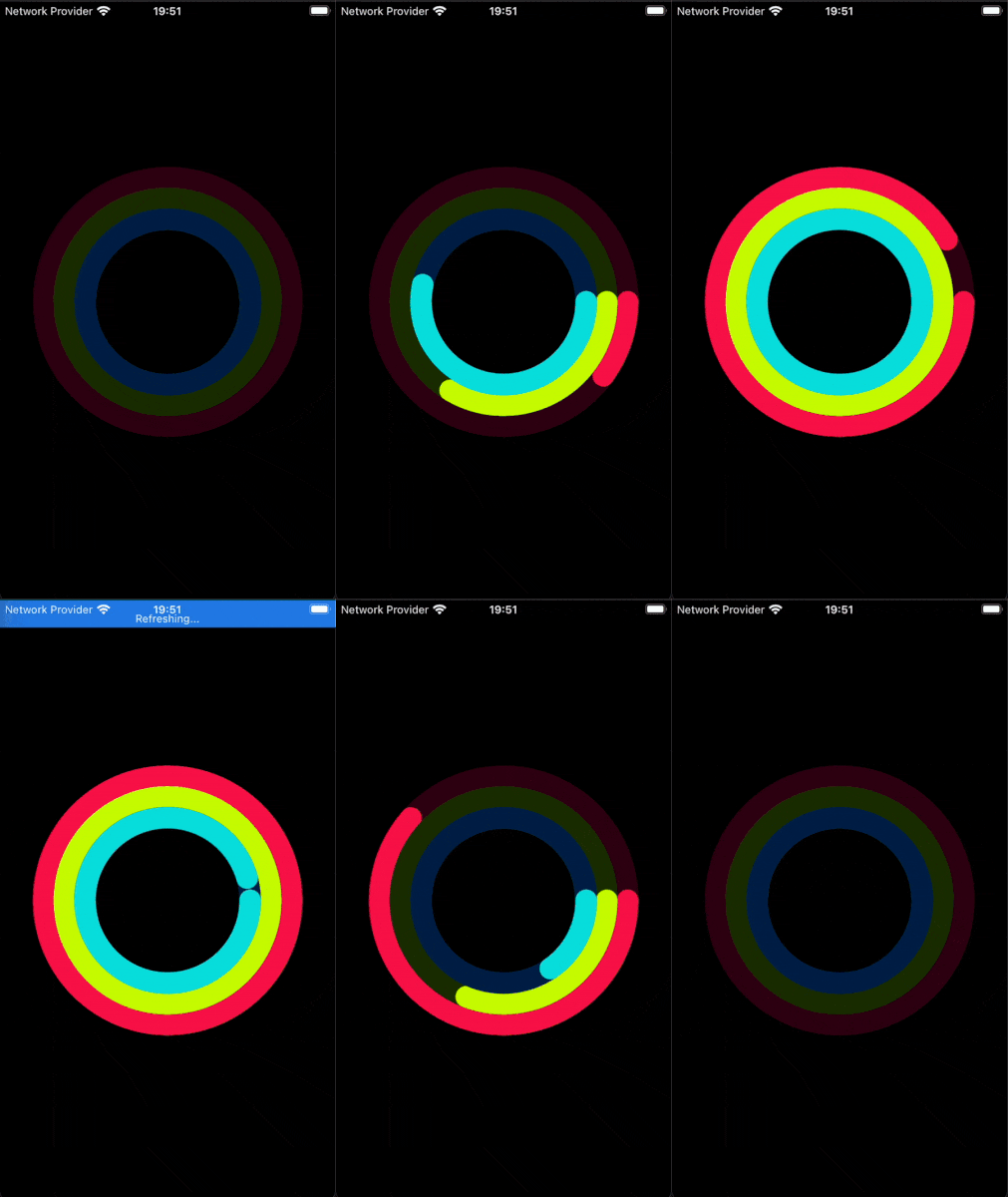
Example app

Installation
yarn add react-native-progress-wheelUsage
import AnimatedProgressWheel from 'react-native-progress-wheel';

<AnimatedProgressWheel
    size={120}
    width={20}
    color={'yellow'}
    progress={45}
    backgroundColor={'orange'}
/>
You can define a progress value, and a value from which to animate when the component is mounted. The following example will animate from 0% to 45% at a duration of 3 seconds.
<AnimatedProgressWheel
    progress={45}
    animateFromValue={0}
    duration={3000}
/>
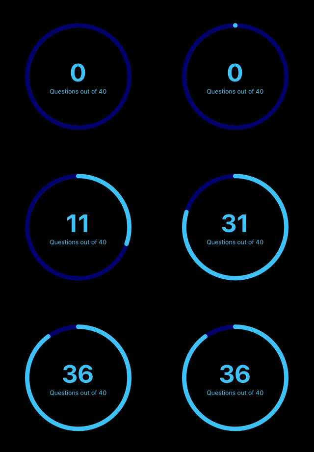
The progress wheel can display progess as titles in the center of the circle.

<AnimatedProgressWheel
        max={40}
        showProgressLabel={true}
        rotation={'-90deg'}
        labelStyle={styles.progressLabel}
        subtitle={'Questions out of 40'}
        subtitleStyle={styles.subtitle}
        {...{color, backgroundColor, size, width, duration, progress, rounded}}
      />
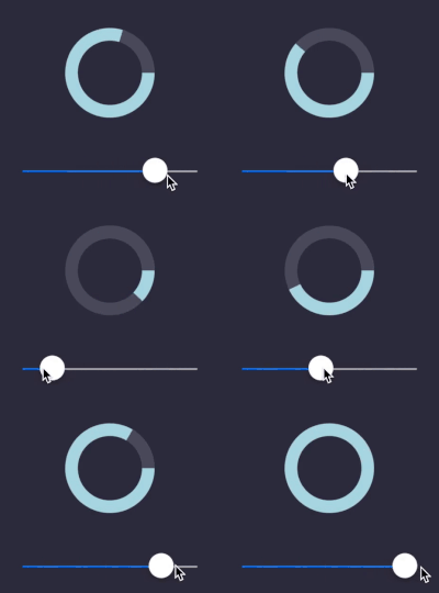
The progress wheel can be updated using state variables.
<AnimatedProgressWheel
    progress={this.state.sliderProgress}
/>
Configuration
You can configure the component using these props:
| Name | Type | Default value | Description |
|---|---|---|---|
| size | number | 200 | Width and height of circle |
| width | number | 25 | Thickness of the progress line |
| color | string | white | Color of the progress line |
| backgroundColor | string | gray | Color of the background progress line |
| progress | number | 0 | Angle from which the progress starts from |
| max | number | 100 | Max value for the progress wheel |
| rotation | string | 0deg | Set starting angle of progress |
| duration | number | 600 | Duration at which to animate the progress |
| rounded | boolean | false | Rounds edges |
| animateFromValue | number | -1 | Starting value to animate to progres when component is mounted |
| containerColor | string | null | Container color |
| delay | number | 0 | Delay for animation |
| easing | EasingFunction | null | Easing for animation |
| showProgressLabel | boolean | false | Show the progress as text in the circle |
| labelStyle | TextStyle | {} | Style object for progress label |
| subtitle | string | null | Text displayed directly below progress label |
| subtitleStyle | TextStyle | {} | Style object for subtitle |
| showPercentageSymbol | boolean | false | Show the progress as a percentage |
| onAnimationComplete | function | null | Called when animation finishes |
Why use this component
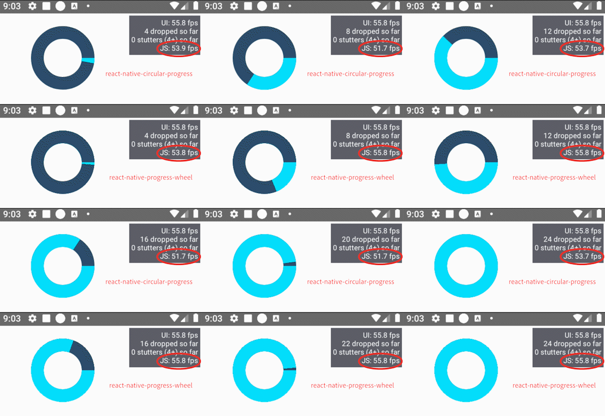
This implementation is 100% base react-native, meaning you do not need to use any additional libraries such as 'react-native-svg' or 'react-native-reanimated'.
This component also sets useNativeDriver: true, meaning that all animation is done smoothly on the native side.💖
This package is also SUPER-LIGHTWEIGHT.
Let's compare:
react-native-progress-wheel: Unpacked size: 8.74 kB (this library)
react-native-circular-progress: Unpacked size: 3.38 MB (other popular library)

FAQ
Q: Does it work in Expo? A: Yes it does.
Q: Does it support Typescript? A: From version 2.0.0 onwards, Typescript is fully supported.
Q: How can I get round edges? A: Pass rounded={true} in the components props. (v2 and up.)
Enjoy making smooth animated designs that use the native driver and DON'T require any additional dependencies. If you like this library please give it a star on GitHub! ⭐️
