1.0.1 • Published 3 years ago
react-native-segment-progress-bar v1.0.1
React Native Segment ProgressBar
Segment ProgressBar for React Native, works on both iOS and Android. Check out our documentation below to learn how to get started.
Demo and Docs
Idea & base code adapted from https://github.com/shipt/segmented-arc-for-react-native
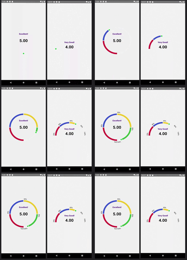
Example Image

Contents
🚀 Installation
Install
react-native-segment-progress-barInstall
react-native-svglibrary for Dependency
yarn add react-native-segment-progress-barnpm install react-native-segment-progress-bar🎉 Usage
Here is a basic example of how to use this component. It covers all the main features.
import React, { useState } from 'react';
import { View, Text, Pressable } from 'react-native';
import { ArcProgressBar } from 'react-native-segment-progress-bar';

const App = () => {
  const [showArcRanges, setShowArcRanges] = useState(false);

  const segments = [
    {
      scale: 0.25,
      filledColor: '#C70039',
      emptyColor: '#F2F3F5',
      data: { label: 'Not bad!' }
    },
    {
      scale: 0.25,
      filledColor: '#404FCD',
      emptyColor: '#F2F3F5',
      data: { label: 'Good!' }
    },
    {
      scale: 0.25,
      filledColor: '#EBD22F',
      emptyColor: '#F2F3F5',
      data: { label: 'Very Good!' }
    },
    {
      scale: 0.25,
      filledColor: '#44CD40',
      emptyColor: '#F2F3F5',
      data: { label: 'Excellent!' }
    }
  ];

  const ranges = ['10%', '20%', '30%', '40%', '50%'];

  const _handlePress = () => {
    setShowArcRanges(!showArcRanges);
  };

  return (
    <View style={{ flex: 1, alignItems: 'center', justifyContent: 'center' }}>
      <ArcProgressBar
        segments={segments}
        fillValue={70}
        isAnimated={true}
        animationDelay={1000}
        showArcRanges={showArcRanges}
        ranges={ranges}
      >
        {data => (
          <Pressable onPress={_handlePress} style={{ alignItems: 'center' }}>
            <Text style={{ fontSize: 16, paddingTop: 16 }}>{data.lastFilledSegment.data.label}</Text>
            <Text style={{ lineHeight: 80, fontSize: 24 }}>More info</Text>
          </Pressable>
        )}
      </ArcProgressBar>
    </View>
  );
};

export default App;
📖 Props
| Name | Type | Default | Description |
|---|---|---|---|
| fillValue | number (0-100) | 0 | Current progress value |
| segments | Array of { scale: number, filledColor: string, emptyColor: string, data: object } | [] | Segments of the arc. Here, scale is a percentage value out of 100%, filledColor for filled part of a segment, and emptyColor is background color for an empty segment, data could be any object that you'd want to receive back for a segment. See example above. |
| filledArcWidth | number | 8 | Thickness of progress line |
| emptyArcWidth | number | 8 | Thickness of background line |
| spaceBetweenSegments | number | 2 | Space between segments |
| arcDegree | number | 180 | Degree of arc |
| radius | number | 100 | Arc radius |
| isAnimated | bool | true | Enable/disable progress animation |
| animationDuration | number | 1000 | Progress animation duration |
| animationDelay | number | 0 | Progress animation delay |
| ranges | Array of strings | [] | Arc ranges (segments) display values |
| rangesTextColor | string | '#000000' | Color of ranges text |
| rangesTextStyle | object | { fontSize: 12 } | Ranges text styling |
| showArcRanges | bool | false | Show/hide arc ranges |
| middleContentContainerStyle | object | {} | Extra styling for the middle content container |
| capInnerColor | string | '#28E037' | Cap's inner color |
| capOuterColor | string | '#FFFFFF' | Cap's outer color |
| children | function | Pass a function as a child. It receives metaData with the last filled segment's data as an argument. From there you can extract data object. See example above. | |
📄 License
MIT