react-native-simple-ptr v1.0.3
react-native-simple-ptr
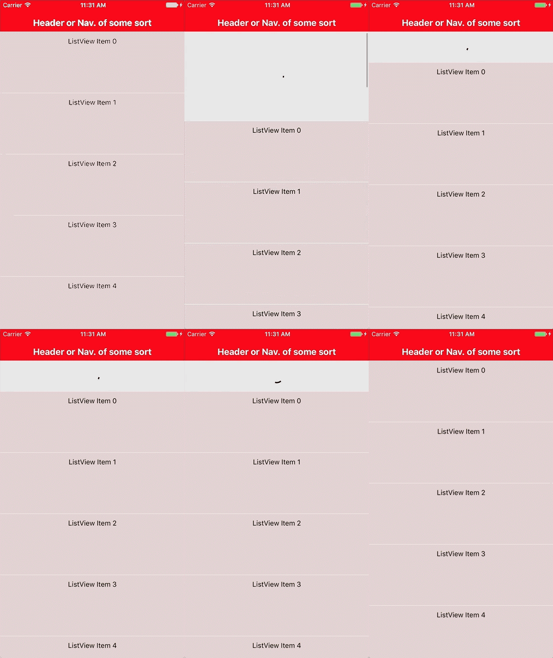
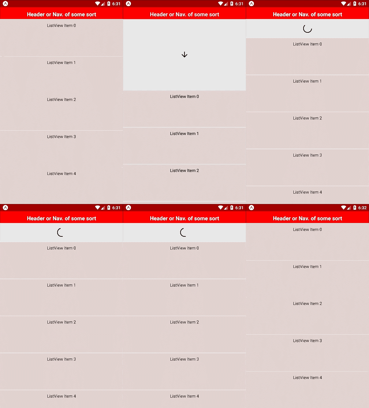
A simple pull to refresh component for React Native, adapted from react-native-animated-ptr.


Why?
Because I wanted more control over the look and feel of the animation than I could get from the native RefreshControl, but less complex animations than react-native-animated-ptr.
This component allows you to specify a custom spinner image, down arrow, colours and sizes. If you need anything more custom than that, try the original react-native-animated-ptr.
Installation
npm i react-native-simple-ptr --save
Basic usage
If you use the default images and styles, the only props required are the isRefreshing variable and the onRefresh function.
import React from 'react';
import { ScrollView, Text } from 'react-native';

import PullToRefresh from 'react-native-simple-ptr';

export default class App extends React.Component {
  constructor(props) {
    super(props);

    this.state = {
      isRefreshing: false
    };
  }

  onRefresh() {
    this.setState({
      isRefreshing: true,
    });

    setTimeout(() => {
      this.setState({isRefreshing: false});
    }, 2000);
  }

  render() {
    return (
      <PullToRefresh isRefreshing={this.state.isRefreshing} onRefresh={this.onRefresh.bind(this)}>
        <ScrollView>
          <Text>Content</Text>
        </ScrollView>
      </PullToRefresh>
    );
  }
}
The images and styles can be changed using the options below. An implementation of all the options can be found in the example.
Options
isRefreshing
Used to start/end refresh animation
onRefresh
Callback to control isRefreshing
minPullDistance
Height of refresh component (default: 62)
contentBackgroundColor
Main app background colour (defaut: #fff)
refreshBackgroundColor
Refresh component background colour (default: #e4e4e4)
arrow
Pull to refresh arrow image(default require('../assets/arrow-down.gif'))
arrowMaxHeight
Restrict the arrow image height (default: 30)
spinner
Loading spinner image (default: require('../assets/spinner.gif'))
spinnerMaxHeight
Restrict the spinner image height (default: 30)
margin
Margin between images and refresh component edges (default: 16)