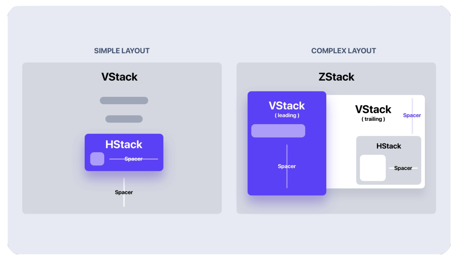
react-native-stacks v1.0.1
react-native-stacks :pancakes:
SwiftUI inspired Stack and Spacer components
- VStack: Vertical Stack
- HStack: Horizontal Stack
- ZStack: Overlay Stack
- Spacer: Spacing within Stacks
Installation
yarn add react-native-stacksUsage
import React from 'react';
import { Text, Button } from 'react-native';
import { VStack, HStack, Spacer } from 'react-native-stacks';

function Example() {
  return (
    <VStack aligment='leading' spacing={20}>
      <Text>Orders</Text>
      <Spacer />
      <HStack>
        <Button onPress={add} title='Add' />
        <Spacer />
        <Button onPress={remove} title='Remove' />
      </HStack>
    </VStack>
  );
}
vs. SwiftUI...
struct Example: View {
  var body: some View {
    VStack(alignment: .leading, spacing: 20) {
      Text("Orders")
      Spacer()
      HStack() {
        Button(action: add) {
          Text("Add")
        }
        Spacer()
        Button(action: remove) {
          Text("Remove")
        }
      }
    }
  }
}
Documentation
<VStack />
A vertical stack
Props:
spacing
The amount of space between each item in the stack
required: no
type:
numberdefault:
0
alignment
The horizontal alignment for the stack items
leading: left aligncenter: center aligntrailing: right align
required: no
type:
'leading' | 'center' | 'trailing'default:
'center'
<HStack />
A horizontal stack
Props:
spacing
The amount of space between each item in the stack
required: no
type:
numberdefault:
0
alignment
The vertical alignment for the stack items
leading: top aligncenter: center aligntrailing: bottom align
required: no
type:
'leading' | 'center' | 'trailing'default:
'center'
<ZStack />
An overlay stack
Props:
alignment
The horizontal and vertical alignment for the stack items. Since a ZStack overlays items on top of one another, we are able to align them both vertically and horizontally:
Veritcal
leading: top aligncenter: center aligntrailing: bottom align
Horizontal
leading: left aligncenter: center aligntrailing: right align
required: no
type:
{ vertical: Alignment, horizontal: Alignment }default:
{ vertical: 'center', horizontal: 'center' }
such that,
type Alignment = 'leading' | 'center' | 'trailing';<Spacer />
A component to provide space between stack items. Adding a Spacer to the bottom of a stack will shift all of the previous stack items up, and opposite for the top. Adding a Spacer between views in a stack will push them apart.
