react-native-stateview
A react native wrapper view to add loading, content, error and placeholder states to your component
Expo
Try it out on expo. Just download the expo app, scan code and you are good to go.

Installation
Using npm:
npm i --save react-native-stateviewUsing yarn:
yarn add react-native-stateview##Usage
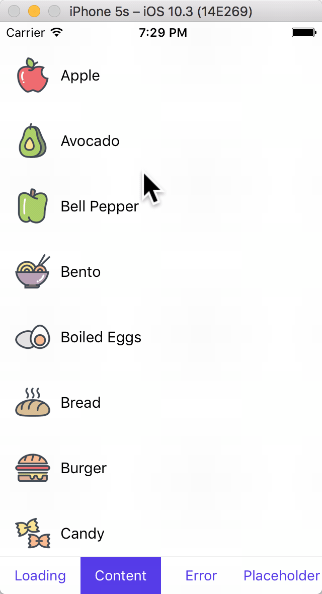
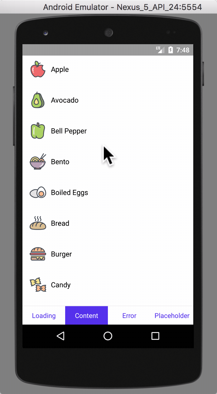
You can wrap your view in StateView to give states to it. The StateView has with 4 states: loading, content, placeholder and error.
Import react-native-keyboard-aware-scroll-view and wrap your content inside it:
import StateView from 'react-native-stateview'
<StateView>
    <View>
        // ...
    </View>
</StateView>
There are some props which you can use to configure the StateView, as given below in API section, but all of them are optional.
API
Props
Generic Props
| Prop | Type | Defaults | Description |
|---|---|---|---|
containerStyle |
PropTypes.object |
{} |
Style of container view |
state |
PropTypes.oneOf([StateView.State.loading, StateView.State.placeholder, StateView.State.error, StateView.State.content]) |
StateView.State.loading |
The state of StateView. |
color |
PropTypes.string |
'#000' |
A general tint color for all views. |
imageStyle |
PropTypes.object |
{} |
Styles for image of placeholder and error view. Overrides the default styles. |
titleStyle |
PropTypes.object |
{} |
Styles for title of loading, placeholder and error view. Overrides the default styles. |
bodyStyle |
PropTypes.object |
{} |
Styles for body of placeholder and error view. Overrides the default styles. |
buttonStyle |
PropTypes.object |
{} |
Styles for button of placeholder and error view. Overrides the default styles. |
buttonTextStyle |
PropTypes.object |
{} |
Styles for button text of placeholder and error view. Overrides the default styles. |
Loading View Props
| Prop | Type | Defaults | Description |
|---|---|---|---|
loadingView |
PropTypes.element |
undefined |
A custom loading view. |
loadingTitle |
PropTypes.string |
'' |
The title for the default loading view. |
loadingTitleStyle |
PropTypes.object |
{} |
Styles for title of loading view. Overrides the titleStyle and default styles. |
Placeholder View Props
| Prop | Type | Defaults | Description |
|---|---|---|---|
placeholderView |
PropTypes.element |
undefined |
A custom placeholder view |
placeholderImageRes |
PropTypes.number.isRequirednumber |
- | Image resource id of the placeholder view image |
placeholderTitle |
PropTypes.string |
'' |
Title text of the placeholder view |
placeholderBody |
PropTypes.string |
'' |
Body text of the placeholder view |
placeholderButtonText |
PropTypes.string |
'' |
Action button text of the placeholder view |
placeholderButtonAction |
PropTypes.func |
() => {} |
Function that is executed when the placeholder view button is clicked. The button is not rendered if this is null or undefined |
placeholderImageStyle |
PropTypes.object |
{} |
Styles for image of placeholder view. Overrides the imageStyle and default styles. |
placeholderTitleStyle |
PropTypes.object |
{} |
Styles for title of placeholder view. Overrides the titleStyle and default styles. |
placeholderBodyStyle |
PropTypes.object |
{} |
Styles for body of placeholder view. Overrides the bodyStyle and default styles. |
placeholderButtonStyle |
PropTypes.object |
{} |
Styles for button of placeholder view. Overrides the buttonStyle and default styles. |
placeholderButtonTextStyle |
PropTypes.object |
{} |
Error View Props
| Prop | Type | Defaults | Description |
|---|---|---|---|
errorView |
PropTypes.element |
undefined |
A custom error view |
errorImageRes |
PropTypes.number.isRequirednumber |
- | Image resource id of the error view image |
errorTitle |
PropTypes.string |
'' |
Title text of the error view |
errorBody |
PropTypes.string |
'' |
Body text of the error view |
errorButtonText |
PropTypes.string |
'' |
Action button text of the error view |
errorButtonAction |
PropTypes.func |
() => {} |
Function that is executed when the error view button is clicked. The button is not rendered if this is null or undefined |
errorImageStyle |
PropTypes.object |
{} |
Styles for image of error view. Overrides the imageStyle and default styles. |
errorTitleStyle |
PropTypes.object |
{} |
Styles for title of error view. Overrides the titleStyle and default styles. |
errorBodyStyle |
PropTypes.object |
{} |
Styles for body of error view. Overrides the bodyStyle and default styles. |
errorButtonStyle |
PropTypes.object |
{} |
Styles for button of error view. Overrides the buttonStyle and default styles. |
errorButtonTextStyle |
PropTypes.object |
{} |
Styles for button text of error view. Overrides the buttonTextStyle and default styles. |
Usage
A StateView with some styles overridded looks something like this:
<StateView
    style={styles.container}
    state={this.state.state}
    color="#5430EC"

    imageStyle={{
        width: 100,
        height: 100,
    }}
    placeholderTitleStyle={{
        color: '#5430EC',
        fontSize: 30
    }}
    buttonStyle={{
        borderRadius: 100,
        shadowColor: '#333',
        shadowOpacity: .6,
        shadowOffset: {
            width: 0,
            height: 3
        }
    }}

    loadingView={(
        <View>
            <ActivityIndicator
                color="#24B32D"
                size="large"/>
            <Text style={{
                fontSize: 20,
                textAlign: 'center',
                marginTop: 20,
                color: '#24B32D',
                fontWeight: 'bold'
            }}>
                Let me see what's cooking...
            </Text>
        </View>
    )}

    placeholderImageRes={require("./icons/ic_pizza.png")}
    placeholderTitle="We're all out!"
    placeholderBody={`It looks like we all out of dishes.\nCome back tomorrow for a nice slice of pizza!`}
    placeholderButtonText="How about now?"
    placeholderButtonAction={() => this._handleRefresh(0)}

    errorImageRes={require("./icons/ic_salt.png")}
    errorTitle="Eh?! This shouldn't be happening"
    errorBody="Don't get so salty. We're working on it!"
    errorButtonText="FIX IT NOW!"
    errorButtonAction={() => this._handleRefresh(0)}
    errorTitleStyle={{
        color: '#E83F6F',
        fontSize: 25
    }}
    errorBodyStyle={{
        color: '#E83F6F',
        marginTop: 10,
        fontSize: 15
    }}
    errorButtonStyle={{
        backgroundColor: '#E83F6F'
    }}
    errorButtonTextStyle={{
        color: '#fff2f6'
    }}
    >

    // ... your content view goes here

    </StateView>
This does look cluttered but StateView has some decent styles for every component and in most cases you should be good to go by just setting color prop to your app's primary color, along with the title, body, button text and it's action. But if you do prefer styling it completely, we recommend you create a component which wraps the StateView and sets all the styles so you don't have to do it everywhere manually.
License
MIT.