1.0.0 • Published 3 years ago
react-native-swippable-modal v1.0.0

react-native-swippable-modal
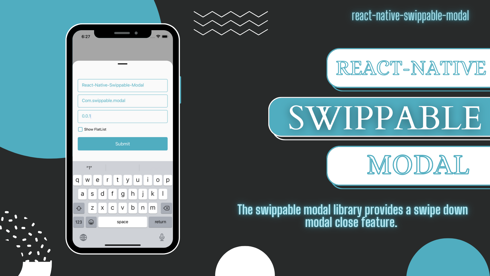
This swippable modal library provides a swipe down modal close feature. Especially same modal contain textInput that too it worked well.
- It also provides an example app and a detailed usage overview of swippable modal
- It's fully Android and iOS compatible.
🎬 Preview
| Example |
|---|
 |
Installation
1. Install swippable modal
$ npm install react-native-swippable-modal
# --- or ---
$ yarn add react-native-swippable-modal
2. Install required dependencies
$ npm install react-native-reanimated react-native-gesture-handler
# --- or ---
$ yarn add react-native-reanimated react-native-gesture-handler
3. Install cocoapods in the ios project
cd ios && pod installNote: Make sure to add Reanimated's babel plugin to your
babel.config.js
module.exports = {
      ...
      plugins: [
          ...
          'react-native-reanimated/plugin',
      ],
  };
Usage
import React, { createRef } from 'react';
import { Button, Image, TextInput, View } from 'react-native';
import {
  SwippableModal,
  SwippableModalRefType,
} from 'react-native-swippable-modal';

const exampleModalRef = createRef<SwippableModalRefType>();

const App = () => {
  return (
    <View style={{ flex: 1, alignItems: 'center', justifyContent: 'center' }}>
      <Button
        title="Open Modal"
        onPress={() => exampleModalRef.current?.show()}
      />
      <SwippableModal ref={exampleModalRef} closeThreadSoldValue={100}>
        <TextInput placeholder={'Example Input'} />
        <View style={{ height: 150, width: '100%', marginTop: 10 }}>
          <Image
            source={{
              uri: 'https://upload.wikimedia.org/wikipedia/commons/thumb/b/b6/Image_created_with_a_mobile_phone.png/800px-Image_created_with_a_mobile_phone.png',
            }}
            style={{ width: '100%', height: '100%' }}
            resizeMode={'contain'}
          />
        </View>
      </SwippableModal>
    </View>
  );
};

export default App;
Properties
| Props | Default | Type | Description |
|---|---|---|---|
| ref* | modalRef | reference | It is default reference to open modal |
| children | - | ReactNode | Pass children as ReactNode (Custom UI) |
| closeThreadSoldValue | 200 | number | It's take number value from where point modal will closed |
| modalStyle | - | ViewStyle | Modal style |
| modalBackgroundColor | #FAFAFA | {backgroundColor: string} | Change modal background color |
| disableLine | false | boolean | It's used for disable line (Hide line) |
| modalInnerContainerStyle | - | ViewStyle | Modal inner container style |
| disableClose | false | boolean | If true, modal will not close if touch out side the modal (only swipe down close allow) |
| disableBackgroundColor | false | boolean | If pass true, it will change background color #FFFFFF04 |
| disableSwipeDown | false | boolean | If true, it will disable gesture swipe down close |
| panGestureProps | {} | PanGestureHandlerProp | Pan Gesture Props |
| modalContainerStyle | - | ViewStyle | Modal Container style |
| modalLineStyle | - | ViewStyle | Modal Line style |
| showModal | - | function | Default function to open modal |
| hideModal | - | function | Default function to hide modal |
| panRef | panRef | reference | Default pan reference to get pan gesture references values |
Example
A full working example project is here Example
- Install dependencies in example app
cd example && yarn && cd ios/ && pod install && cd .. - Run example app
yarn ios
Find this library useful? ❤️
Support it by joining stargazers for this repository.⭐
🤝 How to Contribute
We'd love to have you improve this library or fix a problem 💪 Check out our Contributing Guide for ideas on contributing.
Bugs / Feature requests / Feedbacks
For bugs, feature requests, and discussion please use GitHub Issues


