1.0.2 • Published 9 years ago
react-native-toggle-picker v1.0.2
react-native-toggle-picker
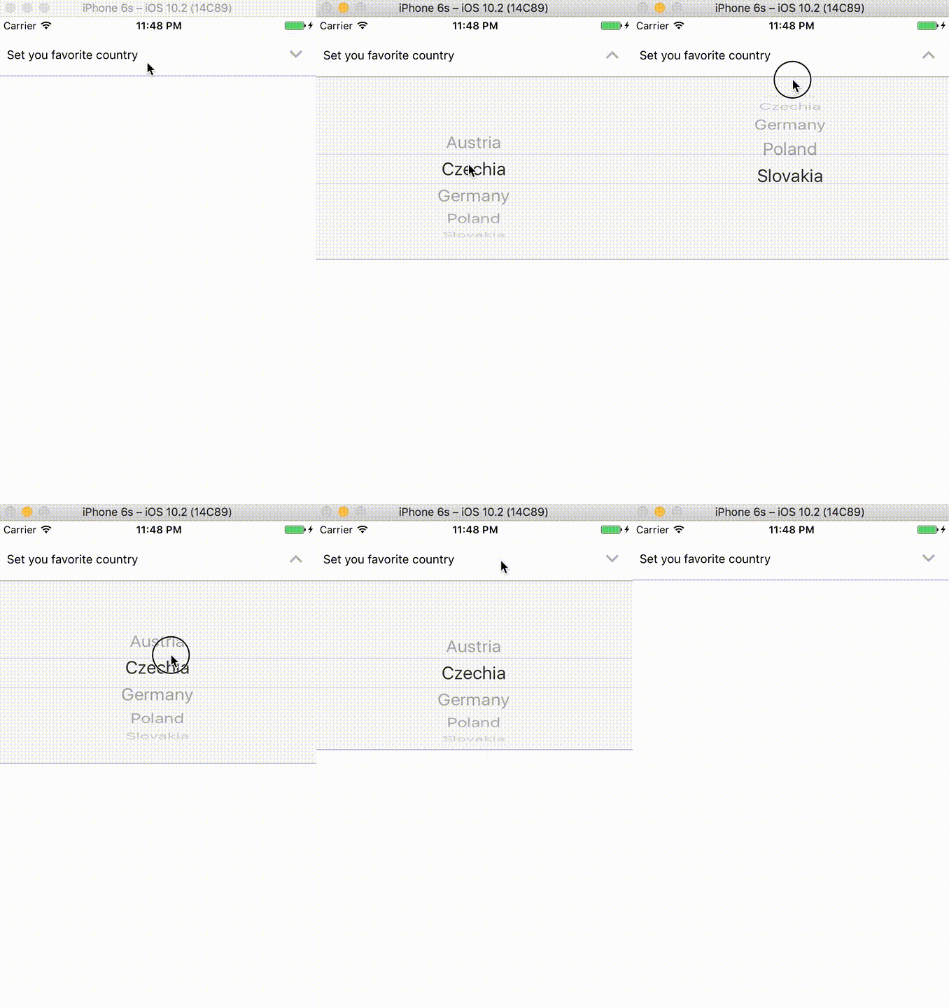
React Native Toggle Picker is easy wrapper for React Native Picker. It has better user experience on iOS.
TogglePickermust be surrounded withScrollView(not as the closest parent)- Works also on Android but there are no toggle effect (it's not according UX guidelines)
- PRs welcome
Demo

Installation
npm i react-native-toggle-picker --saveor
yarn add react-native-toggle-picker --saveUse
import TogglePicker from 'react-native-toggle-picker'

...

<ScrollView style={styles.container}>
  <View style={{flex: 1, marginTop: 20}}>
    <ScrollView style={styles.container}>
      <TogglePicker
        selectedValue='CZ'
        label='Set you favorite country'
        onValueChange={() => {this.handleChange}}
      >
        <Picker.Item label='Austria' value='A' />
        <Picker.Item label='Czechia' value='CZ' />
        <Picker.Item label='Germany' value='DE' />
        <Picker.Item label='Poland' value='PL' />
        <Picker.Item label='Slovakia' value='SLO' />
      </TogglePicker>
    </ScrollView>
  </View>
</ScrollView>
Props
| Prop name | Default prop | Required | Note |
|---|---|---|---|
androidBoxStyle | {} | - | Custom styles |
androidPickerStyle | {} | - | Custom styles |
androidPickerWrapperStyle | {} | - | Custom styles |
arrowColor | rgb(178, 178, 178) | - | - |
arrowSize | 30 | - | - |
arrowDownType | 'keyboard-arrow-down' | - | Icon name fromreact-native-vector-icons/MaterialIcons |
arrowUpType | 'keyboard-arrow-up' | - | Icon name fromreact-native-vector-icons/MaterialIcons |
expanded | false | - | Boolean if box should be expanded or not |
iosBoxStyle | {} | - | Custom styles |
iosPickerStyle | {} | - | Custom styles |
iosPickerWrapperStyle | {} | - | Custom styles |
onValueChange | - | Yes | Prop from RNPicker (expects func) |
label | - | Yes | Left label on the left of title |
selectedValue | - | Yes | Prop from RNPicker (expects any) |
value | null | - | Value on the right title |