react-native-tooltip-mroads v1.0.10
React Native ToolTip

react-native-tooltip is a light weight library that provides functionality to add a tooltip for any element. A tooltip is used to specify extra information about something when the user clicks over an element. The direction of the tooltip can be configured based on the parameter passed to the component. This is an independent package.
The package exports Overlay and ToolTip components.
Overlay component covers the entire viewport and shows the tooltip content over it, by calculating the position based on the direction. The Overlay component has to be placed at the top level in the application or in the root navigator.
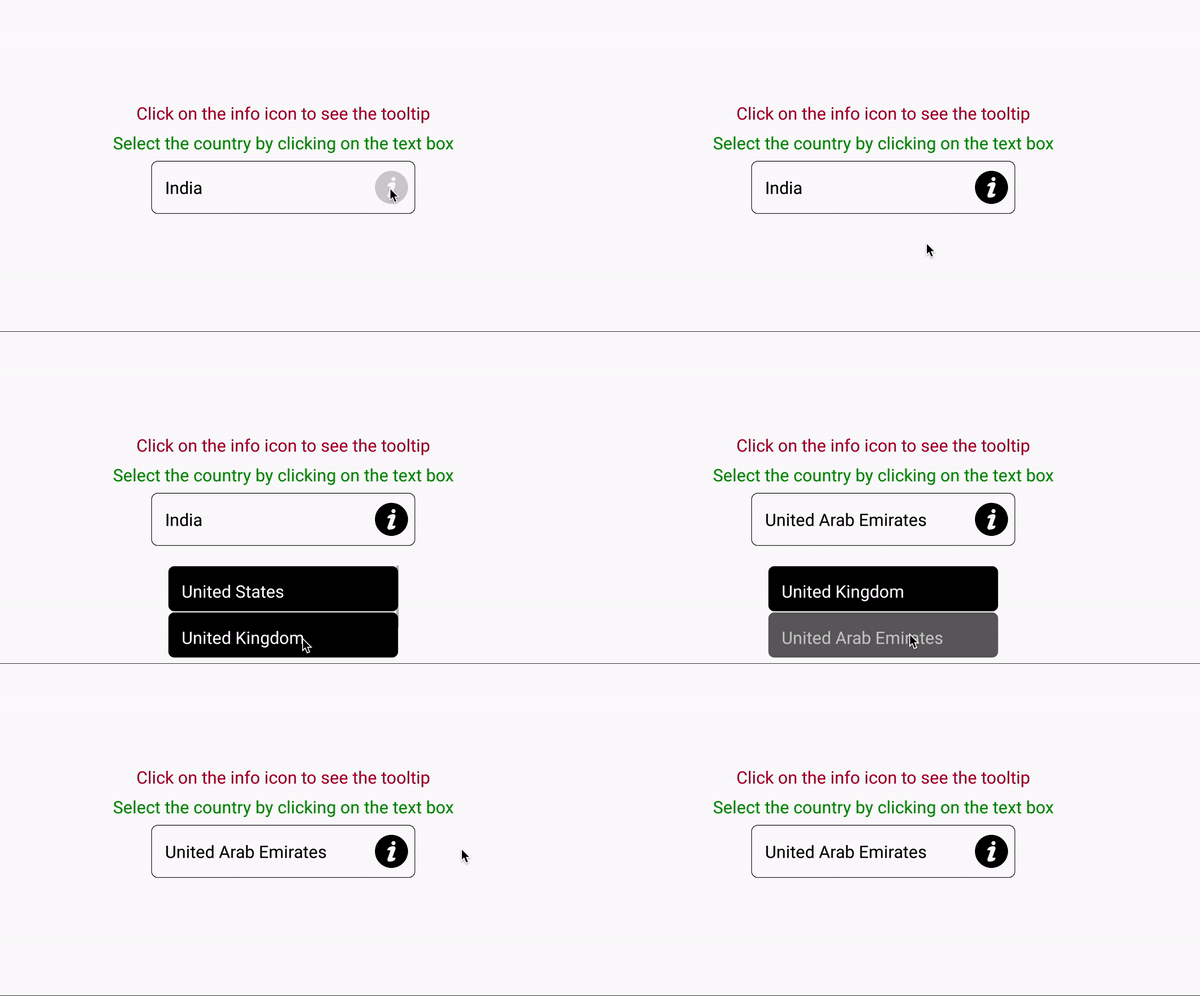
Tooltip takes the content and direction parameters to display the corresponding content on clicking over the element. The content is displayed based on the different directions passed to the component: right, bottom.
Setup
Installation
$ npm install react-native-tooltip-mroads --save
or
$ yarn add react-native-tooltip-mroads
Props
Tooltip takes the below props for implementation.
| Prop | Default | Mandatory | Type | Description |
|---|---|---|---|---|
| content | null | Yes | React Node | Children or content to be shown |
| direction | bottom | No | String | Direction where tooltip data is to be displayed |
Directions Supported
| right | bottom |
|---|
Example
import React from 'react';
import {View, Text, StyleSheet, FlatList, TouchableOpacity, Image} from 'react-native';
import {Overlay, Tooltip} from 'react-native-tooltip-mroads';
import infoImage from './assets/information.png';

const styles = StyleSheet.create({
  //styles for the screen
});

class MainApp extends React.Component {
  state = {
    selectedCountry: 'India',
  };

  setSelectedCountry = country => {
    this.setState({selectedCountry: country});
  };


  renderCountryTooltip = () => {
    //code to render country list as a tooltip
  };

  renderIconTooltip = () => {
    //code to be render text as a tooltip
  };

  render() {
    const {selectedCountry} = this.state;
    return (
        <View style={styles.outerContainer}>
            <Overlay />
            <View style={styles.container2}>
                <Tooltip content={this.renderIconTooltip()} direction="right">
                    <View>
                        <Image source={infoImage} style={styles.imageStyle} resizeMode="contain" />
                    </View>
                </Tooltip>
            </View>
            <View style={styles.container}>
                <Tooltip content={this.renderCountryTooltip()}>
                    <View style={styles.textInputContainer}>
                        <Text style={styles.textInput}>{selectedCountry}</Text>
                    </View>
                </Tooltip>
            </View>
      </View>
    );
  }
}

export default MainApp;
The above example illustrates the usage of Tooltips. The overlay has to be placed at the top level in the application or in the root navigator. The view to be rendered by default is passed as children to Tooltip component. On clicking the icon or text input, an overlay is created which shows the tool tip (content passed to the Tooltip component) either on the right or bottom of the of the element (based on the direction passed to the Tooltip component).