react-navigation-side-tabs v0.0.7
react-navigation-side-tabs
Implements same navigation concepts as @react-navigation with some changes to support side navbar, with fully functional links and support for several methods already well documented into their docs
Support
| EmulatorAndroid | DeviceAndroid | EmulatoriOS | DeviceiOS | SimulatorWeb |
|---|---|---|---|---|
| ❓ | ✅ | ✅ | ❓ | ✅ |
Instalation
React-navigation-side-tabs depends into the @react-navigation package as mentioned above, i've tryed to keep as many support i could for the same properties. We can disscuss improvements and new properties
$ yarn add react-navigation-side-tabs
or
$ npm install react-navigation-side-tabs --save
Implementation
I've implemented two basic projects, one of them is using bottom-navigation and other that only uses this package.
You can download and try yourself the package working, here's a basic implementation
import React from 'react';

import { createSideTabNavigator } from './index'
import Home from '../../screens/HomeScreen';
import Link from '../../screens/LinksScreen';
import { Ionicons } from '@expo/vector-icons';

const Tab = createSideTabNavigator();

const App = () => {
  return (
    <Tab.Navigator
      initialRouteName="LinkScreen"
      tabBarOptions={{
        activeTintColor: '#e91e63',
        iconHorizontal: true,
        iconSize: 32,
        labelSize: 32,
        showLabel: true,
        tabWidth: 130
      }}
    >
      <Tab.Screen
        name="Home"
        component={Home}
        options={{
          title: 'Home Test',
          tabBarLabel: 'Home',
          titleIcon: () => (
            <Ionicons name="md-home" color={'#000'} size={20} />
          ),
          tabBarIcon: ({ color, size, focused }) => (
            <Ionicons name="md-home" color={color} size={size} />
          ),
        }}
      />
      <Tab.Screen
        name="LinkScreen"
        component={Link}
        options={{
          tabBarLabel: 'Updates sada dasdas',
          titleIcon: () => (
            <Ionicons name="md-home"  color={'#000'} size={20} />
          ),
          tabBarIcon: ({ color, size, focused }) => (
            <Ionicons name="md-home" color={color} size={size} />
          ),
        }}
      />
    </Tab.Navigator>
  );
}


export default App
Important properties
Some of these properties already ued into the navigation package, but here they have some special use cases that need a special attention
Tab.Navigator.iconHorizontal
Defines if the the orientation of the icons and their labels, defaults for horizontal,
<Tab.Navigator
  tabBarOptions={{
    iconHorizontal: true
  }}
>
  ...
</Tab.Navigator>
Tab.Navigator.iconSize
You can customize each icon size directly into the component passed to the Navigator component, but i recommend using this property because we apply some validations and treatment using the iconSize to guarantee the labels width doesn't overflow the side panel.
<Tab.Navigator
 tabBarOptions={{
   iconSize: 32
 }}
>
 ...
</Tab.Navigator>
Tab.Navigator.labelSize
Defines the fontSize of the labels located into the side panel, you may don't need this if you configure only to show icons
<Tab.Navigator
 tabBarOptions={{
   labelSize: 12
 }}
>
 ...
</Tab.Navigator>
Tab.Navigator.showLabel
Defines if the render only icons or also respectivelly labels
<Tab.Navigator
 tabBarOptions={{
   labelSize: 12
 }}
>
 ...
</Tab.Navigator>
Tab.Navigator.tabWidth
By default, the sidetab width gonna be directly related to the iconSize if any value given, you configure your own width also.
<Tab.Navigator
 tabBarOptions={{
   tabWidth: 160
 }}
>
 ...
</Tab.Navigator>
Tab.Screen.title
Used to define the title in each screen, currently notsupporting stack navigation
<Tab.Navigator>
 <Tab.Screen
   options={{
     title: 'Home Title Screen'
   }}
 >
   ...
 </Tab.Screen>
</Tab.Navigator>
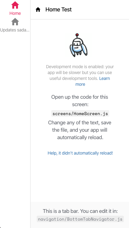
Example web screen-shot

Roadmap
- Implement TS Support (Even using the base TS method from navigation, i've optioned to use vanillaJS because i don't quite familiar yet with TS, any help is well received!)
- Give more support for Header implementation
- Implements Eslint
- Redeploys npm package
- Create zeit.co web demos