react-open-weather-map-widget v1.0.2
Open-Weather-Map Widget
Welcome!
This is a widget showing weather information queried from the open weather map api written in react.
By default it shows the general weather condition, the temperature, the pressure and the humidity of a city you put into the search input.
If something doesn’t work, please file an issue. If you have questions or need help, please ask in GitHub Discussions.
Installation
npm i react-open-weather-map-widgetGet Started
!!Before you start you need to create an account on Open Weather Map and generate an API Key!!
After downloading the package import the weather widget component and use it.
You'll need to pass the API Key as a prop to the component. The prop is called appid.

Example
to quickly try out this component:
npx create-react-app example --template=typescriptthen change the App.tsx return to:
    <div style={
      {
        height: '800px',
        width: '800px',
        display: 'flex',
        justifyContent: 'center',
        alignItems: 'center',
        alignContent: 'center',
        background: '#302e38'
      }
    }>
      <WeatherWidget
        appid='d52d13ab21c51cf8be7c1714ad517494'
        defaultCity='Monaco'
        theme='dark'
      />
    </div>
and from the root of the app run npm run start.
The component will take the full width of the parent that's why I added the wrapper in the example
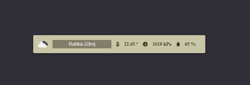
You should see this view:
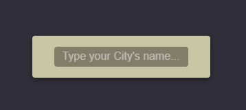
The widget indicates that 's it;s fetching data by a spinner on the right of the input field like so:

If you don't set the appid prop or your API key is invalid you will see and error icon and on hover you'll see an error message like in this example:

Customization
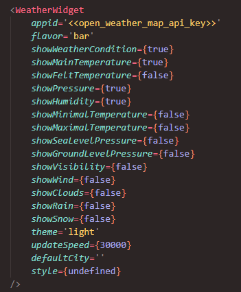
You can customize the widget by setting optional props:
The flavor prop decides about the view of the widget. You can choose either card or bar. Bar is set by default. Check the Styling section to learn more about the views.
You can choose one of the preset themes by setting theme to light or dark or you can create your custom theme and pass it to the style prop. Check the Styling section to learn more about the themes.
You can set a default city as auto fill to the input by setting the defaultCity prop.
You can alter the update speed of the widget which is set by default to 30 seconds by setting the updateSpeed prop.
You can set boolean flags to change the weather data that will be shown by the widget. Each section will show only if it's corresponding data is available in the fetch response!
There are 14 sections that you can show/hide in total. Here's the list with their default values:
    showWeatherCondition = true
    showMainTemperature = true
    showFeltTemperature = false
    showPressure = true
    showHumidity = true
    showMinimalTemperature = false
    showMaximalTemperature = false
    showSeaLevelPressure = false
    showGroundLevelPressure = false
    showVisibility = false
    showWind = false
    showClouds = false
    showRain = false
    showSnow = false
Styling
There are two main customization options you can set.
The first one is the flavor. You can choose to have the widget show as a card or a bar.

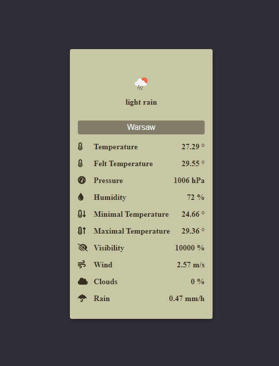
The second choise is choosing the theme. The images above show when the default theme is set so light. Here's an example of the dark theme:
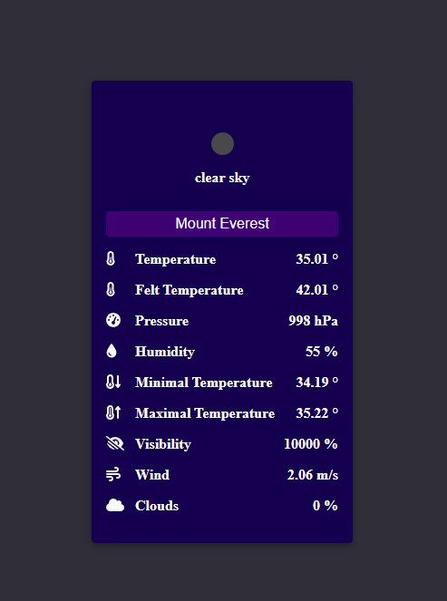
You can create your own theme by passing a styling object to the style prop.
It must implement this interface:
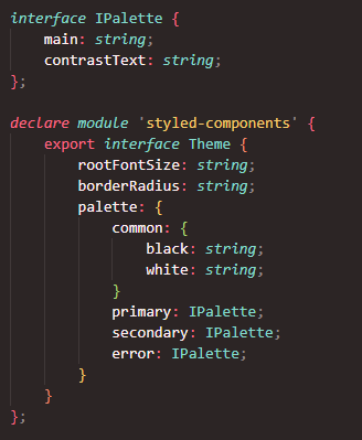
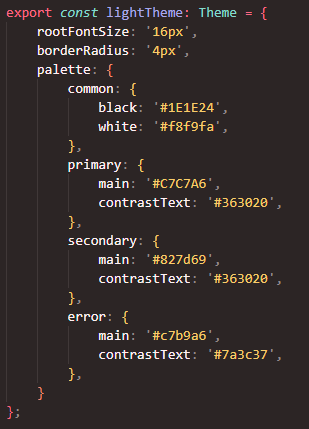
Here's the dark theme as an example:
