0.0.11 • Published 3 years ago
react-overlap v0.0.11
React Overlap

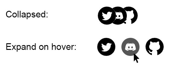
react-overlap is a React component that creates a hover effect where images or SVG graphics overlap each other. Use this component is to display logos or icons in a compact space that expands on hover.
Demo
https://react-overlap.on.fleek.co/
Installation
npm install react-overlapyarn add react-overlapUsing SVG Images
import React from 'react';
import { OverlapHover, OverlapHoverSvg } from 'react-overlap';

import DiscordSvg from './img/svg/Discord.svg';
import GithubSvg from './img/svg/Github.svg';
import TwitterSvg from './img/svg/Twitter.svg';

const logoData = [
  {
    svg: GithubSvg,
    href: 'https://github.com/givepraise/praise',
    alt: 'Github',
  },
  {
    svg: DiscordSvg,
    href: 'https://discord.gg/U2ydzXBG6C',
    alt: 'Discord',
  },
  {
    svg: TwitterSvg,
    href: 'https://twitter.com/givepraise',
    alt: 'Twitter',
  },
];

const App = () => {
  return (
    <OverlapHover size={30} spacing={10} overlap={0.4} direction="left">
      {logoData.map((data, index) => (
        <OverlapHoverSvg
          key={index}
          alt={data.alt}
          href={data.href}
          className="opacity-100 hover:opacity-70" // Optional, tailwind example
          svg={data.svg}
        />
      ))}
    </OverlapHover>
  );
};

export default App;
Using PNG Images
import React from 'react';
import { OverlapHover, OverlapHoverImage } from 'react-overlap';

import DiscordPng from './img/png/Discord.png';
import GithubPng from './img/png/Github.png';
import TwitterPng from './img/png/Twitter.png';

const logoData = [
  {
    img: GithubPng,
    href: 'https://github.com/givepraise/praise',
    alt: 'Github',
  },
  {
    img: DiscordPng,
    href: 'https://discord.gg/U2ydzXBG6C',
    alt: 'Discord',
  },
  {
    img: TwitterPng,
    href: 'https://twitter.com/givepraise',
    alt: 'Twitter',
  },
];

const App = () => {
  return (
    <OverlapHover size={30} spacing={10} overlap={0.4} direction="right">
      {logoData.map((data, index) => (
        <OverlapHoverImage
          key={index}
          alt={data.alt}
          href={data.href}
          className="opacity-100 hover:opacity-70" // Optional, tailwind example
          src={data.img}
        />
      ))}
    </OverlapHover>
  );
};

export default App;
Animation direction
To change the direction of the animation, pass the direction prop with either "left" or "right" (default is "right").
<OverlapHover direction="left">
  // Your OverlapHoverImage or OverlapHoverSvg components
</OverlapHover>
Dark Mode
The OverlapHover component supports dark mode, which can be enabled by setting the darkMode prop to true. When dark mode is enabled, the component will invert the colors of the images or SVGs to provide better contrast and visibility against a dark background.
To enable dark mode, simply pass the darkMode prop to the OverlapHover component:
<OverlapHover darkMode={true}>
  // Your OverlapHoverImage or OverlapHoverSvg components
</OverlapHover>
OverlapHover Props
| Prop | Type | Default | Description |
|---|---|---|---|
| direction | string | "right" | The direction of the animation on hover. Can be "left" or "right" |
| size | number | 25 | The size of the images or SVGs in pixels |
| spacing | number | 16 | The spacing between images or SVGs in pixels |
| overlap | number | 0.33 | The overlap percentage |
| darkMode | bool | false | Whether to enable dark mode or not. By default, darkmode inverts the colours of the images. |
License
MIT