
react-pic-gallery
Small, accessible React image gallery and lightbox with a polished default UI and typed escape hatches for custom controls.

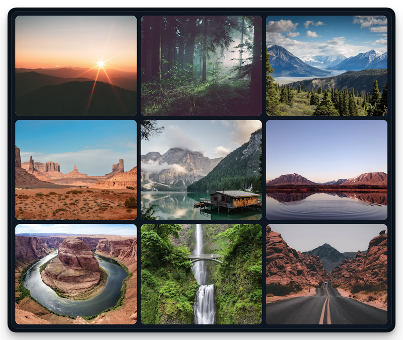
Install
npm install react-pic-gallerypnpm add react-pic-gallery
yarn add react-pic-gallery
bun add react-pic-galleryReact 18.3+ and React 19 are supported. The Quick start docs provide these commands in a package-manager switcher.
The package is intentionally lightweight: it has no runtime dependencies and React is a peer dependency. The built JavaScript and CSS together are about 8.5 KB gzipped (6.13 KB JS + 2.34 KB CSS).
Why react-pic-gallery
- Tiny by design — no runtime dependencies, no context providers, no polyfills; ~8.5 KB gzipped total.
- Simple by default — one component, one stylesheet import, sensible accessible defaults.
- Yours when needed — typed
renderActions,renderCaption, andrenderControlscallbacks let you add custom UI without rebuilding the lightbox; extra fields on your image objects flow through fully typed. - Accessible — native modal
<dialog>, focus containment and restoration, Escape to close, screen-reader announcements,prefers-reduced-motionsupport. - Keyboard and touch friendly — arrow-key navigation in the grid (roving tabindex) and in the lightbox, Enter to open, swipe navigation on touch devices.
- Themeable — namespaced classes and CSS variables (
--gallery-accent,--gallery-overlay,--gallery-motion, …). - Three layouts — choose a uniform grid, proportional justified rows, or an editorial mosaic.
Quick start
import { PicGallery } from 'react-pic-gallery'
import 'react-pic-gallery/styles.css'

const images = [
  {
    src: 'https://example.com/photo-large.jpg',
    thumbnailSrc: 'https://example.com/photo-thumb.jpg',
    alt: 'A mountain reflected in a lake',
    caption: 'Morning at the lake'
  }
]

export function App() {
  return <PicGallery images={images} />
}
src and alt are required. id, thumbnailSrc, caption, width, and height are optional. Image objects can include application-specific fields; those fields remain available in renderer callbacks when using TypeScript generics.
Gallery layouts
The default is the existing three-column grid. Choose another layout with layout:
<PicGallery images={images} layout='justified' />
<PicGallery images={images} layout='mosaic' />grid— consistent tiles with a configurable fixed column count.justified— proportional photos arranged in aligned rows; the final row stays left-aligned.mosaic— alternating featured photos and smaller supporting tiles.
Image width and height are recommended, but optional. Justified rows use them when supplied and fall back to 3:2 when either dimension is missing or invalid. Accurate dimensions give the most faithful layout and help reserve space while images load. rowHeight sets the tile height for the grid, the base row height for the mosaic, and the target row height for justified galleries. columns applies to the grid only.
Custom UI
Add actions without rebuilding the lightbox:
<PicGallery
  images={images}
  renderActions={({ image }) => (
    <button type='button' onClick={() => saveImage(image)}>
      Save
    </button>
  )}
/>
Every renderer receives:
{
  image,
  index,
  count,
  close,
  next,
  previous,
  canGoNext,
  canGoPrevious
}
Use renderCaption to replace the caption, or renderControls to replace the complete default control layer. When renderControls is provided, your controls are responsible for rendering close and navigation actions.
Standalone components
Use the thumbnail grid and lightbox separately when your application owns selection state:
import { useState } from 'react'
import { Gallery, Lightbox } from 'react-pic-gallery'

export function CustomViewer({ images }) {
  const [index, setIndex] = useState<number | null>(null)

  return (
    <>
      <Gallery images={images} onImageClick={setIndex} />
      <Lightbox images={images} index={index} onIndexChange={setIndex} />
    </>
  )
}
Lightbox behavior
The lightbox uses the native modal <dialog> element and includes:
- Keyboard navigation, Escape-to-close, focus containment, and focus restoration.
- Backdrop closing with stable page width while scrolling is locked.
- Native lazy loading for thumbnails and explicit image loading/error states.
- Horizontal swipe navigation on touch devices.
- Instagram-Stories-style edge taps on touch screens: tap the right edge of the image to go forward, the left edge to go back (navigation buttons are hidden on small screens where tap zones take over).
- Reduced-motion support, safe-area padding, rounded image surfaces, and animated transitions.
Gallery tiles use roving focus. Left/Right follow image order; in the grid, Up/Down jump a row, and in justified and mosaic layouts they follow the nearest tile position. Home/End move to the first/last image. Enter opens the lightbox, and focus returns to the same tile when it closes.
Native modal behavior targets modern browsers: Chrome 37+, Edge 79+, Firefox 98+, and Safari/iOS 15.4+. The package does not ship a dialog polyfill.
Styling
The stylesheet uses namespaced classes and CSS variables. Import it once, then override variables globally or on the lightbox class:
:root,
.react-pic-gallery__lightbox {
  --gallery-accent: #ff7a59;
  --gallery-overlay: rgba(10, 10, 14, 0.98);
  --gallery-control-size: 3rem;
  --gallery-motion: 240ms;
}
The default grid uses three columns. Pass columns for a different fixed count. rowHeight accepts CSS height values or numeric pixels; its meaning depends on the selected layout as described above.
API
PicGallery
| Prop | Type | Description |
|---|---|---|
images |
readonly GalleryImage[] |
Images to display. |
layout |
'grid' | 'justified' | 'mosaic' |
Defaults to 'grid'. |
columns |
number |
Optional fixed grid column count. Defaults to three; only applies to grid. |
rowHeight |
CSSProperties['height'] |
Grid tile height, mosaic base row height, or justified target row height. |
renderActions |
LightboxRenderer |
Adds controls to the default toolbar. |
renderCaption |
LightboxRenderer |
Replaces the current caption. |
renderControls |
LightboxRenderer |
Replaces the complete default control layer. |
showCounter |
boolean |
Shows the current image count. Defaults to true. |
showNavigation |
boolean |
Shows previous/next controls. Defaults to true. |
Gallery accepts images, onImageClick, layout, columns, rowHeight, className, and style.
Lightbox accepts images, controlled index, onIndexChange, the renderer props, showCounter, showNavigation, and className.
Migrating from v1
v2 intentionally removes the old configuration and external lightbox workaround.
| v1 | v2 |
|---|---|
imgList |
images |
fullSrc |
src |
thumbnailSrc |
thumbnailSrc |
description |
caption |
| default import | named PicGallery import (default import remains available) |
options.picsPerRow |
columns |
options.rowHeight |
rowHeight |
topCustomContent / bottomCustomContent |
renderActions, renderCaption, or renderControls |
externalLightbox / setExtLightboxChildren |
controlled Lightbox |
customLoadComponent |
CSS overrides or your own Gallery composition |
react-zoom-pan-pinch |
removed dependency; native lightbox pinch zoom |
Before:
<PicGallery
  imgList={[{ fullSrc, thumbnailSrc }]}
  options={{ picsPerRow: 4 }}
/>
After:
<PicGallery
  images={[{ src: fullSrc, thumbnailSrc, alt: 'Description' }]}
  columns={4}
/>
The package is ESM-only in v2. Import styles.css explicitly in applications that do not automatically process CSS imported by JavaScript.
Development
Node 22.12+ is required for the Astro documentation workflow.
npm install
npm run dev
npm run dev:library
npm test
npm run typecheck
npm run build
npm run build:docs
npm pack --dry-run
npm run dev starts the Astro playground and docs site. npm run dev:library starts the standalone Vite library demo. Publishing runs the package build automatically through prepack.
License
MIT marcelrsoub