1.0.1 • Published 7 years ago
react-png-flipcard v1.0.1
Install
Use in bash CLI:
$ npm install --save react-png-flipcard
Showcase

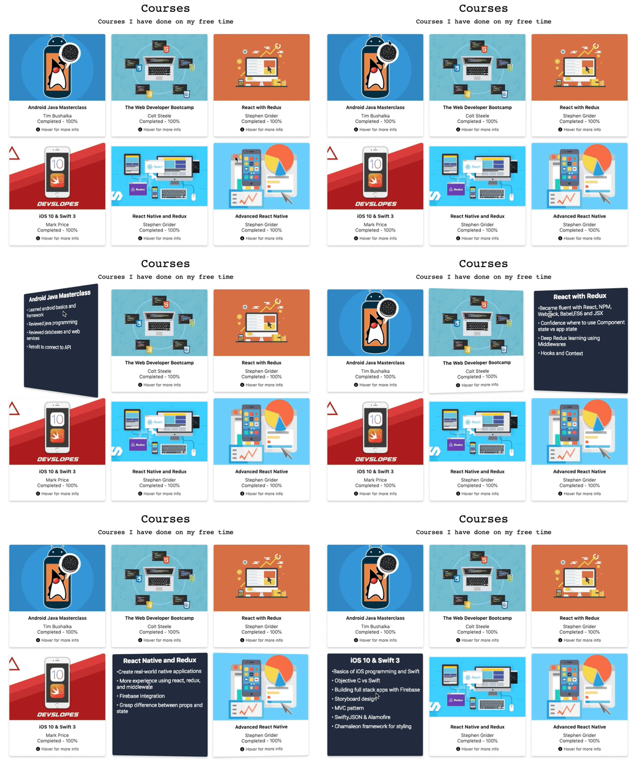
React Plug-N'-Go Flipcard
Renders a card that provides animation to transition between its front and back JSX. The animation is activated on Hover.
Instructions
- literally, just plug and go.
- import FlipCard from "react-png-flipcard";
- declare the component and pass the required props (front, back, direction, height, width) look below for more details.
- style front and back as you wish using the frontClass and backClass props.
Features
- Nice animation transition between front and back of the card.
Props
| Props | Functionality | Default | Data Type |
|---|---|---|---|
front | this props receive JSX to be rendered on the front of the card. Look down for examples on how to do it. | Front here | JSX |
back | this props receive JSX to be rendered on the back of the card. Look down for examples on how to do it. | back here | JSX |
width | Width of the card | 300 | number |
height | height of the card | 300 | number |
direction | flip direction | "horizontal" | string |
flipSpeed | Speef of flip animation, in ms | 600ms | number (ms) |
style | style object to customize the card | NA | object |
containerClass | CSS class to style the card | NA | css class |
manual | Boolean that set animation to be on action (for example on click) this is good to be managed by a state | NA | boolean |
flip | Boolean state that keeps track of wether card is flipped or not | False | boolean |
frontStyle | style object to customize the front of the card | NA | object |
backStyle | style object to customize the back of the card | NA | object |
frontClass | CSS class to style the front of the card | NA | css class |
backClass | CSS class to style the back of the card | NA | css class |
margin | Number to set margin | NA | number |
Usage
For React.js version ^16.8
Uses React Hooks
import FlipCard from 'react-png-flipcard';For React.js version ^15.0.0
Uses React Classes to handle state
Pending...
Example
<FlipCard
  front={
    <div className="CardContent">
      <img
        src="https://images.unsplash.com/photo-1501509497947-782640bc1412?ixlib=rb-1.2.1&ixid=eyJhcHBfaWQiOjEyMDd9&auto=format&fit=crop&w=1050&q=80"
        alt="Miami"
        className="CardImage"
      />
      <h3>Miami</h3>
      <div className="HoverInfo" onClick={() => setFlip(true)}>
        <p style={{ margin: 5 }}>Click here to learn more</p>
        <i className="fas fa-arrow-right" style={{ marginTop: 7 }} />
      </div>
    </div>
  }
  back={
    <div className="CardContent">
      <ul style={{ margin: 15, marginLeft: 5 }}>
        <li>Miami, officially the City of Miami</li>
        <li>
          is the cultural, economic and financial center of South Florida.
        </li>
        <li>
          Miami is the seat of Miami-Dade County, the most populous county in
          Florida.
        </li>
      </ul>
      <div
        className="HoverInfo"
        onClick={() => setFlip(false)}
        style={{ marginLeft: 15 }}
      >
        <p style={{ margin: 5 }}>Go back</p>
        <i className="fas fa-arrow-left" style={{ marginTop: 7 }} />
      </div>
    </div>
  }
  backClass={backClass}
  frontClass={frontClass}
  margin={20}
  width={300}
  height={300}
  borderRadius={50}
  direction="horizontal"
  manual
  flip={flip}
/>
Pending
- Support for react older versions
License
MIT © jorgebaralt


