1.0.3 • Published 7 years ago
react-png-hovercard v1.0.3
Install
Use in bash CLI:
$ npm install --save react-png-hovercard
Showcase

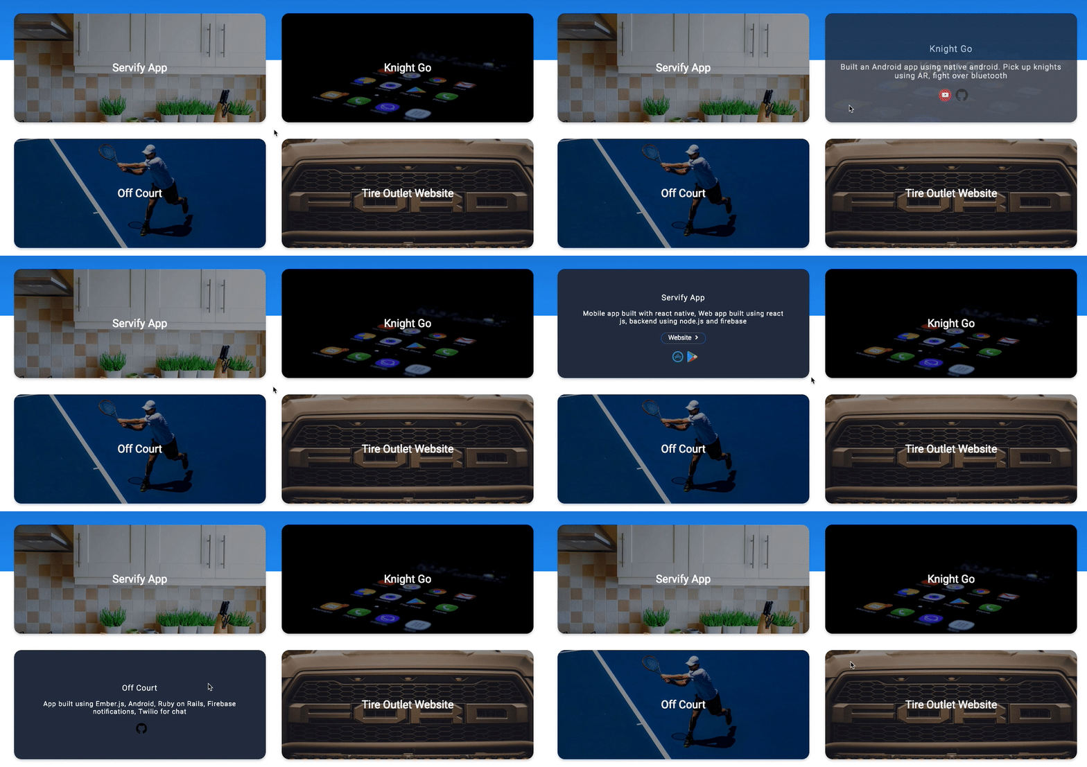
React Plug-N'-Go Hovercard
Renders a card that provides animation to transition between its front and back JSX. The animation is activated on Hover.
Instructions
- literally, just plug and go.
- import HoverCard from "react-png-hovercard";
- declare the component and pass the required props (front, back) look below for more details.
- style front and back as you wish. remember, the default border radius is 20px, so it will require to either change border radius, or add some padding to the content of your card.
Features
- Nice animation transition between front and back of the card.
Props
| Props | Functionality | Default |
|---|---|---|
front | REQUIRED, this props receive JSX to be rendered on the front of the card. Look down for examples on how to do it. | NA |
back | REQUIRED, this props receive JSX to be rendered on the back of the card. Look down for examples on how to do it. | NA |
style | style object to customize the card | NA |
className | CSS class to style the card | NA |
maxWidth | Width of the card | 100% |
animationSpeed | time in milliseconds | 250 ms |
borderRadius | border radius of the card | 20px |
heigth | height of the card | 400px |
margin | margin of the card | 0px |
Usage
For React.js version ^16.8
Uses React Hooks
import HoverCard from 'react-png-hovercard';For React.js version ^15.0.0
Uses React Classes to handle state
import { HoverCard } from 'react-png-hovercard';Example
<HoverCard
  front={
    <div className="Front">
      <img
        src="https://images.unsplash.com/photo-1498910265115-9fb541931cd1?ixlib=rb-1.2.1&ixid=eyJhcHBfaWQiOjEyMDd9&auto=format&fit=crop&w=1089&q=80"
        alt=""
        style={{ objectFit: 'cover' }}
      />
    </div>
  }
  back={
    <div className="Back">
      <p> I would do anything to be there</p>
    </div>
  }
  maxWidth={400}
  animationSpeed={500}
  height={300}
  margin={10}
/>
Pending
- Support for react older versions
License
MIT © jorgebaralt


