1.0.2 • Published 1 year ago
react-popup-cards v1.0.2
Popup Component

Overview
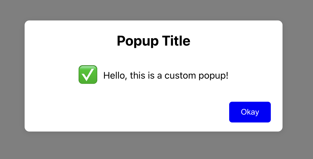
The Popup component is a customizable modal dialog for React applications. It allows you to display messages, titles, and emojis with an action button. The popup can be configured to close automatically when clicking outside of it.
Features
- Customizable title, message, and emoji
- Customizable button text, color, and background color
- Configurable width, height, and background color of the popup
- Option to auto-close the popup on outside click
- Callback function after button click
Installation
You can install the Popup component from npm:
npm i react-popup-cardsUsage
Import the Popup component:
import { PopupCard } from 'react-popup-cards';Use the Popup component in your application:
const App = () => {
  return (
    <div>
      <PopupCard
        message="Your custom message"
        title="Your custom title"
        emoji="✅"
        buttonText="Close"
        width="400px"
        height="250px"
        bgColor="#f0f0f0"
        buttonColor="#fff"
        buttonBgColor="#007bff"
        autoCloseOnOutsideClick={true}
        afterNavigation={() => console.log('Button clicked!')}
      />
    </div>
  );
};

export default App;
Props
| Prop | Type | Default | Description |
|---|---|---|---|
message | string | "Default message" | The message displayed in the popup. |
title | string | "Default title" | The title displayed at the top of the popup. |
emoji | string | "✅" | The emoji displayed to the left of the message. |
afterNavigation | function | undefined | Callback function invoked after the button is clicked. |
buttonText | string | "OK" | The text displayed on the button. |
width | string | "300px" | The width of the popup. |
height | string | "200px" | The height of the popup. |
bgColor | string | "#ffffff" | The background color of the popup. |
buttonColor | string | "#fff" | The text color of the button. |
buttonBgColor | string | "#0000ff" | The background color of the button. |
autoCloseOnOutsideClick | boolean | true | If true, the popup will close when clicking outside of it. |
Development
To contribute to the development of this component:
Clone the repository:
git clone https://github.com/madhurajayashanka/react-popup-card-npm.gitNavigate to the project directory:
cd react-popup-card-npmInstall the dependencies:
npm installRun the development server:
npm start
License
This project is licensed under the MIT License. See the LICENSE file for more details.