1.2.0 • Published 2 years ago
react-progressbars-with-indicator v1.2.0
react-progressbars-with-indicator
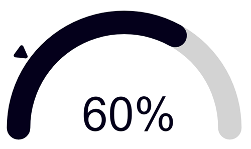
A semicircle progress bar with an indicator for React applications. Originally forked from react-semicircle-progressbar


Installation
Use the package manager npm to install react-progressbars-with-indicator.
npm install react-progressbars-with-indicatorUsage
Semicircle Progress Bar
import React from 'react';
import SemiCircleProgressWithIndicator from 'react-progressbars-with-indicator';

function App() {
  return (
      <div>
        <SemiCircleProgressWithIndicator
            percentage={80}
            indicatorPercentage={50}
            strokeWidth={10}
            strokeColor="#f00"
            indicatorColor="#f00"
        />
      </div>
  );
}

export default App;
HorizontalProgressWithIndicator
import React from 'react';
import HorizontalProgressWithIndicator from 'react-progressbars-with-indicator';

function App() {
  return (
      <div>
        <HorizontalProgressWithIndicator
            percentage={80}
            indicatorPercentage={50}
            strokeWidth={10}
            strokeColor="#f00"
            indicatorColor="#f00"
        />
      </div>
  );
}

export default App;
Properties
SemiCircleProgressWithIndicator
| Property | Type | Description |
|---|---|---|
| strokeWidth | number | The width of the progress bar line in pixels |
| strokeLinecap | "butt" | "round" | "square" | The type of end cap for the progress bar line ("butt", "round", or "square") |
| percentage | number | The percentage of the progress bar filled |
| indicatorPercentage | number | The position of the indicator along the progress bar (null value hides indicator) |
| percentageSeparator | string | The separator to use between the percentage and label text (default is "of") |
| strokeColor | string | The color of the progress bar line in hex |
| indicatorColor | string | The color of the indicator in hex |
| indicatorRelativeSize | number | The size of the indicator relative to the stroke width of the progress bar line |
| includeText | boolean | The text indicating percentage complete of the progress bar |
| fontStyle | { fontSize: string, fontFamily: string, fontWeight: string, fill: string } | The style of the label text |
| hasBackground | boolean | The background of the progress bar |
| bgStrokeColor | string | The color of the progress bar background line in CSS |
HorizontalProgressWithIndicator
| Property | Type | Description |
|---|---|---|
| strokeWidth | number | The width of the progress bar line in pixels |
| strokeLinecap | "butt" | "round" | "square" | The type of end cap for the progress bar line ("butt", "round", or "square") |
| percentage | number | The percentage of the progress bar filled |
| indicatorPercentage | number | The position of the indicator along the progress bar (null value hides indicator) |
| strokeColor | string | The color of the progress bar line in hex |
| indicatorColor | string | The color of the indicator in hex |
| indicatorRelativeSize | number | The size of the indicator relative to the stroke width of the progress bar line |
| customText | string | Custom text that is displayed inside the progress bar |
| textPosition | 'start' | 'end' | 'middle' | The position of the custom text inside the progress bar |
| fontStyle | { fontFamily: string, fontWeight: string, fill: string } | The style of the label text |
| hasBackground | boolean | The background of the progress bar |
| bgStrokeColor | string | The color of the progress bar background line in CSS |
Testing (development only)
This project has Storybook installed for testing purposes. To run the storybook, use the following command:
npm run storybookNote that storybook only works in this repository - it is not available in the npm package.