react-qsm v1.2.0
React Quick-Select Menu
Light-weight quick-select menu with fuzzy search. Inspired by the vs-code command palette.

Table of Contents
Usage
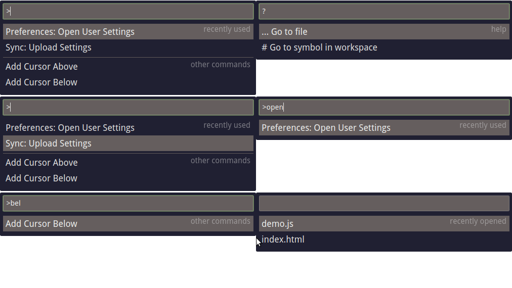
The code below creates the demo you see above.
import React, { Component } from 'react';
import ReactDOM from 'react-dom';
import QuickSelectMenu from 'react-qsm';
import './react-qsm.css';

const sections = [
  {
    label: 'recently opened',
    items: [{ label: 'demo.js' }, { label: 'index.html' }]
  },
  {
    prefix: '>',
    label: 'recently used',
    items: [{ label: 'Preferences: Open User Settings' }, { label: 'Sync: Upload Settings' }]
  },
  {
    prefix: '>',
    label: 'other commands',
    items: [{ label: 'Add Cursor Above' }, { label: 'Add Cursor Below' }]
  },
  {
    prefix: '?',
    label: 'help',
    items: [{ label: '... Go to file' }, { label: '# Go to symbol in workspace' }]
  }
];

const onMenuItemSelect = item => console.log(item);

ReactDOM.render(
  <QuickSelectMenu defaultValue=">" onMenuItemSelect={onMenuItemSelect} menuSections={sections} />,
  document.getElementById('root')
);
Installation
yarn add react-qsm or npm install --save react-qsm
Props
| Prop | Type | Required | default | Description |
|---|---|---|---|---|
| menuSections | arraymenuSection | ✓ | Array of menuSections. These contain all of the data for the menuItems as well. | |
| onMenuItemSelect | function | Callback to fire when a menu item is selected. A menuItem will be passed into this callback as the only argument. | ||
| onMenuItemFocus | function | Callback to fire when a menu item is focused. A menuItem will be passed into this callback as the only argument. | ||
| defaultValue | string | '' | Initial text value of the input. If provided, this would likely be a section prefix. | |
| maxItemsToDisplay | number | Infinity | Maximum number of items to display in the quick select menu at once . | |
| renderInput | function | Custom input to render. If this prop is specified, you MUST also make use of the value prop(see below) and pass along the given props to the callback function of renderInput for react-qsm to function properly. IE: renderInput={props => <input {...myProps} {...props} />} | ||
| value | string | if renderInput is specified | The current value of the custom input supplied to renderInput. This should only be used when rendering a custom input. |
| className | string | | 'react-qsm' | Class name for the menu wrapper (div) | | inputClassName | string | | 'qsm-input' | Class name for the menu input (input) | | menuSectionWrapperClassName | string | | 'qsm-menu-sections-wrapper' | Class name for the menu sections wrapper (div) | | menuSectionClassName | string | | 'qsm-menu-section' | Class name for a menu section (div) | | menuSectionLabelClassName | string | | 'qsm-menu-section-label' | Class name for a menu label (h2) | | menuItemClassName | string | | 'qsm-menu-item | Class name for a menu item (li) |
menuSection Properties
| Prop | Type | Required | Description |
|---|---|---|---|
| items | arrayobject | ✓ | Array of item objects, which will be passed to onMenuItemSelect when selected. The only required property in these objects is label, but you can put whatever you want in here (ie id). |
| label | string | A label to display for your section. | |
| prefix | string | A prefix to match at the beginning of the input field in order to display this section. If a prefix for a section is provided, the input box must match the prefix to display this section. If a prefix is provided for any section, sections without a prefix will not match when the input box matches the provided prefix. |
Styling
- There is a minimal and clean stylesheet to get you on your feet quickly located at react-qsm/src/react-qsm.css.
- If you have questions on ways to import a stylesheet, consult the documentation of your build system.
Future Plans
- Ability to add components to both the left and right side of a menu item. This would allow things like icons to be displayed next to a label.