react-radio-lab
React-radio-lab is a react component library for node. It can be used with redux-form and can be readily modified and stylized. You can you the stylize the default circle buttons, or create your own buttons from html.
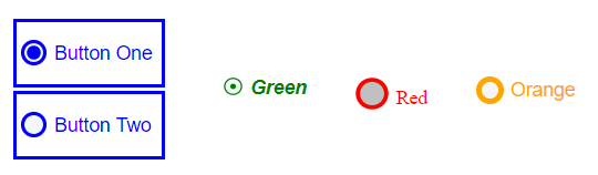
Table of Contents
- Installation
- Getting Started
- Styling the Radio Buttons
- Creating Unique Custom Buttons
- Use with Redux-Form
Installation
Install using npm:
npm install --save react-radio-labDependencies
You'll need Radium and lodash installed in your app if you don't have them already:
npm install --save radium lodashImport the RadioLab and RadioButton components to your react file:
import { RadioLab, RadioButton } from 'react-radio-lab';Getting Started
Wrap the RadioButton child components with the RadioLab component
RadioButton - Each RadioButton should have a unique value (number, string or boolean) by which it can be identified. You can also pass in a label (i.e. 'Button One').
RadioLab - Pass an onChange function as a prop, to handle changes when buttons are selected. The onChange function will receive the value of the RadioButton selected. The init prop indicated which RadioButton should be selected by default, and should be the value of the desired RadioButton.
onChange(value) {
this.setState({selectedValue: value});
}
render() {
return (
<RadioLab onChange={this.onChange} init={"one"}>
<RadioButton value={"one"}>Button One</RadioButton>
<RadioButton value={"two"}>Button Two</RadioButton>
</RadioLab>
);
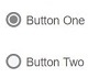
}The default (unstyled) buttons look like this:
RadioLab Props
| prop | type | required | notes |
|---|---|---|---|
| onChange | function | yes | callback for when RadioButton is selected; receives the value of the selected RadioButton |
| init | string, boolean, number | no | init should be the value of the RadioButton to be selected by default. Note, do not pass an init if using with redux-form (see below) |
RadioButton Props
| prop | type | required | Notes |
|---|---|---|---|
| value | string, boolean, number | yes | the value identifies the RadioButton and should be unique |
| style | object | no | change the style of the RadioButton, see styling, creating unique buttons, below. |
| on | function | no | Optional. Used to pass create your own unique ON (selected) button. |
| off | function | no | Optional. Used to pass create your own unique OFF (not selected) button. |
Styling the Radio Buttons
By default, the radio buttons are composed of an inner and outer circle using svg circle elements. You can override the default styles of each RadioButton by passing in an object to the style prop.
The following properties can be modified by the style prop:
innerCircle - changes the styling of the inner circle.
outerCircle - changes the styling of the outer circle.
label - changes the styling of the label
container - modify the div wrapping the label and the svg
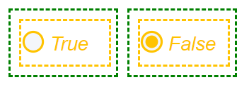
  <RadioLab onChange={this.onChange} init={false}>
    <div style={styles.inline}>
      <RadioButton value={true} style={styles.button}>
        <span><i>True</i></span>
      </RadioButton>
    </div>
    <div style={styles.inline}>
      <RadioButton value={false} style={styles.button}>
        <span><i>False></i></span>
      </RadioButton>
    </div>
  </RadioLab>
  ....
  const styles = {
    inline: {
      display: "inline-block",
      margin: '5px',
      padding: '10px',
      border: '2px dashed green',
      width: '100px'
    },
    button: {
      innerCircle: {
        r: 7,
        fill: '#FFC300',
      },
      outerCircle: {
        r: 11,
        stroke: '#FFC300',
      },
      label: {
        color: '#FFC300',
        bottom: 4,
        fontSize: 22
      },
      container: {
        border: '2px dashed #FFC300'
      },
    },
  }
The above code results in the styling shown below.
Below are summaries of the different properties for innerCircle, outerCircle, Note that you may pass in other properties than those listed below.
innerCircle Properties
| Key | Property | Default | Notes |
|---|---|---|---|
| r | circle radius | 5 | Inner radius should be less than outer radius, should be a number |
| fill | fill color | '#888' | |
| stroke | stroke color | '#888' | |
| strokeWidth | stroke width | 0 |
outerCircle Properties
| Key | Property | Default | Notes |
|---|---|---|---|
| r | circle radius | 8 | Inner radius should be less than outer radius, should be a number |
| fill | fill color | '#F4F6FA' | |
| stroke | stroke color | '#888' | |
| strokeWidth | stroke width | 2.5 |
label Properties
| Key | Property | Default | Notes |
|---|---|---|---|
| color | label color | '#5f6062' | |
| fontSize | font size | 14 | |
| fontFamily | font | 'arial' | |
| position | position | 'relative' | |
| bottom | distance from bottom of container div | 5 | |
| left | left distance | 5 |
container Properties
| Key | Property | Default | Notes |
|---|---|---|---|
| float | float | 'left' | |
| width | width | '100%' | |
| height | height | '100%' | |
| paddingTop | top padding | 10 | |
| cursor | mouseover pointer | 'pointer' |
Creating Unique Custom Buttons
RadioButton accepts two props, on and off, which can be used to create your own unique buttons. Simply pass in a function returning html tags:
 <RadioLab init={true} onChange={this.onChange.bind(this)}>
    <RadioButton value={true} on={this.on} off={this.off} style={styles.label}>True</RadioButton>
    <RadioButton value={false} on={this.on} off={this.off} style={styles.label}> False</RadioButton>
 </RadioLab>

...

//on and off should be functions like this:
on() {
  return (
    <svg height="15px" width="15px">
        <rect {...rectOuter} />
        <rect {...rectInner} />
    </svg>
  );
 }

off() {
  return (
    <svg height="15px" width="15px">
        <rect {...rectOuter} />
    </svg>
);

//style the inner rect
const rectInner = {
  fill: "orange",
  x: '3.5',
  y: '3.5',
  height: '8',
  width: '8',
}

//style the outer rect
const rectOuter = {
  x: '0',
  y: '0',
  height: '15',
  width: '15',
  stroke: '#888',
  strokeWidth: 4,
  fill: 'none'
}
The above code results in this:
Or pass in a react component:
const CustomButton = ({ label, styles }) => {
return (
<div style={styles.div}>
<span style={styles.span}>{label}</span>
</div>
);
}
...
//function returning ON button
on() {
return (
<CustomButton label="ON" styles={{div: styles.on, span: styles.span }}/>
);
};
//function returning OFF button
off() {
return (
<CustomButton label="ON" styles={{div: styles.off, span: styles.span }}/>
);
};
//styling
const styles = {
on: {
border: '2px solid blue',
background: 'orange',
height: '30px',
width: '50px',
textAlign: 'center'
},
off: {
border: '2px solid blue',
height: '30px',
width: '50px',
textAlign: 'center'
},
span: {
display: 'inline-block',
paddingTop: '5px'
},
}
...
<RadioLab init={true} onChange={this.onChange.bind(this)}>
<RadioButton value={true} on={this.on} off={this.off}></RadioButton>
<RadioButton value={false} on={this.on} off={this.off}></RadioButton>
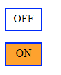
</RadioLab>Which results in:
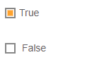
Use with Redux-Form
Add a functional component prop to the Field component in redux-form. This function should accept the props passed down by Field and pass it on to RadioLab. Note that no onChange or init props is necessary for RadioLab (though you will have to initialize the value using redux-form.
<Field
  name="RadioButtonsField"
  component={(props) => {
    return (
      <div style={{maxWidth: '90em'}}>
        <RadioLab {...props} >
          <Row>
            <Col xs={6}>
                <RadioButton value={false}>
                  <span>False</span>
                </RadioButton>
            </Col>
            <Col xs={6}>
              <RadioButton value={true}>
                <span>True</span>
              </RadioButton>
            </Col>
          </Row>
        </RadioLab>
      </div>
    );
  }}
/>