react-scrape v0.1.12
React-scrape
Re-usable react Typescript components and functions.
This project is still in its early days and in development.
Available components
- SpinnerMultiColor
- Bouncer
SpinnerMultiColor
Installation
Use the package manager npm to install react-scrape.
npm i react-scrapeBasic Usage
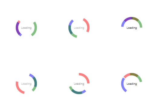
This is a customisable loading spinner. Zero config out of the box. But flexible and easy to customize.
Use case
As all spinner it`s a placeholder while data is in the process or user need to wait for any action. Mainly loading or fetching data.
// import the component and the css file provide the style.
import { SpinnerMultiColor } from 'react-scrape'; //<-- the componenet
import 'react-scrape/dist/react-scrape.cjs.development.css'; //<-- the css provide the default style

// pluge it in anywhere you need a loading spinner.
function App() {
  return (
    <div>
      <SpinnerMultiColor />
    </div>
  );
}
Output

Customize the component
You can use parameters to send additional style in to the component.
- textStyle={ }
- text={ }
- sizeStyle={ }
- firstSectionStyle={ }
- secondSectionStyle={ }
- thirdSectionStyle={ }
NOTE: If you like to change a color of a specific use the following combination.
- firstSectionStyle={{ borderTopColor: ' ' }} <-- the first segment you see is the "borderTopColor" css property.
- secondSectionStyle={{ borderLeftColor: ' ' }} <-- the second segment you see is the "borderLeftColor" css property.
- thirdSectionStyle={{ borderRightColor: ' ' }} <-- the third segment you see is the "borderRightColor" css property.
Example
// costumize the component with parameters
function App() {
  return (
    <div>
      <SpinnerMultiColor
        textStyle={{ fontSize: '1rem', fontFamily: 'Times New Roman' }}
        text={'foo'}
        sizeStyle={{ height: '110px', width: '110px' }}
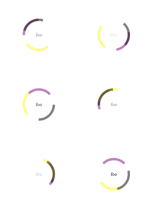
        firstSectionStyle={{ borderTopColor: 'purple' }}
        secondSectionStyle={{ borderLeftColor: 'yellow' }}
        thirdSectionStyle={{ borderRightColor: 'black' }}
      />
    </div>
  );
}
You can essentially push any additional css to the component and override its default css. Except the keyframe.
Output

Bouncer
Installation
Use the package manager npm to install react-scrape.
npm i react-scrapeBasic Usage
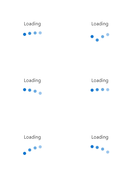
This is a customisable loading bouncer. Zero config out of the box. But flexible and easy to customize.
Use case
As all bouncer it`s a placeholder while data is in the process or user need to wait for any action. Mainly loading or fetching data.
// import the component and the css file provide the style.
import { Bouncer } from 'react-scrape'; //<-- the componenet
import 'react-scrape/src/bouncer/bouncer.css'; //<-- the css provide the default style

// pluge it in anywhere you need a loading bouncer.
function App() {
  return (
    <div>
      <Bouncer />
    </div>
  );
}
Output

Customize the component
You can use parameters to send additional style in to the component.
- text={ }
- displayText={ }
- textStyle={ }
- containerStyle={ }
- bouncerStyle={ }
NOTE: If you like to remove the text and have the bouncing elements only you have to pass the "off" string value to displayText prop. If you like to add text back just remove the displayText prop as it is.
Example
// costumize the component with parameters
function App() {
  return (
    <div>
      <Bouncer
        text={'Foo'}
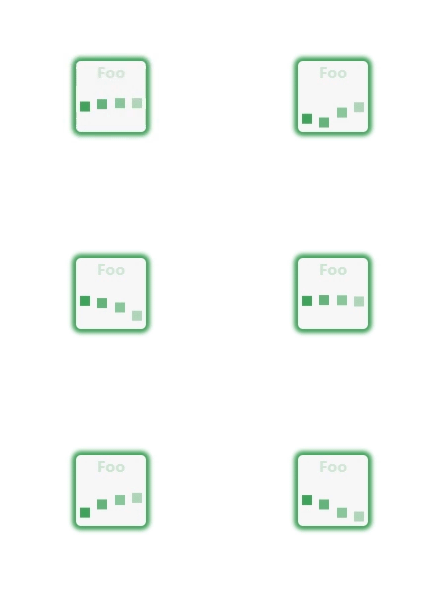
        textStyle={{ fontWeight: 'bold', color: '#40a35a' }}
        containerStyle={{
          backgroundColor: '#f7f7f7',
          boxShadow: '0px 0px 4px 4px #40a35a',
          borderRadius: '5px',
        }}
        bouncerStyle={{ backgroundColor: '#40a35a', borderRadius: '0%' }}
      />
    </div>
  );
}
You can essentially push any additional css to the component and override its default css. Except the keyframe.
Output

Example for text off
// costumize the component with parameters
function App() {
  return (
    <div>
      <Bouncer
        displayText={'off'}
        bouncerStyle={{ backgroundColor: '#40a35a', borderRadius: '0%' }}
      />
    </div>
  );
}
Output

Contributing
Info coming soon on how to contribute and what rules will be set. So please stay tuned.