react-scrollable-accordion v2.2.6
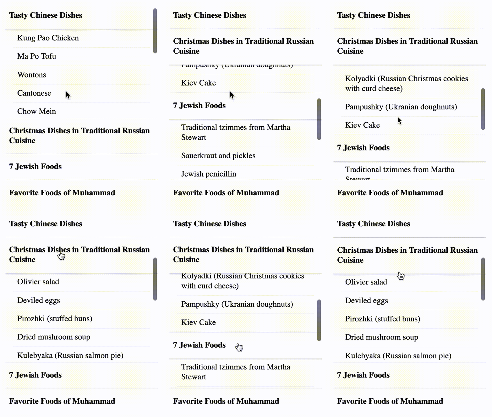
An easily designable, cross browser, basic HTML list, that allows you to define sticky list items, called headers, like this:

The purpose of this package is to provide a cross-browser alternative to the position: sticky CSS property with some improvements like scrolling the list to the beginning of section when clicking on the header;
A stickily positioned header is an element whose computed position value is sticky. It's treated as relatively positioned until the container it scrolls within crosses a specified threshold (the edge of the containing block, or previous/next header), at which point it is treated as fixed until meeting the opposite boundary.
Install
npm install react-scrollable-accordionWhy do I need this ?
- CSS position sticky attribute still doesn't have a full cross browser support.
- It's possible to have extra features, for example, specify to which side of the list the header should stick.
- With current solution it's possible to specify the design of sticked elements in different states, for example, you can set the header to have a border-bottom when it sticks to the top, and vise versa when it sticks to the bottom.
Prerequisites
React v16.8.0 and up since I'm very fancy of hooks.
Getting Started
Please find here the Live Example.
A basic list, which is almost no different from standard HTML list, although it has no visible bullet points:
import { List, ListHeader, ListItem } from "react-scrollable-accordion";

<List>
  <ListHeader key={0} className="Header">
    Header 1
  </ListHeader>
  <ListItem key={1}>Item 1</ListItem>
  <ListItem key={2}>Item 2</ListItem>
  <ListHeader key={3} className="Header">
    Header 2
  </ListHeader>
  <ListItem key={4}>Item 3</ListItem>
  <ListItem key={5}>Item 4</ListItem>
</List>;
How to change the design ?
For starters, you can apply this minimal styling:
.Header {
  background-color: white;
  cursor: pointer;
  display: block;
  font-weight: bold;
  padding: 2px 0;
}
You are free to provide custom CSS classes to a className property to all List, ListHeader, LIstItem components with any given properties, except of position attribute, which can disrupt the component behavior.
What options are available?
To convert it to accordion, pass stickyHeaders property to the List element:
import { List, ListHeader, ListItem } from "react-scrollable-accordion";

<List stickyHeaders>
  <ListHeader key={0}>Header 1</ListHeader>
  <ListItem key={1}>Item 1</ListItem>
  <ListItem key={2}>Item 2</ListItem>
  <ListHeader key={3}>Header 2</ListHeader>
  <ListItem key={4}>Item 3</ListItem>
  <ListItem key={5}>Item 4</ListItem>
</List>;
You can customize the layout by passing a string to use a DOM element via component property as we all as providing CSS class with className property:
import { List, ListHeader, ListItem } from "react-scrollable-accordion";

<List component="div" className="accordion" stickyHeaders>
  <ListHeader component="div" className="list-header" key={0}>
    Header 1
  </ListHeader>
  <ListItem component="div" className="list-item" key={1}>
    Item 1
  </ListItem>
  <ListItem component="div" className="list-item" key={2}>
    Item 2
  </ListItem>
  <ListHeader component="div" className="list-header" key={3}>
    Header 2
  </ListHeader>
  <ListItem component="div" className="list-item" key={4}>
    Item 3
  </ListItem>
  <ListItem component="div" className="list-item" key={5}>
    Item 4
  </ListItem>
</List>;
You may also customize a scroll-behavior CSS property by passing scrollBehavior property to the List component with either auto (default) or smooth values:
<List stickyHeaders scrollBehavior="smooth">
  ...
</List>
If you you'd like the headings to stick to only one side of the list, you can set the scrollTo propert to the List with one of values:
- all - stick headers to both sides of the list (default).
- bottom - stick headers to bottom only.
- top - stick headers to top only.
<List stickyHeaders stickTo="top">
  ...
</List>
Read more about scroll-behavior property.
Contributing
Pull requests are very welcome! For major changes, please open an issue first to discuss what you would like to change.
Please make sure to update tests as appropriate.
Sponsors
These services support me by providing free infrastructure.
License
6 years ago
6 years ago
6 years ago
6 years ago
6 years ago
6 years ago
6 years ago
6 years ago
6 years ago
6 years ago
7 years ago
7 years ago
7 years ago
7 years ago
7 years ago
7 years ago
7 years ago
7 years ago

