1.0.9 • Published 4 years ago
react-search-panel v1.0.9
React Search Panel
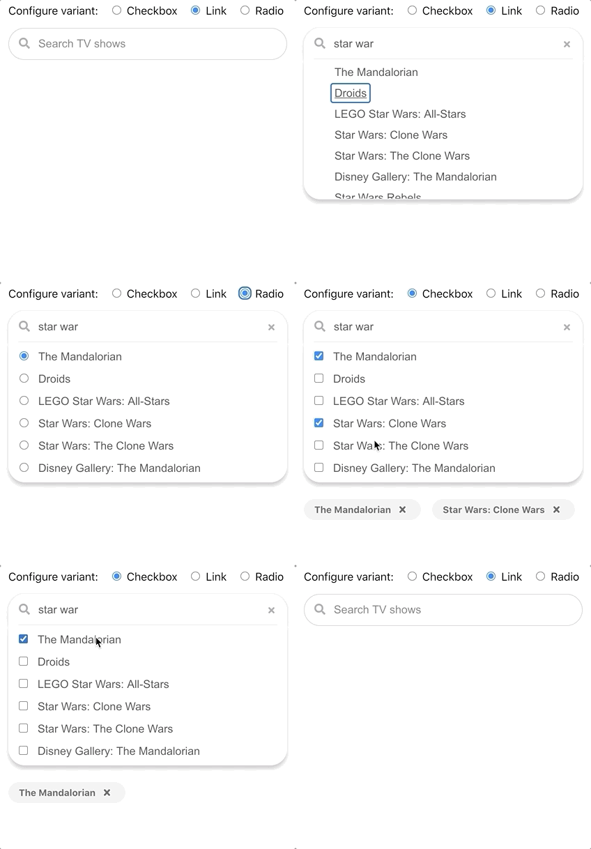
A react search panel that expands, autocompletes, and support single or multi select.
Demo

There is a demonstration of react-search-panel as coded in the example folder.
Many other variants of this component are demonstrated in this Storybook demonstration.
Documentation
Here is documentation of the component API.
Getting started
For development
npm install --save-dev react-search-panel
Run example locally
git clone https://github.com/jeremydavidson/react-search-panelcd examplenpm installnpm start
Usage
Typescript example
This is an example in Typescript with all available props:
import React from "react";
import { SearchPanel } from "react-search-panel";

const App = () => {
  const [input, setInput] = React.useState("");
  const [selectedChoices, setSelectedChoices] = useState(choices);
  return (
    <SearchPanel
      chips
      choices={choices}
      float
      maximumHeight={250}
      onChange={event => setInput((event as React.ChangeEvent<HTMLInputElement>).target.value)}
      onClear={() => setInput("")}
      onFocus={event => handleFocus((event as React.FocusEvent<HTMLInputElement>).target.value)}
      onSelectionChange={setSelectedChoices}
      noChoiceItem={noChoiceItem}
      placeholder="Search"
      selectedChoices={selectedChoices}
      shadow
      small
      value={input}
      variant={SearchPanelVariant.checkbox}
      width={300}
    />
  );
}
export default App;
Javascript
This is an example in Javascript with only the required props.
import React from "react";
import { SearchPanel } from "react-search-panel";

const App = () => {
  const [input, setInput] = React.useState("");
  const [selectedChoices, setSelectedChoices] = useState(choices);
  return (
    <SearchPanel
      choices={choices}
      onChange={event => setInput(event.target.value)}
      onSelectionChange={setSelectedChoices}
      placeholder="Search"
      selectedChoices={selectedChoices}
      value={input}
    />
  );
}
export default App;