react-searchable-dropdown-component v1.0.3
React Searchable Dropdown Component

About
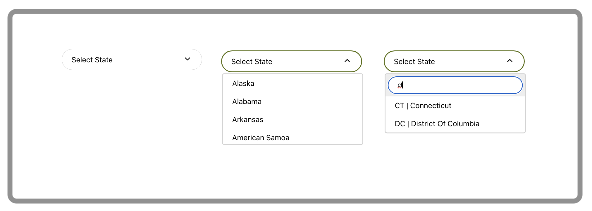
This component will enable you to add a searchable dropdown selector to your React application.
Amongst others, its key advantages include the ability to search your dropdown's options, use your own up/down arrows, and update the parent component's state with either dropdown's key or value.
Note: If your React project was initiated with Create React App, you are better off installing react-app-searchable-dropdown-component instead to avoid a possible Babel error.
Prerequisites
- NodeJS.
- npm.
- Naturally, you will need to be building a React application as the dropdown relies on a number of React imports.
Installation
Run npm install react-searchable-dropdown-component.
Use
Import the dropdown:
import {Dropdown} from 'react-searchable-dropdown-component';Use the dropdown as you would any other React component. The dropdown accepts the following parameters:
<Dropdown   placeHolder='Select State'
            options={useStates}
            arrowDown={<ArrowDropDownOutlinedIcon/>}
            arrowUp={<ArrowDropUpOutlinedIcon/>}
            isSearchable
            parentElementStateSetter={wrapperSetHomeState}
            persistKey
/>
You will find detailed description of each parameter below.
Available APIs
placeHolder='string'
placeHolder appears on the dropdown's first load in its furled state as a cue to what this selector is about.
options={array}
options accept an array of json "key":"value" pairs:
    const usaStates = [
        {
            "key": "AL",
            "value": "Alabama"
        },
        {
            "key": "AZ",
            "value": "Arizona"
        }
    ];

    <Dropdown   options={usaStates} />
Note that the array must be in "key":"value" format. If your array uses different names for its pairs, these should be renamed prior to passing them to the dropdown component.
arrowDown={<Component />} and arrowUp={<Component />}
arrowDown and arrowUp serve to pass your own arrow icons to be displayed on the dropdown when it is furled and unfurled, respectively. These parameters are optional and in the absence of your icons default Down SVG Vector and Up SVG Vector will be used.
    import ArrowDropDownOutlinedIcon from '@mui/icons-material/ArrowDropDownOutlined';
    import ArrowDropUpOutlinedIcon from '@mui/icons-material/ArrowDropUpOutlined';

    <Dropdown   arrowDown={<ArrowDropDownOutlinedIcon/>}
                arrowUp={<ArrowDropUpOutlinedIcon/>}
    />
isSearchable
isSearchable will enable your dropdown options to be searched inside their "key":"value" pairs. A text input will appear just above all other options. This parameter is optional.
parentElementStateSetter={wrapper}
parentElementStateSetter enables you to capture dropdown state change in its parent component. This is especially useful when you use this dropdown in a form, for example, to keep the form's state in one place.
    const [homeState, setHomeState] = useState('');
    const wrapperSetHomeState = useCallback(value => {
            setHomeState(value);
    }, [setHomeState]);

    <Dropdown   options={usaStates}
                parentElementStateSetter={wrapperSetHomeState}
    />
persistKey
By default, parentElementStateSetter will return value of the "key":"value" pair to its parent component. persistKey will enable you to pass key instead.
Troubleshooting
If your React project was initiated with Create React App, you may be faced with a Babel error such as Support for the experimental syntax 'jsx' isn't currently enabled. This happens because Babel processes JS inside and outside of the app (i.e. its src directory) differently. If you encounter this error, rest assured that it is not a fault of the dropdown component itself.
There exists a precompiled version of this dropdown - react-app-searchable-dropdown-component - for projects kicked off with Create React App which does not produce this error. Simply alternate these components in your projects.
To remedy the error manually:
1. Create babel.config.json file in the root of your project and add the following block of code to it:
    {
      "presets": [
        "@babel/preset-env",
        [
          "@babel/preset-react",
          {
            "runtime": "automatic"
          }
        ]
      ]
}- Locate
webpack.config.jsfile in the./node_modules/react-scripts/config/directory. On line474(at the time of writing this document) changeconfigFile: falsetoconfigFile:true. This will tell Babel to use the config file created in the step above. - Restart your app server to make sure configuration changes are applied.