0.1.1 • Published 10 years ago
react-select-popover v0.1.1
React Select Popover
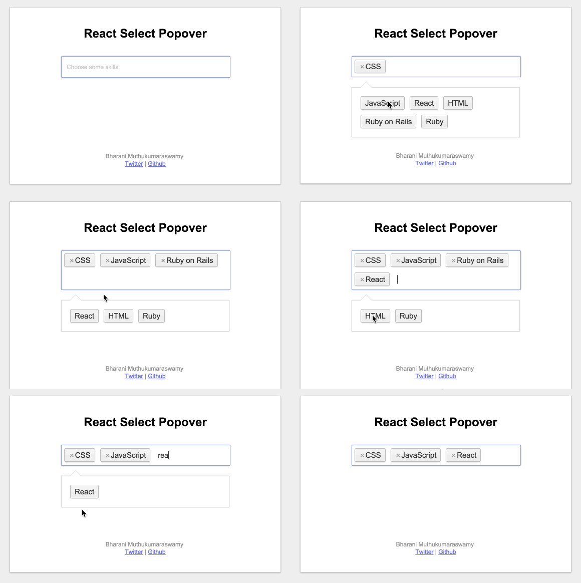
A react component to convert a select box into a nifty popover with prepopulated options.
This creates a hidden multi select field. You can submit it as part of a form or listen for onChange event.
Demo

Usage
The easiest way to use this is to install it via npm
npm install react-select-popoverAlternately, you can also use the CSS & Javascript files in the dist folder. Just make sure that you have included React separately and that it is available in the global scope. You'll also need to include react-onclickoutside.
Using this component is fairly easy,
var SelectPopover   = require("react-select-popover"),
    React           = require('react');


// These are the props that you can pass to the component
// options is a required prop, rest of them are optional
var options = [
    { label: "CSS", value: "css" },
    { label: "HTML", value: "html" },
    { label: "JavaScript", value: "js" },
    { label: "Ruby on Rails", value: "ror" },
];
var selectFieldName = "my-select";
var selectPlaceholder = "Choose some options...";
var onChange = function(obj) {
    console.log("EVENT", obj.event); // "added" or "removed"
    console.log("ITEM", obj.item);   // item that has been added/removed { label: '...', value: '...' }
    console.log("VALUE", obj.value); // [{label: '...', value: '...'}, {label: '...', value: '...'}]
}

React.render(
    <SelectPopover
        options={options}
        name={selectFieldName}
        selectPlaceholder={selectPlaceholder}
        onChange={ onChange }
    />,
    document.getElementById("root")
);PS: I am new to React and this is my first attempt at making a component. Do let me know if I have made any mistakes.