react-semantic-toasts v0.6.6
React Semantic Toasts
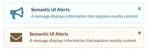
Simple and easy Semantic UI animated toast notifications for React

Installation
$ npm install --save react-semantic-toasts semantic-ui-react semantic-ui-cssUsage
The library does not depend on semantic-ui-css anymore, make sure to import semantic.min.css or at the very least, to include the following components:
import 'semantic-ui-css/components/reset.min.css';
import 'semantic-ui-css/components/site.min.css';
import 'semantic-ui-css/components/container.min.css';
import 'semantic-ui-css/components/icon.min.css';
import 'semantic-ui-css/components/message.min.css';
import 'semantic-ui-css/components/header.min.css';
Import the library into your project using ES6 module syntax:
import { SemanticToastContainer, toast } from 'react-semantic-toasts';
import 'react-semantic-toasts/styles/react-semantic-alert.css';
Render the SemanticToastContainer component:
render() {
    return <SemanticToastContainer />;
}
Fire as many notifications as you want
setTimeout(() => {
    toast(
        {
            title: 'Info Toast',
            description: <p>This is a Semantic UI toast</p>
        },
        () => console.log('toast closed'),
        () => console.log('toast clicked'),
        () => console.log('toast dismissed')
    );
}, 1000);

setTimeout(() => {
    toast({
        type: 'warning',
        icon: 'envelope',
        title: 'Warning Toast',
        description: 'This is a Semantic UI toast wich waits 5 seconds before closing',
        animation: 'bounce',
        time: 5000,
        onClose: () => alert('you close this toast'),
        onClick: () => alert('you click on the toast'),
        onDismiss: () => alert('you have dismissed this toast')
    });
}, 5000);
API
Toast Container
The <SemanticToastContainer> receives an optional position prop, which can be one of top-right, top-center, top-left, bottom-right, bottom-center or bottom-left.
The type of animation can be specifed using an optional animation prop with any supported SemanticUI animation value. If not present, will be derived from the container position.
<SemanticToastContainer position="top-right" />Max Toasts
Supply the maxToasts prop to <SemanticToastContainer> to control the amount of toasts visible at any given time.
maxToasts- The amount of toasts to display at once. On new toasts, the toaster will dismiss the oldest toast to say within the limit.
<SemanticToastContainer position="top-right" maxToasts={3}/>Toast
The toast notification function receives a toast options object and optional close, click and dismiss callbacks as function arguments:
toast(options, onClose, onClick, onDismiss);Toast Options
title- The header of the toastdescription- The content of the toasttype- Can be one ofinfo,success,warning, orerroricon- Override the default iconcolor- Override color with semantic valuessize- Size of toast with semantic valueslist- Array of strings for showing an item menu inside the toasttime- Duration to keep the toast open, 0 to wait until closed by the useronClose- The function that will be called when the toast is closed (either if you have clicked the close sign or if the toast has been closed aftertimehas passed)onClick- The function that will be called when you click on the toastonDismiss- The function that will be called when you click to close the toast. onClose function will be called afterwards.animation- Override the default toast container animation
License
Licensed under MIT
4 years ago
6 years ago
6 years ago
7 years ago
7 years ago
7 years ago
7 years ago
7 years ago
7 years ago
7 years ago
7 years ago
7 years ago
7 years ago
7 years ago
7 years ago
7 years ago
7 years ago
7 years ago
7 years ago
8 years ago
8 years ago
8 years ago
8 years ago
8 years ago
8 years ago
8 years ago
8 years ago
8 years ago