0.0.5 • Published 2 years ago
react-simple-stylable-select v0.0.5
React simple styleable and accessible select
This is a simple animatable select implementation which is customisable via several components that can be passed in. It uses the ARIA combobox pattern for accessibility and is modelled after the sonder-ui select (see the linked page for more notes on accessibility).
Demo
Installation and usage
npm install react-simple-stylable-selectUsage:
import { Select } from "react-simple-stylable-select";

const countries = ["France", "South Africa", "Japan", "Antigua and Barbuda", "Argentina", "United Kingdom"];
<Select
name="select"
options={countries}
defaultValue="United Kingdom"
components={{
SelectValue: ({ selectedIndex }: { selectedIndex: number }) => (
<div
style={{
minWidth: '200px',
padding: '0.5rem 2rem 0.5rem 0.5rem',
border: '2px solid #eee',
background: '#f9f9f9',
color: '#111',
}}
>
{countries[selectedIndex]}
</div>
),
OptionListWrapper: ({ children }: { children: React.ReactNode }) => (
<div
style={{
backgroundColor: '#eee',
color: '#111',
}}
>
{children}
</div>
),
OptionValue: ({
option,
isSelected,
isFocused,
}: {
option: string;
isSelected: boolean;
isFocused: boolean;
}) => (
<div
style={{
padding: '0.5rem',
outlineOffset: '-2px',
outline: isFocused ? '2px solid #ccc' : 'none',
background: isSelected ? '#ccc' : 'none',
}}
>
{isSelected ? '✓ ' : ''}
{option}
</div>
),
}}
/>Props
| Prop | Type | Description |
|---|---|---|
name | string | The name of the Select when submitted as part of a form |
options | string[] | List of options |
id? | string | HTML id attribute, it is passed inside |
value? | string | Controllable value which can be used to set the value of the Select |
defaultValue? | string | Initial value of the Select |
onChange? | (value: string) => void | A callback function which is called when the value of the Select changes |
components? | DisplayComponents | Components which allow additional html/jsx and styling to be added (see table below) |
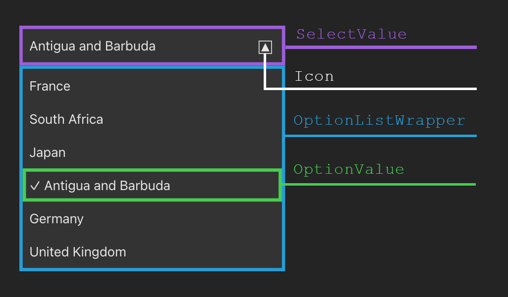
Anatomy

Display components
| Component | Props | Type | Description |
|---|---|---|---|
SelectValue? | selectedIndex | number | The selected option |
OptionListWrapper? | children | React.ReactNode | Wraps all options |
OptionValue? | optionisSelectedisFocused | stringbooleanboolean | Wraps each option |
Icon? | React.ElementType | Any html/jsx can be used as an icon |