react-smart-select v1.4.1
React Smart Select
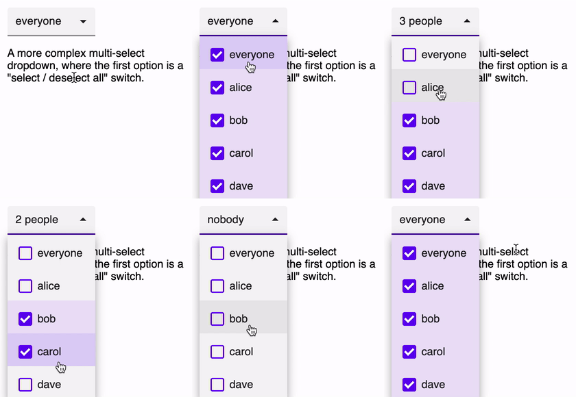
A small, responsive and highly configurable React form control. react-smart-select allows you to create single-select, multi-select and toggle-select controls, where the first item in the list can select and unselect the whole list.
Features
- Single and Multi select modes
- "Toggle" mode
- Responsive
- Custom label and option rendering
- Highly configurable styles
- Beautiful default styles
- Accessible WAI ARIA compliance
- Powered by Floating-UI and styled-components
Examples
If you want to run a demo of react-smart-select just clone the repository and run npm run start or yarn start (it will automatically install all the dependencies).
Single select
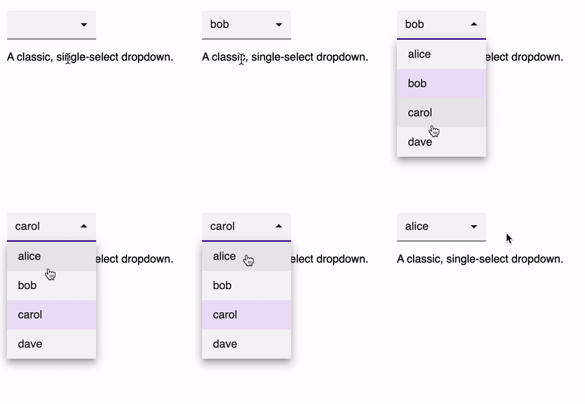
A classic, single-select dropdown.
Multi select
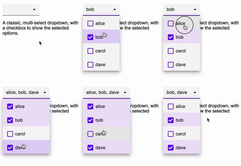
A classic, multi-select dropdown, with checkboxes to show the selected options.
Toggle select
A more complex multi-select dropdown, where the first option is a "select / deselect all" switch.
Group select
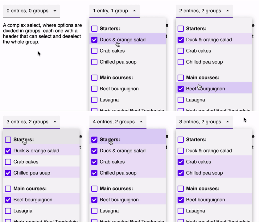
With little effort it's possible to achieve advanced features like groups of options, where each group has a header that can select and deselect the whole group. You can find the code for this control in the demo app!
Fancy select
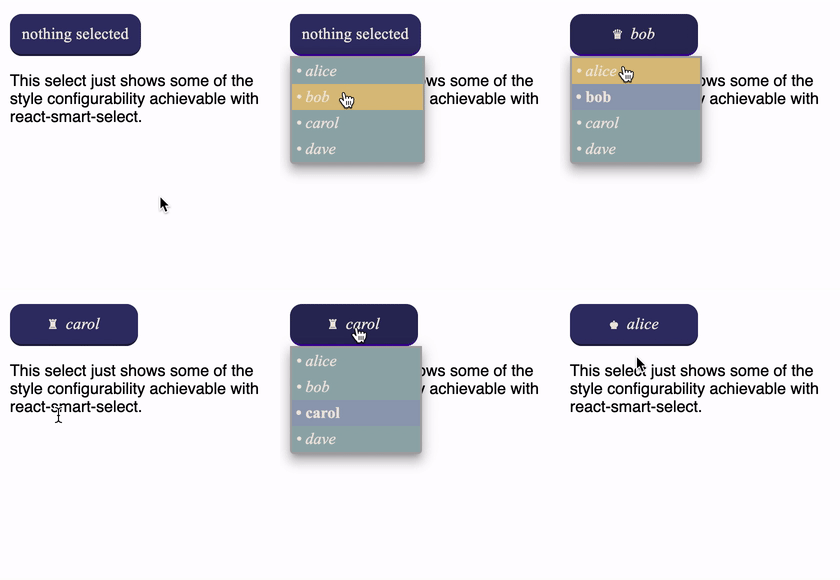
This control just shows some of the style configurability achievable with react-smart-select.
Responsive layout
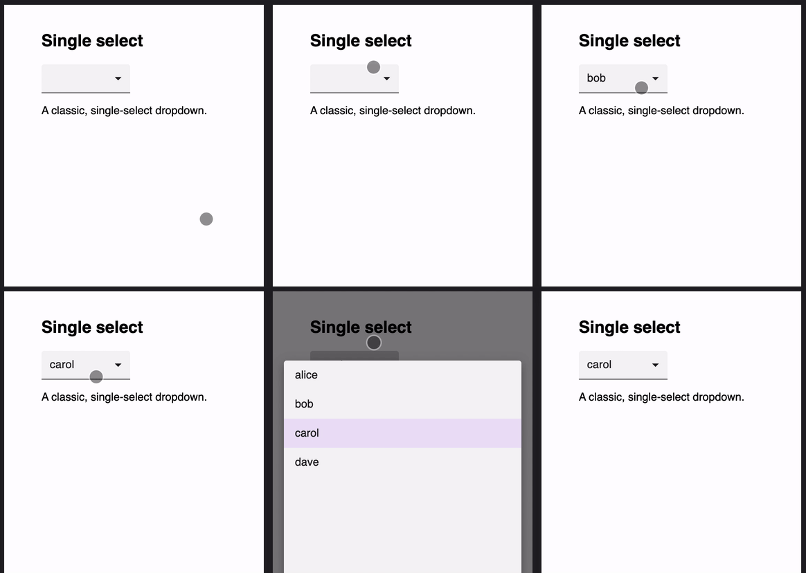
On small screens react-smart-select switches to a responsive layout.
Installation and usage
Install the library and its peer dependencies:
npm install --save-dev react-smart-select styled-components @floating-ui/react-dom
or:
yarn add --dev react-smart-select styled-components @floating-ui/react-dom
Example usage:
import SmartSelect from 'react-smart-select';
import React, { useState } from 'react';

const options = [
  { label: 'alice', value: 'alice' },
  { label: 'bob', value: 'bob' },
  { label: 'carol', value: 'carol' },
  { label: 'dave', value: 'dave' }
];

export default function Form() {
  const [ value, onChange ] = useState();

  return (
    <SmartSelect value={value} options={options}
      onChange={onChange} />
  );
}
The onChange callback receives three arguments:
  function onChange(value, selected, options) {
    ...
}value: the current option (for single-select controls) or the array of currently selected options (for multi-select and toggle-select controls).selected: the option the user just clicked.options: the list of the select's options.
Styling
There are different ways to customize the appearance of react-smart-select.
Style props
The simplest one is through the usual style props, which defines the style of the main component. Styles can also be applied to the various components through additional props:
labelStyledropdownStyleoptionStyle
For example:
const style = {
  backgroundColor: '#33336a',
  color:           '#efe8de',
  borderRadius:    '12px'
};

const optionStyle = {
  padding: '4px'
};

return (
  <SmartSelect value={value} options={options}
    style={style} optionStyle={optionStyle}
    onChange={onChange} />
);
Stylesheets
Another way to change the component's appearance is through stylesheets. react-smart-select define the smart-select class, plus any additional ones you pass with the className prop. It also defines other classes on its main elements:
rss-labelrss-dropdownrss-option
Defining your own styles allows you to style pseudo-elements too, which is not possibile using React's style props. For example:
.smart-select {
  font-family: 'Times New Roman', Time, serif;
}

.smart-select .rss-dropdown .rss-option:hover {
  background-color: #dac281;
  color: #efe8de;
}
styled-components
react-smart-select uses styled-components for its styles, so you can use its API to wrap the component with your own styles.
Remember to declare your wrapped component outside any render method, as explained by styled-component's FAQ
import SmartSelect from 'react-smart-select';
import styled from 'styled-components';
import React, { useState } from 'react';

const Styled = styled(SmartSelect)`
  font-family: 'Times New Roman', Time, serif;

  .rss-dropdown .rss-option:hover {
    background-color: #dac281;
    color: #efe8de;
  }
`;

export default function StyledComponent() {
  const [ value, onChange ] = useState();

  return (
    <Styled value={value} options={options}
      onChange={onChange} />
  );
}
Props
Props you may want to specify include:
onChange: subscribe to change eventsoptions: specify the options the user can select fromvalue: control the current option (i.e. the corresponding entry in the options array)placeholder: the placeholder value when no options are selectedclassName: optional class name for the componentstyle: optional style for the componentlabelStyle: optional style for the control labeldropdownStyle: optional style for the dropdown boxoptionStyle: optional style for each dropdown menu itemformatLabel: a function invoked to get the label content. Can return a string or a React componentformatOption: a function invoked to get each option content. Can return a string or a React componentdisabled: disable the controlmulti: enable the multi-select modetoggle: enable the toggle-select mode.
Callbacks
You can control not only the component style, but its content too. You can pass the formatLabel and formatOptions callbacks to control what will be printed in each element. These callbacks can return a string or a React component.
The formatLabel function is called to format the content of the select's label. It is passed the current value and all the control's options. For single-select controls, value is either the current selected value or null if nothing is selected, while for multi-select controls it's the array of currently selected values or an empty array if nothing is selected.
Please note that if you specify this callbacks the placeholder prop will be ignored, as it is now your responsibility to render the correct label when value is null or an empty array.
function formatLabel(value, options) {
  if (value === null) {
    return 'nothing selected';
  }

  return value.label;
}
The formatOptions function is called to format the content of each option. It is passed the option being rendered and a boolean indicating if it is currently selected or not.
function formatOption(option, selected) {
  if (selected === true) {
    return (
      <strong>{option.label}</strong>
    );
  }

  return option.label;
}