react-smart-slider v0.1.2
react-smart-slider
Super light-weight, easy to use React JS smart slider

Installation
npm install react-smart-sliderOverview
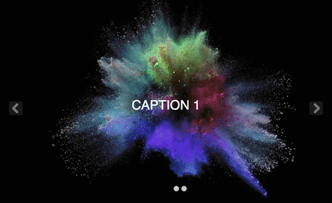
Smart slider:
React.render(<SmartSlider slides={slidesArray} autoSlide={true} />, document.body);Now you can style it as you want. Checkout the Codesandbox Playground example to see how.
Properties
slides {slidesArray}
Example:-
// DummyCaption component for example
const DummyCaption = ({ caption }) => (
  <div style={{
    position: 'absolute',
    right: 100,
    top: 250,
    fontSize: 38,
    padding: 55,
    border: 'solid 1px',
  }}>
    {caption}
  </div>
)

const slidesArray = [
      {
        url: "https://i.imgur.com/7u8i7L1.jpg",

        // (Optional) Set if you want to add any content on your slide
        childrenElem: <DummyCaption caption="Caption 1" />
      },
      {
        url: "https://i.imgur.com/E8gkF2f.jpg",
        childrenElem: <DummyCaption caption="Caption 2" />
      },
      {
        url: "https://i.imgur.com/t2a1zLi.jpg",
        childrenElem: <DummyCaption caption="Caption 3" />
      },
    ];
slidesArray is the set of images, that you want to add, caption title value is optional, if you don't want to show caption on image then leave it blank.
If you want to add some content on slide then pass component on childrenElem key of slide's object, otherwise leave it blank.
childrenElem {component} (Optional)
The childrenElem is used for add content over the slide. if you want to add some content over the layer, then create childrenElem key.
showIndicators {boolean} default: true
The image slider's indicator will be visible or not.
height {number} default: 500
The height of slide container, by default it is 500.
autoSlide {boolean} default: false
Set true if you want to autoScroll slider image, by default it is false.
autoSlideInterval {number} default: 3000
Set autoSlideInterval value for autoScroll. By default it will be 3000ms. It is minimum time period you can set more than default time value.
buttonShape {string} default: square
Set buttonShape value for Next/Previous button. You can choose with two options, round and square. By default it is square.
License
See the License file.

