react-social-badge v1.0.6
React Social Badge
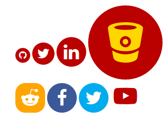
Creates an icon in a shape (circle by default) which links to your personal social media channels of choice. Built to be adapted for personal preference.
The purpose of this component is to add a cookie-cutter social badge to use as a component in React apps. It uses a Font Awesome CDN to deliver the font to the page.
Demo & Examples
Check out the live demo!

To build the examples locally, run:
npm install
npm start
Then open localhost:8000 in a browser.
Installation
The easiest way to use react-social-badge is to install it from NPM and include it in your own React build process (using Browserify, Webpack, etc).
You can also use the standalone build by including dist/react-social-badge.js in your page. If you use this, make sure you have already included React, and it is available as a global variable.
npm install react-social-badge --saveUsage
This is a pretty straight forware component, it just takes a URL to your preffered website's link and produces a link with an associated Font Awesome Icon
import SocialBadge from 'react-social-badge'

<SocialBadge url='http://github.com/mackiedrew' />
Props
| Prop | Type | Description |
|---|---|---|
url | string | The URL to your social media page, this will be the badge link, and be used to determine icon. It's the only required prop. |
size | string | You can set it to 'small', 'medium', 'large', or some number of pixels as a string or number "30" but NOT "30px". |
badgeClassName | string | Additional classnames to be appended to the classname for the badge div container, not the icon itself, but the circle around it. |
badgeColor | string | The background circle's color, can be a word 'red', rgba value 'rgba(255,0,0)' or hex code '#FF0000'. |
badgeStyle | object | The inline-style object for the badge, this will be merged with the default. |
iconScale | number | How large, relative to 1.0 the icon will appear in the badge. |
iconClassName | string | Additional classnames to be appended to the classname for the icon div container. |
iconColor | string | The actual icon color, can be a word 'red', rgba value 'rgba(255,0,0)' or hex code '#FF0000'. |
iconStyle | object | The inline-style object for the icon itself, this will be merged with the default. |
Notes
- You only need to specify the URL, all other components are optional.
- Styles and classnames are merged in the component with the defaults you will be able to use your own without completely overriding the defaults if you don't want to.
- If there is a problem with the icon you can set your own preffered font-awesome icon from the list here: http://fontawesome.io/icons/ specified as the icon prop.
- Any link will work, and you can set the icon manually, but the officially supported social networks are: - Free Code Camp - Google+ - Pinterest - Reddit - Snapchat - Steam - Youtube - Stack Exchange - Facebook - Github - Bitbucket - Deviantart - Etsy - Flickr - Instagram - LinkedIn - Meetup - Paypal - Skype - Soundcloud - Spotify - Slack - Twitter - Wordpress - Tumblr - StumbleUpon - Twitch - Vimeo - Yelp
Development (src, lib and the build process)
NOTE: The source code for the component is in src. A transpiled CommonJS version (generated with Babel) is available in lib for use with node.js, browserify and webpack. A UMD bundle is also built to dist, which can be included without the need for any build system.
To build, watch and serve the examples (which will also watch the component source), run npm start. If you just want to watch changes to src and rebuild lib, run npm run watch (this is useful if you are working with npm link).
License
MIT License (See /LICENSE for details.)
Copyright (c) 2017 Mackie Drew.