react-spotify-playback-player
Welcome to react-spotify-playback-player
This component is a player that is able to play songs via Spotify Web Playback
This component works in an agnostic way to the SDK implementation in your application, you can build your application the way you want and only pass the props necessary for the component to work, these props can be obtained in the official documentation of the Playback SDK, you can go to the link here: Spotify Web Playback Documentation
You can see a demonstration of how this component works at this link: React Spotify playback player demo For this you must have a valid Spotify token and a premium account, which is required to use the Playback API
Setup
First you must install the component, you can do it in these ways for example:
npm i react-spotify-playback-player@latest
or
yarn add react-spotify-playback-player
Integration
The integration of this component is agnostic to your application, that means you can do it in several ways, in this example I will use an SDK library you can find it at this link: react-spotify-web-playback-sdk
import { useCallback } from "react";
import { SpotifyPlaybackPlayer } from "react-spotify-playback-player";
import "./App.css";
import {
WebPlaybackSDK,
usePlayerDevice,
usePlaybackState,
useSpotifyPlayer,
} from "react-spotify-web-playback-sdk";
export const App = () => {
// your spotify token
const token = process.env.token_example;
const getOAuthToken = useCallback(
(callback: (arg0: string) => any) =>
callback(token?.replace("Bearer", "").trim()),
[token]
);
return (
<WebPlaybackSDK
initialDeviceName="Spotify example"
getOAuthToken={getOAuthToken}
initialVolume={0.5}
>
<h2>Hello react-spotify-playback-player</h2>
<Player />
</WebPlaybackSDK>
);
};
export const Player = () => {
// spotify sdk playback methods, you can get them any way you like
const device = usePlayerDevice();
const player = useSpotifyPlayer();
const playback = usePlaybackState();
return (
<SpotifyPlaybackPlayer
playback={playback || undefined}
player={player || undefined}
deviceIsReady={device?.status}
/>
);
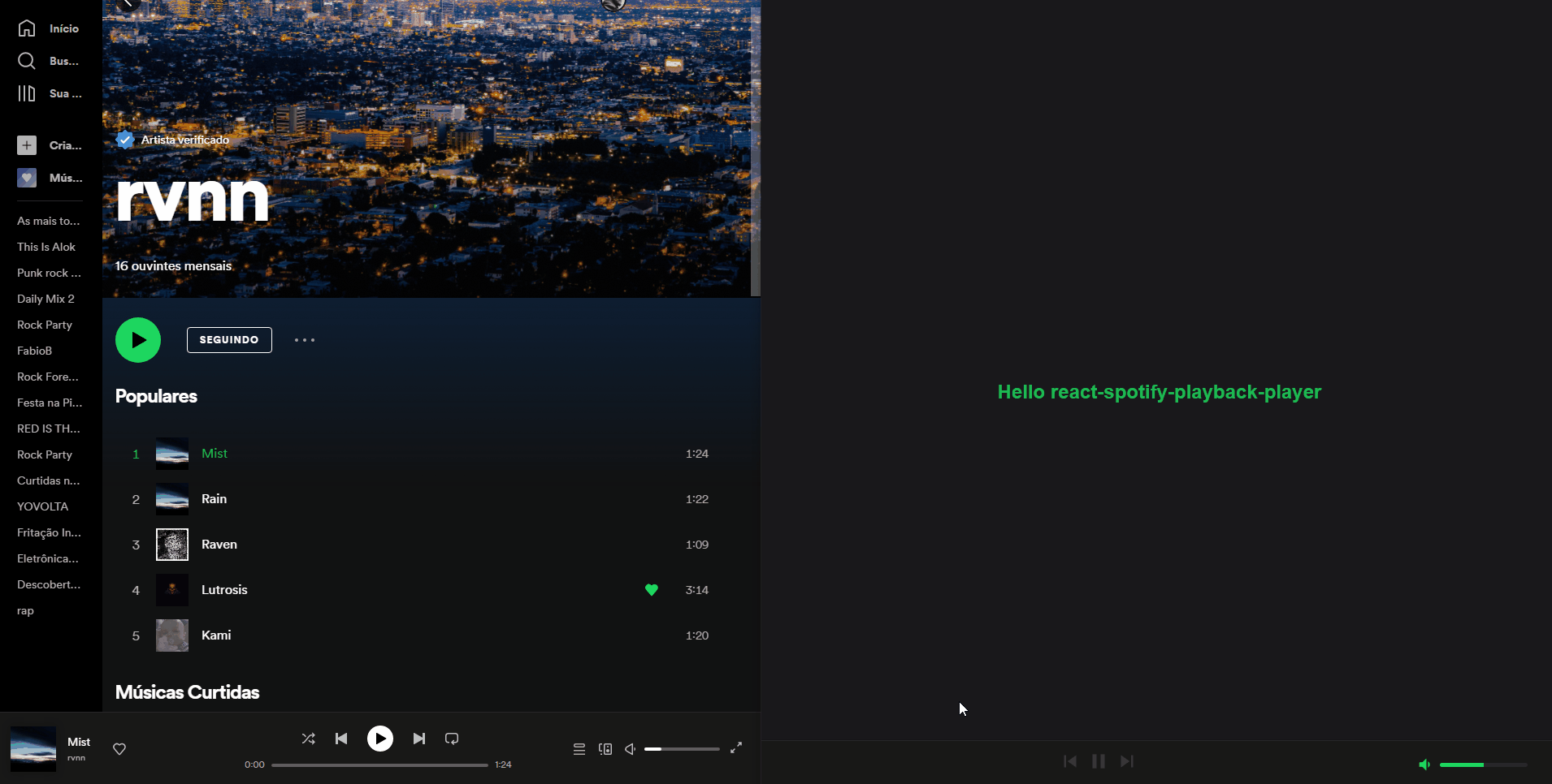
};This example generated this screen, as you can see it is fully functional, in this example I use the official Spotify application but you can do these interactions from within your application without any problems.
Works fine
Functional properties
Important, no properties are required but if you don't pass any of them it changes the player's operation, for example if you don't pass the player prop the component will not be rendered until it receives the property.
| Name | Is required | type | Description |
|---|---|---|---|
| children | false | ReactNode | Allows you to pass react components into the player, but it is not recommended |
| player | false | Player | This property expects to receive the player coming from the Spotify Playback SDK |
| playback | false | PlaybackState | This property expects to receive the player coming from the Spotify Playback SDK |
| deviceIsReady | false | 'ready' \ 'not_ready' |
This property expects to receive the device state, you can get it in Spotify Playback SDK |
| onLinkClick | false | ILinkClick | This property asks for a call back it returns the attributes of the track's title elements and the player's artists in the form of name\uri\link |
Customization
You might want to customize your component to suit the rest of your application, every color change the component will react dynamically with no reloads needed, just change the theme prop
export const Player = () => {
// spotify sdk playback methods, you can get them any way you like
const device = usePlayerDevice();
const player = useSpotifyPlayer();
const playback = usePlaybackState();
// You can dynamically receive a theme if your application has more than one
const newTheme = {
backgroundColor: "#0f172a",
disabledColor: "#475569",
highLightColor: "#EA047E",
primaryTextColor: "#f9fafb",
secondaryBackgroundColor: "#1e293b",
secondaryTextColor: "#cbd5e1",
popOverColor: "#000000",
};
return (
<SpotifyPlaybackPlayer
playback={playback || undefined}
player={player || undefined}
deviceIsReady={device?.status}
theme={newTheme}
/>
);
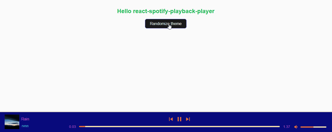
};This will generate something like this:

Your application can be an arc with multiple themes, no problem this solution is robust enough for all designs!
Cutomization properties
The props are defined in the theme property example: theme={{ backgroundColor: '#000000' }}.
| Name | Is required | type | Description |
|---|---|---|---|
| backgroundColor | false | string | Sets the main color for the player shape |
| highLightColor | false | string | Sets the color of active icons, progress bars and anything else that needs to be highlighted |
| primaryTextColor | false | string | Defines main text color, recommended to always contrast with backgroundColor |
| secondaryBackgroundColor | false | string | Sets the secondary color of the player, used to contrast the progress bars for example |
| secondaryTextColor | false | string | Defines secondary text color, recommended to always contrast with |
| disabledColor | false | string | Sets color for disabled elements |
| popOverColor | false | string | Sets color for the popOver used in floatbar views |
Callback events
You might want to get the id of the artists or the track played, for that you can use onLinkClick which returns a callBack 'event.link'.
const onLinkClick = (event: { link?: string }) => {
  if (event?.link) {
    return setLinkTarget(event.link);
  }
};

return (
  <SpotifyPlaybackPlayer
    playback={playback || undefined}
    player={player || undefined}
    deviceIsReady={device?.status}
  />
);
how to contribute
tag: descriptionThe tag must be the type of change, following the reference that will be below with checkbox;
And the description should be a simple commit message, covering all changes within PR;
What kind of changes does this code review introduce? (Tag)
-
featNew functionality -
fixBug fix -
docsDocumentation update -
refactCode change that is neither new functionality nor bug fixes -
perfPerformance improvement -
testAdding, changing or removing tests -
buildChange in build process or external dependencies -
ciPipeline or publishing flow change -
choreOther changes that do not modify base files or test files -
revertRollback of previous commits
Example: feat/tip-card-component