react-styleguide v0.0.4
react-styleguide
A React component that takes in other components and organizes them into an easy to use styleguide.
Installation
$ npm install --save react-styleguideTo view a working demo version,
$ npm install
$ npm run build
And then open the demo/index.html file in your browser.
Example Usage
Include the generated css file from dist if you want to use the styling that I've created in your project.
Just create a new component containing the Styleguide component. Include all the components that you want in the styleguide and provide the information that you want in include in the props. The props that can be included for each are:
- title
- description
- example (this is the code that will be displayed)
Inside the div, include the code that should be rendered and displayed in the styleguide. This will probably be the same as the example prop.
var React = require('react');
var Styleguide = require('react-styleguide');

// If you would like to include Prism.js as the syntax highlighter
var Prism from '../demo/vendor/prism.js';

// Require the components that you want to include
import Button from './examples/Button.js';
import Blockquote from './examples/Blockquote.js';

var Component = React.createClass({
  render: function() {
    <Styleguide title="Example Project Styleguide">
      <div
        title="Blockquote"
        description="Here is a description describing a simple Blockquote component and how to use it."
        example='<Blockquote
text="Lorem ipsum dolor sit amet, consectetur adipiscing elit. In nec imperdiet ligula."
speaker="Mauris porta ac lectus" />'
      >
        <Blockquote text="Lorem ipsum dolor sit amet, consectetur adipiscing elit. In nec imperdiet ligula." speaker="Mauris porta ac lectus" />
      </div>

      <div
        title="Button"
        description="Here is a description describing a simple Button component and how you would use it."
        example="<Button />"
      >
        <Button />
      </div>

      ...

    </Styleguide>
  }
});
Styleguide Options
For the styleguide, the following options are available:
codeClassName- changes the<code>class if you do not want to use Prism.js for highlighting otherwise defaults tolanguage-javascripthighlight- a function that can be passed if you want highlight the code using a different function from Prism.js's function. Defaults to just the code example itself.
Optional Includes
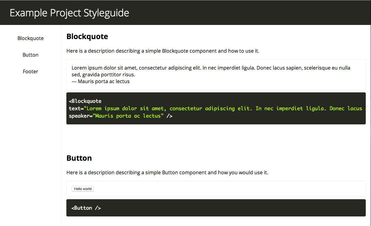
You can have the styleguide come styling free if you desire, but it is also possible to have the included styles be used (they can be seen in the screenshots). Please look at the demo/index.html to see what else could be included.
- Google web fonts
main.csslocated in thedistfolderprism.jslocated in thedemofolder (can be included via Node.js or browser side)
Any and all of these are optional but are recommended.
Extending the Styles
The styles of the styleguide follow a simple version of SuitCSS, and follow a simple hierarchy. Please view the scss/main.scss for a look at how to style the page.
Screenshots

TODO
- Better way of converting from example and example code to the styleguide (instead of including it twice, essentially)
- Write tests for the component (framework is already set in place)
- Make styled version responsive
License
MIT