react-swipeable-views-modified v0.7.12
react-swipeable-views-modified
!!!This is a temp bug fix version of react-swipeable-views !!!. There is a small issue in react-swipeable-views, I have made a pull request on github, this is only used for those who needed and will be removed when the pull request is accepted by the original author, thanks a lot!
Installation
Browser
npm install --save react-swipeable-views react-motionNative
npm install --save react-swipeable-viewsThe problem solved
Check out the demos from a mobile device (real or emulated). It is tiny (<4kB) and quickly render the first slide then lasy-load the other.
Simple example

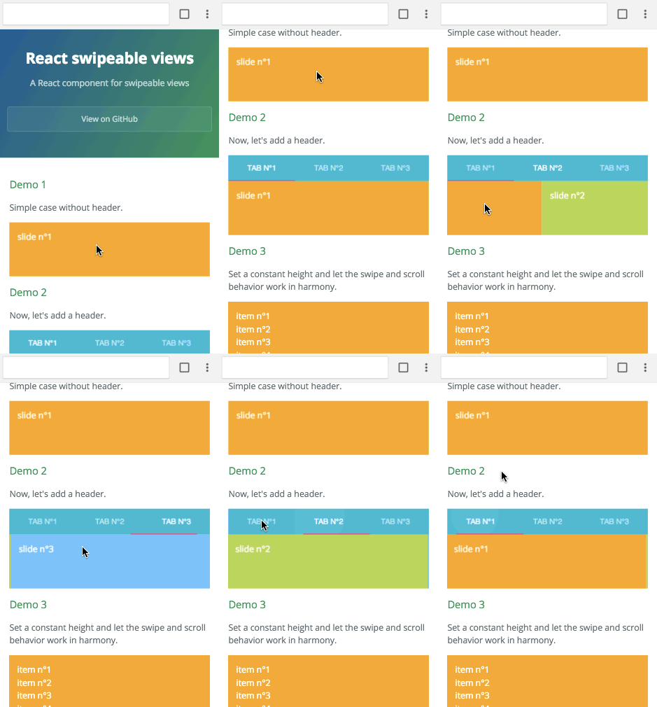
Browser
import React from 'react';
import SwipeableViews from 'react-swipeable-views';

const MyComponent = () => (
  <SwipeableViews>
    <div style={Object.assign({}, styles.slide, styles.slide1)}>
      slide n°1
    </div>
    <div style={Object.assign({}, styles.slide, styles.slide2)}>
      slide n°2
    </div>
    <div style={Object.assign({}, styles.slide, styles.slide3)}>
      slide n°3
    </div>
  </SwipeableViews>
);

const styles = {
  slide: {
    padding: 15,
    minHeight: 100,
    color: '#fff',
  },
  slide1: {
    background: '#FEA900',
  },
  slide2: {
    background: '#B3DC4A',
  },
  slide3: {
    background: '#6AC0FF',
  },
};

export default MyComponent;
Native
import React, {
  StyleSheet,
  Text,
  View,
} from 'react-native';
import Button from 'react-native-button';

import SwipeableViews from 'react-swipeable-views/lib/index.native.animated';
// There is another version. I'm unsure which one give the best UX.
// import SwipeableViews from 'react-swipeable-views/lib/index.native.scroll';

const MyComponent = () => (
  <SwipeableViews style={styles.slideContainer}>
    <View style={[styles.slide, styles.slide1]}>
      <Text style={styles.text}>
        slide n°1
      </Text>
    </View>
    <View style={[styles.slide, styles.slide2]}>
      <Text style={styles.text}>
        slide n°2
      </Text>
    </View>
    <View style={[styles.slide, styles.slide3]}>
      <Text style={styles.text}>
        slide n°3
      </Text>
    </View>
  </SwipeableViews>
);

const styles = StyleSheet.create({
  slideContainer: {
    height: 100,
  },
  slide: {
    padding: 15,
    height: 100,
  },
  slide1: {
    backgroundColor: '#FEA900',
  },
  slide2: {
    backgroundColor: '#B3DC4A',
  },
  slide3: {
    backgroundColor: '#6AC0FF',
  },
  text: {
    color: '#fff',
    fontSize: 16,
  },
});

export default MyComponent;
Supported platforms
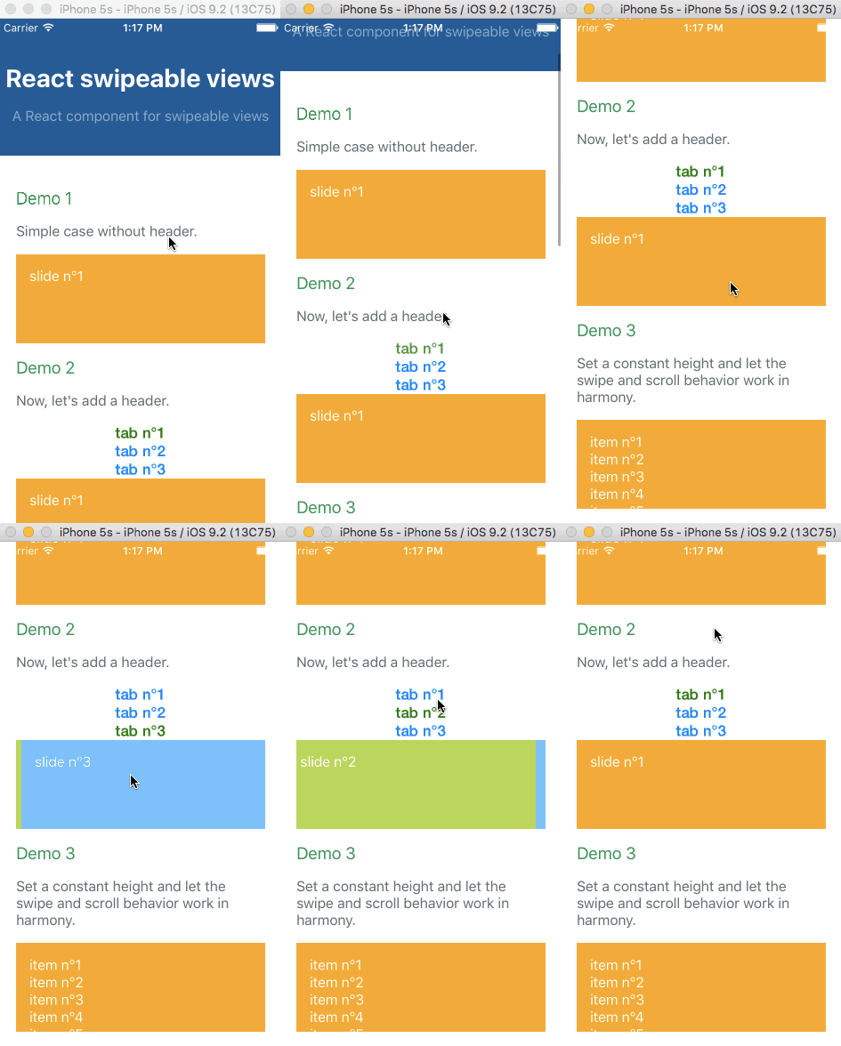
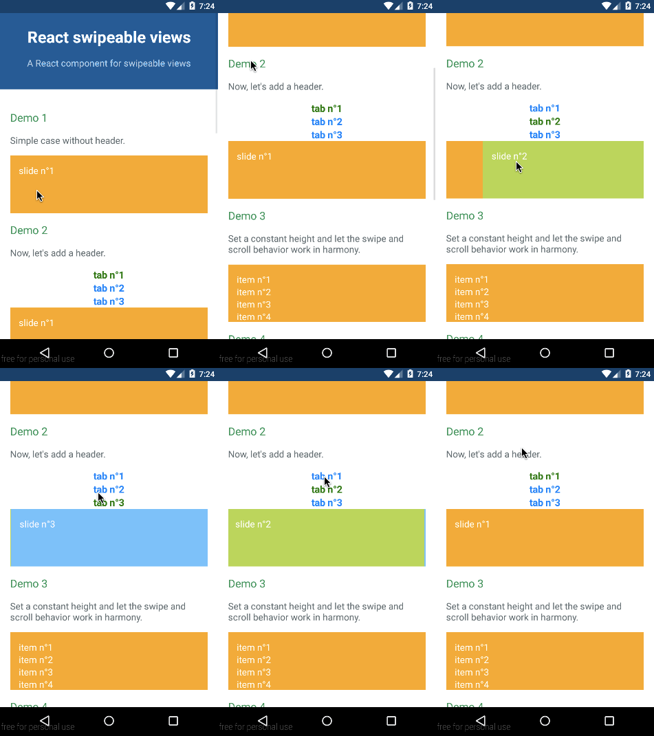
The API is as consistent as possible between the three platforms so the same component can be used independently on where it's running.
Browser

iOS

Android

Example with virtualize
The infinite feature is provided thanks to an High Order Component. It's working independently of the targeted platform. You can have a look at the Demo 8 to see it in action. It's higly inspired by react-virtualized. Let's see an example with the browser:
import React from 'react';
import virtualize from 'react-swipeable-views/lib/virtualize';
import SwipeableViews from 'react-swipeable-views';

const VirtualizeSwipeableViews = virtualize(SwipeableViews);

const slideRenderer = ({key, index}) => (
  <div key={key}>
    {`slide n°${index + 1}`}
  </div>
);

const MyComponent = () => (
  <VirtualizeSwipeableViews slideRenderer={slideRenderer} />
);

export default MyComponent;
Example with autoPlay
The auto play feature is provided thanks to an High Order Component. It's working independently of the targeted platform. You can have a look at the Demo 7 to see it in action. Let's see an example with the browser:
import React from 'react';
import autoPlay from 'react-swipeable-views/lib/autoPlay';
import SwipeableViews from 'react-swipeable-views';

const AutoPlaySwipeableViews = autoPlay(SwipeableViews);

const MyComponent = () => (
  <AutoPlaySwipeableViews>
    <div>slide n°1</div>
    <div>slide n°2</div>
    <div>slide n°3</div>
  </AutoPlaySwipeableViews>
);

export default MyComponent;
Example with bindKeyboard
The keyboard navigation feature is provided thanks to an High Order Component. You can have a look at the Demo 9 to see it in action. Let's see an example with the browser:
import React from 'react';
import bindKeyboard from 'react-swipeable-views/lib/bindKeyboard';
import SwipeableViews from 'react-swipeable-views';

const BindKeyboardSwipeableViews = bindKeyboard(SwipeableViews);

const MyComponent = () => (
  <BindKeyboardSwipeableViews>
    <div>slide n°1</div>
    <div>slide n°2</div>
    <div>slide n°3</div>
  </BindKeyboardSwipeableViews>
);

export default MyComponent;
API
<SwipeableViews />
| Name | Type | Default | Platform | Description |
|---|---|---|---|---|
| animateHeight | bool | false | browser | If true, the height of the container will be animated to match the current slide height. Animating another style property has a negative impact regarding performance. |
| animateTransitions | bool | true | all | If false, changes to the index prop will not cause an animated transition. |
| axis | enum 'x', 'x-reverse', 'y', 'y-reverse' | 'x' | browser | The axis on which the slides will slide. |
| children | node | all | Use this property to provide your slides. | |
| containerStyle | object | {} | all | Whether or not the auto complete is animated as it is toggled. |
| disabled | bool | false | all | If true, it will disable touch events. This is useful when you want to prohibit the user from changing slides. |
| index | integer | 0 | all | This is the index of the slide to show. This is useful when you want to change the default slide shown. Or when you have tabs linked to each slide. |
| onChangeIndex | function(index, indexLatest) | all | This is callback prop. It's call by the component when the shown slide change after a swipe made by the user. This is useful when you have tabs linked to each slide. | |
| onSwitching | function(index, type) | all | This is callback prop. It's called by the component when the slide switching. This is useful when you want to implement something corresponding to the current slide position. | |
| resistance | bool | false | all | If true, it will add bounds effect on the edges. |
| style | object | {} | all | This is the inlined style that will be applied on the root component. |
| slideStyle | object | {} | all | This is the inlined style that will be applied on the slide component. |
| springConfig | object | {stiffness: 300, damping: 30} | Browser | This is the config given to react-motion for the spring. This is useful to change the dynamic of the transition. |
| threshold | integer | 5 | all | This is the threshold used for detectinga quick swipe. If the computed speed is above this value, the index change. |
Any other properties like className will be applied to the root component.
virtualize
This HOC extends the properties of <SwipeableViews /> and adds the following ones:
| Name | Type | Default | Platform | Description |
|---|---|---|---|---|
| overscanSlideCount | integer | 2 | all | Number of slide to render before/after the visible slide. |
| slideCount | integer | all | When set, it's adding a limit to the number of slide: 0, slideCount. | |
| slideRenderer | func | all | Responsible for rendering a slide given an index. ({ index: integer }): node |
autoPlay
This HOC extends the properties of <SwipeableViews /> and adds the following ones:
| Name | Type | Default | Platform | Description |
|---|---|---|---|---|
| autoplay | bool | true | all | If false, the auto play behavior is disabled. |
| direction | enum: 'incremental' 'decremental' | 'incremental' | all | This is the auto play direction. |
| interval | integer | 3000 | all | Delay between auto play transitions (in ms). |
bindKeyboard
This HOC exposes the same properties as <SwipeableViews />.
Composition of HOCs
The composition order of the HOCs matters.
The virtualize HOC needs to be the first one called.
E.g.
// creates a function that invokes the given functions from right to left.
import flowRight from 'lodash/flowRight';

const EnhancedSwipeableViews = flowRight(
  bindKeyboard,
  autoPlay,
  virtualized,
)(SwipeableViews);
Performance on browser
Having 60 FPS is critical for this type of component.
I have made a tradeoff by using react-motion.
The performance is not as good as they could have been
using data binding to apply the needed styles.
However, the implementation is simpler.
react-motion is rendering the components at each request animation frame.
That has one specific implication for package users.
You need to have a pure logic in the slides components if the render method is expensive.
License
MIT


