react-tailwind-tooltip v1.0.4
React tailwind tooltip
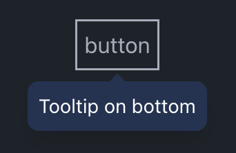
React tailwind tooltip is a React component for creating customizable tooltips using Tailwind CSS. It provides flexibility in tooltip placement, appearance, and behavior, making it easy to enhance user interfaces with informative tooltips.


Installation:
Install with npm:
npm install react-tailwind-tooltip
Install with yarn:
yarn add react-tailwind-tooltip
Install with pnpm:
pnpm add react-tailwind-tooltip
License
This project is licensed under the MIT License - see the LICENSE file for details.
Repository
For more information, issues, and contributions, visit the GitHub repository.
Preview
Open this example in StackBlitz:
Example Usage:

import React from 'react';
import { Tooltip } from 'react-tailwind-tooltip';

const App = () => {
  return (
    <div className="p-6">
      <Tooltip title="This is a tooltip!" placement="top" arrow>
        <button className="px-4 py-2 bg-blue-500 text-white rounded">Hover me</button>
      </Tooltip>
    </div>
  );
};

export default App;
Tailwind Configuration
In your tailwind.config.(js|ts):
module.exports = {
  content: [
    './src/**/*.{js,jsx,ts,tsx}',
    './node_modules/react-tailwind-tooltip/**/*.{ts,tsx,js,jsx}',
  ],
  theme: {
    extend: {},
  },
  plugins: [],
};
Monorepo Setup
If you’re working in a monorepo with workspaces, you may need to use require.resolve to ensure Tailwind can see your content files:
In tailwind.config.(js|ts):
const path = require('path');

module.exports = {
  content: [
    './components/**/*.{html,js}',
    './pages/**/*.{html,js}',
    path.join(path.dirname(require.resolve('react-tailwind-tooltip')), '**/*.{ts,tsx,js,jsx}'),
  ],
  theme: {
    extend: {},
  },
  plugins: [],
};
Properties
| Name | Type | Description |
|---|---|---|
children | React.ReactNode | The element that the tooltip will be attached to. |
title | React.ReactNode | The content of the tooltip. |
placement* | top \| top-start \| top-end \| bottom \| bottom-start \| bottom-end \| left \| left-start \| left-end \| right \| right-start \| right-end | TThe preferred position of the tooltip. Default bottom |
followCursor* | boolean | Whether the tooltip should follow the cursor. Default false |
arrow* | boolean | Whether to display an arrow pointing to the element. Default false |
open* | boolean | Control the visibility of the tooltip. |
tooltipStyle* | string | Style of the tooltip. Default bg-[#223354]/95 text-white text-sm |
arrowStyle* | string | Style of the arrow. Default to-[#223354]/95 |
enterDelay* | number | Delay in milliseconds before the tooltip appears. Default 100 |
leaveDelay* | number | Delay in milliseconds before the tooltip disappears. Default 100 |
onOpen* | (event: React.MouseEvent<HTMLDivElement, MouseEvent>) => void | Callback function triggered when the tooltip opens. |
onClose* | (event: React.MouseEvent<HTMLDivElement, MouseEvent>) => void | Callback function triggered when the tooltip closes. |
Props marked with * are not required.


