1.1.1 • Published 7 years ago
react-thumb-photo-gallery v1.1.1
React-Photo-Gallery
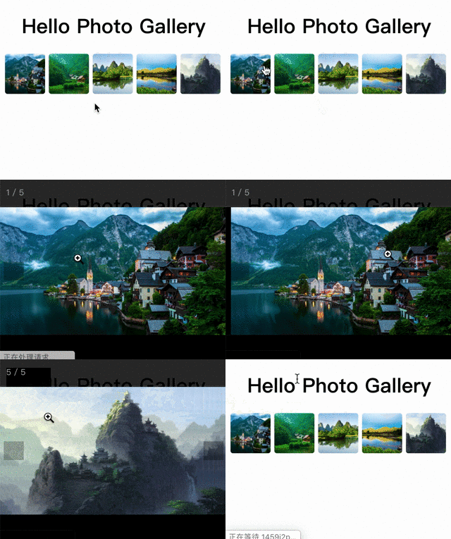
react-thumb-photo-gallery solve two problems:
1. first display image thumbs

- view original picture after click the thumb image

Online Demo
Usage
- PhotoGallery
import PhotoGallery from 'react-thumb-photo-gallery'

<PhotoGallery photos={photos} margin={6} radius={4} />- PhotoThumbs
import { PhotoThumbs } from 'react-thumb-photo-gallery'

<PhotoThumbs photos={photos} margin={6} radius={4} />
PhotoThumbs only handle thumbs without photoswipe integration, so it has smaller package size.
What this package did
PhotoViewer is based on photoswipe.
First is solve image original size, photoswipe only works with correct width and height of images. Unfortunately, we always don't have the image original size.
Second is layout style, thumb have margin between others, and there wrapper cannot take more space.
Components
1. PhotoGallery/PhotoThumbs
Props
| Prop Name | Type | Default | Description |
|---|---|---|---|
| photos | Arraystring | [] | Image data set |
| size | Number | 64 | Thumbnail image size |
| width | Number | undefined | Thumbnail image width |
| height | Number | undefined | Thumbnail image height |
| direction | 'row' | 'column' | 'row' | Thumbnail Direction |
| margin | Number | undefined | Thumbnail margin |
| srcPrefix | String | undefined | Add prefix string for each photo src |
| imagePlaceholder | String | undefined | default image for gallery item |
| itemClass | String | undefined | add class for gallery item |
| radius | String | undefined | quick set image border-radius, such as 4 or '4px' |
| expandAnimate | boolean | undefined | only for PhotoGallery, make preview animation start from thumb position |
2. PhotoViewer
PhotoViewer is just the wrapper of photoswip for react
import { PhotoViewer } from 'react-thumb-photo-gallery'Props
| Prop Name | Type | Default | Description |
|---|---|---|---|
| items | Array{src, w, h} | undefined | Image data set |
| options | Object | {} | Props reference photos props: Link |
